This object is used as the global theme for every StorytellerListView included in your application. We, therefore, recommend setting it as early as possible in the application's lifecycle.
It is also possible to apply a specific theme to a specific StorytellerListView instance. For example:
A Theme contains theme customizations for various components in the SDK. All properties are optional.
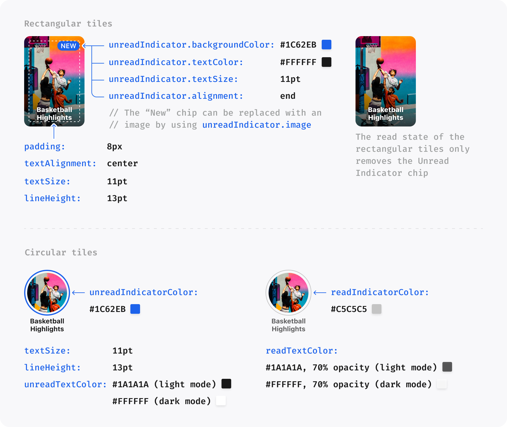
Some properties take their default value from others. For example, setting the primaryColor to #FF0000 will also result in the New Indicator for Rectangular Tiles being colored red. Such properties are indicated in the table below.
Note that theme properties may be used for other situations in future.
Required for outline on Live chip and fade to the side of the row.
title.font
null
FontProvider
Defines the font of the Title in Section
title.textSize
22
number
Size of the Title in Section
title.lineHeight
28
number
The line height of the Title in Section
title.textCase
default
TextCase
Sets the text case for the Title in Section. Possible values are upper, lower and default
title.textColor
null
ARGB string
Color of Title in Section
animateTilesOnReorder
true
boolean
When the reloadData() method is called to update lists, a reorder animation is added to visualise the updating process.
enablePlayerOpen
true
boolean
Controls whether tapping a list tile opens the Storyteller player automatically. Set to false only when your app intentionally handles tile taps itself.
The ThemeGradient struct allows for the creation of a color gradient, with options to customize both the colors and the positions at which the gradient starts and ends.
Android 11.6.3 correctly honors the numeric GradientPosition enum values. Untyped JavaScript themes that omit either position retain the compatibility defaults of topLeft for the start and bottomRight for the end.
Property
Default Value
Data Type
Description
startColor
null
ARGB string
The color where the gradient begins.
endColor
null
ARGB string
The color where the gradient ends.
startPosition
topLeft
GradientPosition
The position indicating where the gradient starts.
iOS 11.6.0 and Android 11.6.3 map clips.topGradient, bottomGradient, feed-switcher/title/category typography, progress-bar position and colours, and four Embedded Clips spacing fields. Omitted or invalid fields preserve native defaults.
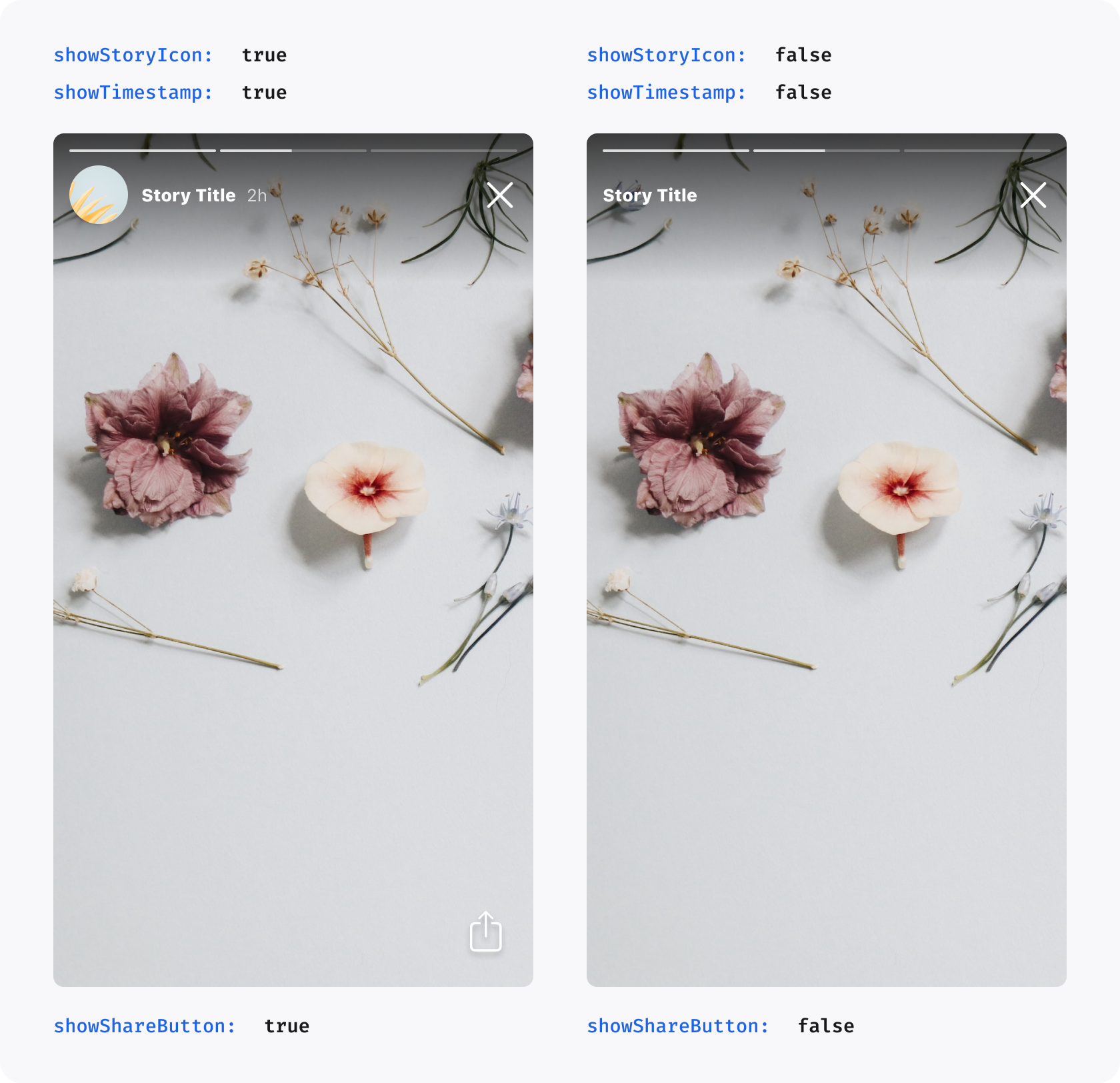
The player property is used to customize properties relating to the Story Player.
Property
Default Value
Data Type
Description
showStoryIcon
false
Boolean
Shows the round Story icon before the Story Title in the Player
showTimestamp
true
Boolean
Shows the timestamp after the Story Title in the Player, indicating how long ago a Story was published
showShareButton
true
Boolean
Shows the share button in the Player. Setting this to false entirely disables sharing in Storyteller
showLikeButton
true
Boolean
Shows the like button in the Player. Setting this to false entirely disables liking in Storyteller
showMoreButton
true
Boolean
Shows the more/options button in the Player where supported
enableFollowableCategorySwipeFromRightEdge
true
Boolean
Enables the Clips followable category/profile screen swipe gesture from the right edge
liveChip.image
null
ImageSource?
Image used in place of Live Chip before Live Story or Clip Titles. If set, it overrides liveChip.backgroundGradient
liveChip.textColor
null
ARGB string?
Text color used for badge label for Live Story or Clip
liveChip.backgroundGradient
null
ThemeGradient?
Background gradient of the badge for Live Story or Clip. If set, it overrides liveChip.backgroundColor
liveChip.backgroundColor
theme.colors.alert
ARGB string?
Background color of the badge for Live Story or Clip
liveChip.borderColor
null
ARGB string
Border color of the badge for Live Story or Clip
icons.share
null
ImageSource
An image to be used in place of the default share icon
icons.refresh
null
ImageSource
Refresh button image to be used in place of default refresh icon
icons.close
null
ImageSource
Close button image to be used in place of default close icon
icons.like.initial
null
ImageSource
Initial like button image to be used in place of default initial like icon
icons.like.liked
null
ImageSource
Liked button image to be used in place of default liked icon
icons.like.animation.liked
null
PlayerLikeAnimationResource?
Lottie animation played when a Clips like button moves from unliked to liked
icons.like.animation.unliked
null
PlayerLikeAnimationResource?
Lottie animation played when a Clips like button moves from liked to unliked
icons.back
null
ImageSource
Back button image to be used in place of the default Clips back icon
icons.more
null
ImageSource
More/options button image to be used in place of the default icon where supported
icons.mute.muted
null
ImageSource
Image used for the mute button when audio is muted in Stories and Clips
icons.mute.unmuted
null
ImageSource
Image used for the mute button when audio is unmuted in Stories and Clips
icons.captions.enabled
null
ImageSource
Image used for the captions button when captions are enabled in Stories and Clips
icons.captions.disabled
null
ImageSource
Image used for the captions button when captions are disabled in Stories and Clips
clips.showButtonBackgrounds
true
Boolean
Controls whether Clips player action buttons render the default circular backgrounds
clips.actionIconSize
32
number
Size for Clips player action icons. Values outside the native supported range are clamped
clips.topGradient
native readability scrim
ThemeGradient?
iOS 11.6.0+ and Android 11.6.3+: top Clips readability gradient; a fully transparent gradient is a valid visual opt-out
clips.bottomGradient
native readability scrim
ThemeGradient?
iOS 11.6.0+ and Android 11.6.3+: bottom Clips readability gradient
clips.feedSwitcher.selected.fontWeight
native selected weight
StorytellerFontWeight?
iOS 11.6.0+ and Android 11.6.3+: selected For You/Following label weight
clips.feedSwitcher.selected.textSize
15
number?
iOS 11.6.0+ and Android 11.6.3+: selected feed label size
clips.feedSwitcher.selected.lineHeight
20
number?
iOS 11.6.0+ and Android 11.6.3+: selected feed label line height
clips.feedSwitcher.unselected.fontWeight
native unselected weight
StorytellerFontWeight?
iOS 11.6.0+ and Android 11.6.3+: unselected For You/Following label weight
clips.feedSwitcher.unselected.textSize
15
number?
iOS 11.6.0+ and Android 11.6.3+: unselected feed label size
clips.feedSwitcher.unselected.lineHeight
20
number?
iOS 11.6.0+ and Android 11.6.3+: unselected feed label line height
clips.progressBar.position
bottom
StorytellerClipsProgressBarPosition?
iOS 11.6.0+ and Android 11.6.3+: bottom or aboveAction for Embedded Clips
clips.progressBar.playedColor
native compatibility colour
ARGB string?
iOS 11.6.0+ and Android 11.6.3+: non-scrubbing played-track colour
clips.progressBar.remainingColor
native compatibility colour
ARGB string?
iOS 11.6.0+ and Android 11.6.3+: non-scrubbing remaining-track colour
clips.progressBar.active.playedColor
inherits configured base
ARGB string?
iOS 11.6.0+ and Android 11.6.3+: played-track colour while scrubbing
clips.progressBar.active.remainingColor
inherits configured base
ARGB string?
iOS 11.6.0+ and Android 11.6.3+: remaining-track colour while scrubbing
clips.progressBar.active.currentTimeColor
native compatibility colour
ARGB string?
iOS 11.6.0+ and Android 11.6.3+: current-time and separator colour while scrubbing
clips.progressBar.active.totalTimeColor
native compatibility colour
ARGB string?
iOS 11.6.0+ and Android 11.6.3+: total-duration colour while scrubbing
clips.title.font
inherits global font
FontProvider?
Custom font for the Clips player title
clips.title.fontWeight
native title weight
StorytellerFontWeight?
iOS 11.6.0+ and Android 11.6.3+: title font weight
clips.title.textSize
16
number
Text size for the Clips player title
clips.title.lineHeight
null
number?
Line height for the Clips player title
clips.title.textColor
inherits colors.white.primary
ARGB string?
Text color for the Clips player title
clips.eyebrow.font
inherits global font
FontProvider?
Custom font for the Clips player eyebrow text
clips.eyebrow.textSize
15
number
Text size for the Clips player eyebrow text
clips.eyebrow.lineHeight
20
number?
Line height for the Clips player eyebrow text
clips.eyebrow.textColor
inherits colors.white.secondary
ARGB string?
Text color for the Clips player eyebrow text
clips.categoryNavigation.fontWeight
regular
StorytellerFontWeight?
iOS 11.6.0+ and Android 11.6.3+: category-navigation label weight
clips.categoryNavigation.textSize
16
number?
iOS 11.6.0+ and Android 11.6.3+: category-navigation label size
clips.categoryNavigation.lineHeight
native font line height
number?
iOS 11.6.0+ and Android 11.6.3+: category-navigation label line height
clips.spacing.backButtonStartInset
0
number
Start inset for the Clips back or close button
clips.spacing.contentInsetHorizontal
16
number
Horizontal/top padding for Clips description and action content areas
clips.spacing.contentInsetBottom
16
number
Bottom padding for Clips description and action content areas
clips.spacing.actionSpacing
12
number
Vertical spacing between Clips action icons
clips.spacing.eyebrowToTitleSpacing
4
number
Spacing between Clips eyebrow text and title
clips.spacing.titleToActionSpacing
16
number
Horizontal gap between Clips text content and the action icon column
clips.spacing.titleToCategoriesSpacing
native layout
number?
iOS 11.6.0+ and Android 11.6.3+: Embedded Clips title-to-categories spacing
clips.spacing.categoriesToMoreSpacing
native layout
number?
iOS 11.6.0+ and Android 11.6.3+: Embedded Clips categories-to-expansion spacing
clips.spacing.metadataToProgressBarSpacing
native layout
number?
iOS 11.6.0+ and Android 11.6.3+: Embedded Clips metadata-to-progress spacing
clips.spacing.progressBarToActionSpacing
native layout
number?
iOS 11.6.0+ and Android 11.6.3+: Embedded Clips progress-to-primary-action spacing
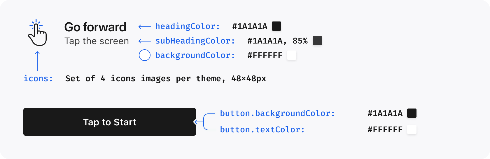
Use the instructions property to customize the appearance of the instructions screen.
Property
Default Value
Data Type
Description
show
true
boolean
Determines whether the Instructions Screen is shown the first time a user opens the Story Player. Set to false to completely disable the instructions screen.
headingColor
inherits colors.black.primary for light, colors.white.primary for dark
ARGB string
The color of the heading text on the Instructions Screen
headingTextCase
default
TextCase
Determines the text case of the heading on the Instructions Screen. Possible values are upper, lower and default
headingFont
null
FontProvider
Defines the font of the heading text on the Instructions Screen
subHeadingColor
inherits colors.black.secondary for light, colors.white.secondary for dark
ARGB string
The color of the subheading text on the Instructions Screen
backgroundColor
inherits colors.white.primary for light, colors.black.primary for dark
ARGB string
The color of the background of the Instructions Screen
icons
custom
null
A set of custom icons to be used for each instruction on the Instructions Screen
button.backgroundColor
inherits colors.black.primary for light, colors.white.primary for dark
ARGB string
The background color of the button used on the Instructions Screen
button.textColor
inherits colors.white.primary for light, colors.black.primary for dark
ARGB string
The text color of the button used on the Instructions Screen
The search property applies customizations to the Search component.
iOS 11.6.0 and Android 11.6.3 support complete Search styling for backgrounds, input, filter button, suggestions, no-results content, the Filters sheet and options, and the Apply button. Partial configurations fall back per field.
Property
Default Value
Data Type
Description
backIcon
chevron.backward system image on iOS, default back icon on Android
ImageSource?
Image to be used as a back icon in the Search UI
heading.font
inherits lists.title.font
FontProvider
Defines the styling of the Filters title in the Filter View
heading.textSize
inherits lists.title.textSize
number
Size of the Filter View title
heading.lineHeight
inherits lists.title.lineHeight
number
The line height of the Filter View title
heading.textCase
inherits lists.title.textCase
TextCase
Sets the text case for Filter View title. Possible values are upper, lower and default
heading.textColor
inherits lists.title.textColor
ARGB string
Color of Filter View title
backgroundColor
native Search background
ARGB string?
iOS 11.6.0+ and Android 11.6.3+: Search screen background
input.backgroundColor
native input background
ARGB string?
iOS 11.6.0+ and Android 11.6.3+: Search input background
input.textColor
native text colour
ARGB string?
iOS 11.6.0+ and Android 11.6.3+: entered Search text colour
input.placeholderTextColor
native placeholder colour
ARGB string?
iOS 11.6.0+ and Android 11.6.3+: placeholder colour
input.iconColor
native icon colour
ARGB string?
iOS 11.6.0+ and Android 11.6.3+: Search/clear icon colour
input.cornerRadius
native radius
number?
iOS 11.6.0+ and Android 11.6.3+: input corner radius
Custom fonts can be used by setting the customFont property. The SDK will load font files for various font weights that will be used.
iOS 11.6.0 and Android 11.6.3 support the optional light (300) font file and the StorytellerFontWeight values light, regular, medium, semiBold, bold, heavy, and black for the Clips typography properties above. If iOS receives no light font name, it falls back to the configured regular font.
Platform Differences:
iOS: Fonts should be defined as their font name (e.g., Comic Sans MS)
Android: Fonts are defined by file name without extension (e.g., Comic_Sans_MS for Comic_Sans_MS.ttf)
For example, if you have a font file Comic_Sans_MS.ttf containing the font Comic Sans MS, then setting it as the regular custom font should look like this:
Android Compatibility Note: The semibold font weight is only supported on Android API level 28+ (Android 9). On API level 27 and below, the bold font is used instead.
...customFont:{regular:Platform.OS==='ios'?`Comic Sans MS`:`Comic_Sans_MS`,...}
On Android, custom fonts can be packaged in either of these locations:
android/app/src/main/assets/fonts/ for file-based font loading.
android/app/src/main/res/font/ for Android font resources. This is recommended when the same custom font theme is used across
multiple Storyteller lists or re-rendered often, because Android can reuse packaged font resources more efficiently.
When using res/font, define a font-family XML resource and include the matching font files. For example:
On Android, the SDK normalizes common font file names such as Montserrat-Medium or Montserrat-Medium.ttf to find a matching
res/font/montserrat.xml font-family resource. If no matching font resource is found, it falls back to file-based loading from assets/fonts.
This applies to both global themes set with StorytellerSdk.setTheme(theme) and per-view themes passed through a Storyteller component's configuration.theme.
constmyTheme:Theme={light:{colors:{primary:'#309c47'},tiles:{title:{textSize:30}},player:{showStoryIcon:true,},engagementUnits:{poll:{percentBarColor:'#309c47',},}},dark:{colors:{primary:'#acb32e'},customFont:{regular:Platform.OS==='ios'?`Comic Sans MS`:`Comic_Sans_MS`,medium:Platform.OS==='ios'?`Comic Sans MS`:`Comic_Sans_MS`,semibold:Platform.OS==='ios'?`Comic Sans MS`:`Comic_Sans_MS_Bold`,bold:Platform.OS==='ios'?`Comic Sans MS`:`Comic_Sans_MS_Bold`,heavy:Platform.OS==='ios'?`Comic Sans MS`:`Comic_Sans_MS_Bold`,black:Platform.OS==='ios'?`Comic Sans MS`:`Comic_Sans_MS_Bold`,},tiles:{title:{textSize:10}},player:{showStoryIcon:true,},engagementUnits:{poll:{percentBarColor:'#acb32e',}}},};...<Storyteller...theme={myTheme}/>
Properties that accept custom images (such as icons.share, liveChip.image, rectangularTile.unreadIndicator.image) use the ImageSource type, which can be set using any of the following formats:
// Using require for local assetstheme.player.icons.share=require('./assets/share-icon.png');// Using image source objects with URItheme.player.icons.share={uri:'https://example.com/share-icon.png'};// Platform-specific imagestheme.player.icons.share=Platform.select({ios:require('./assets/share-icon-ios.png'),android:require('./assets/share-icon-android.png'),});
The resource can be a string or an object with name, iosName, androidResourceName, and bundlePath. The same resource name can be used on both platforms when the iOS app bundle and Android res/raw resource share a file name:
On iOS, name is resolved from the app bundle. On Android, name is resolved from the app's res/raw/<name>.json resources. If the resource names differ by platform, provide iosName or androidResourceName:
RN 12 exposes these theme overrides on Android native 12.0.0 and iOS native 11.7.0 under light and dark, except where marked Android-only. Omit them to preserve native or remote defaults.
sheets.cornerRadius: non-negative top corner radius in dp (Android) or points (iOS) for SDK-owned sheets. Zero produces square corners.
player.clips.embeddedVideoSizing: StorytellerEmbeddedClipsVideoSizing.legacy or .widthConstrained. Applies only to Embedded Clips; omission inherits remote settings.
instructions.button.textSize and .lineHeight: Android-only positive values in sp for the Clips Instructions button.
Gradients accept an optional stops array of { color, location } entries on both platforms. Supply at least two entries with finite, non-decreasing locations from 0 to 1. Equal locations are supported. Retain startColor, endColor, startPosition and endPosition for compatibility and malformed-input fallback. Invalid stops fall back to these endpoint colors.
{"slug": "themes", "page_title": "Themes", "page_url": "Themes/", "canonical_url": "/react-native/Themes/", "markdown": "# Themes\n\nThe appearance of the SDK can be customized by setting the `theme` prop. This requires a `Theme` configurable object.\n\n```js\n const globalTheme: Theme = {\n ...\n }\n StorytellerSdk.setTheme(globalTheme)\n```\n\nThis object is used as the global theme for every [StorytellerListView](StorytellerListViews.md) included in your application. We, therefore, recommend setting it as early as possible in the application's lifecycle.\n\nIt is also possible to apply a specific theme to a specific [StorytellerListView](StorytellerListViews.md) instance. For example:\n\n```js\n const myTheme: Theme = {\n ...\n }\n\n ...\n <StorytellerStoriesRowView\n ...\n theme={myTheme}\n />\n```\n\n> For more information on setting a theme on an individual list, see [StorytellerListView](StorytellerListViews.md).\n\n## Configuring a UiTheme\n\nA `Theme` consists of the following properties:\n\n- `light` sets the `ThemeType` to apply for light mode.\n- `dark` sets the `ThemeType` to apply for dark mode.\n\n## Creating Themes\n\nA `Theme` contains theme customizations for various components in the SDK. All properties are optional.\n\nSome properties take their default value from others. For example, setting the `primaryColor` to `#FF0000` will also result in the New Indicator for Rectangular Tiles being colored red. Such properties are indicated in the table below.\n\nNote that theme properties may be used for other situations in future.\n\n### Colors\n\nThe `colors` property on theme is used to establish a set of base colors for the SDK to use.\n\n| Property | Default Value | Data Type | Description |\n|----------|---------------|-----------|-------------|\n| `primary` | `#1C62EB` | `ARGB string` | The default accent color used throughout the UI. In general, this should be the primary brand color. |\n| `success` | `#3BB327` | `ARGB string`| Used to indicate correct answers in Quizzes. |\n| `alert` | `#E21219` | `ARGB string`| Used to indicate incorrect answers in Quizzes. |\n| `white.primary` | `#FFFFFF`| `ARGB string` | Used for white text |\n| `white.secondary` | `white.primary` at 85% opacity | `ARGB string` | Used for light text |\n| `white.tertiary` | `white.primary` at 70% opacity | `ARGB string` | Used for gray text |\n| `black.primary` | `#000000`| `ARGB string` | Used for black text |\n| `black.secondary` | `black.primary` at 85% opacity | `ARGB string` | Used for light black text |\n| `black.tertiary` | `black.primary` at 70% opacity | `ARGB string` | Used for gray text |\n\n---\n\n### Primitives\n\nThe `primitives` object contains base values which are used throughout the SDK.\n\n| Property | Default Value | Data Type | Description |\n|----------|---------------|-----------|-------------|\n| `cornerRadius` | `8` | `number` | The corner radius used for rectangular tiles, buttons and poll/quiz answers |\n\n---\n\n### Lists\n\nThe `lists` customizes properties of the various list types available from the SDK.\n\n| Property | Default Value | Data Type | Description |\n|----------|---------------|-----------|-------------|\n| `row.tileSpacing` | `8` | `number` | The space between each Tile in a row |\n| `row.startInset` | `12` | `number` | The space before the first Tile in a row |\n| `row.endInset` | `12` | `number` | The space after the last Tile in a row |\n| `grid.tileSpacing` | `8` | `number` | The space between each Tile in a grid, both vertically and horizontally |\n| `grid.columns` | `2` | `number` | The number of columns in a grid |\n| `grid.topInset` | `12` | `number` | The space before the first row in a grid |\n| `grid.bottomInset` | `12` | `number` | The space after the last row in a grid |\n| `backgroundColor` | `colors.white.primary` (light mode), `colors.black.primary` (dark mode) | `ARGB string` | Required for outline on Live chip and fade to the side of the row. |\n| `title.font`| `null` | `FontProvider` | Defines the font of the Title in Section |\n| `title.textSize` | `22`| `number` | Size of the Title in Section |\n| `title.lineHeight` | `28` | `number` | The line height of the Title in Section |\n| `title.textCase` | `default` | `TextCase` | Sets the text case for the Title in Section. Possible values are `upper`, `lower` and `default` |\n| `title.textColor` | `null` | `ARGB string` | Color of Title in Section |\n| `animateTilesOnReorder` | `true` | `boolean` | When the `reloadData()` method is called to update lists, a reorder animation is added to visualise the updating process. |\n| `enablePlayerOpen` | `true` | `boolean` | Controls whether tapping a list tile opens the Storyteller player automatically. Set to `false` only when your app intentionally handles tile taps itself. |\n\n---\n\n### Gradient\n\nThe `ThemeGradient` struct allows for the creation of a color gradient, with options to customize both the colors and the positions at which the gradient starts and ends.\n\nAndroid 11.6.3 correctly honors the numeric `GradientPosition` enum values. Untyped JavaScript themes that omit either position retain the compatibility defaults of `topLeft` for the start and `bottomRight` for the end.\n\n| Property | Default Value | Data Type | Description |\n|----------------|---------------|---------------------|------------------------------------------------------|\n| `startColor` | `null` | `ARGB string` | The color where the gradient begins. |\n| `endColor` | `null` | `ARGB string` | The color where the gradient ends. |\n| `startPosition`| `topLeft` | `GradientPosition` | The position indicating where the gradient starts. |\n| `endPosition` | `bottomRight` | `GradientPosition` | The position indicating where the gradient ends. |\n\n#### Enum: GradientPosition\n\nDefines positions for starting and ending points of the gradient.\n\n| Value | Data Type | Description |\n|----------------|-----------|--------------------------------------------------|\n| `'bottomLeft'` | `string` | Bottom left corner of the gradient area. |\n| `'bottomCenter'` | `string` | Bottom center edge of the gradient area. |\n| `'bottomRight'` | `string` | Bottom right corner of the gradient area. |\n| `'centerLeft'` | `string` | Center left edge of the gradient area. |\n| `'centerCenter'` | `string` | Center of the gradient area. |\n| `'centerRight'` | `string` | Center right edge of the gradient area. |\n| `'topLeft'` | `string` | Top left corner of the gradient area. |\n| `'topCenter'` | `string` | Top center edge of the gradient area. |\n| `'topRight'` | `string` | Top right corner of the gradient area. |\n\n### Tiles\n\nThe `tiles` property can be used to customize the appearance of the Tiles.\n\n| Property | Default Value | Data Type | Description |\n|----------|---------------|-----------|-------------|\n| `title.textSize` | `11` | `number` | The size of the Title on a Tile |\n| `title.lineHeight` | `13` | `number` | The line height of the Title on a Tile |\n| `title.alignment` | `center` | `ElementAlignment` | The alignment of the Title on a Tile. Possible values are `left`, `center` and `right` |\n| `circularTile.title.unreadTextColor` | inherits `colors.black.primary` for `light`, `colors.white.primary` for `dark` | `ARGB string` | The text color of the Title for a circular Tile when the item is unread |\n| `circularTile.title.readTextColor` | inherits `colors.black.tertiary` for `light`, `colors.white.tertiary` for `dark` | `ARGB string` | The text color of the Title for a circular Tile when the item is read |\n| `circularTile.unreadIndicatorColor` | inherits `colors.primary` | `ARGB string` | The color of the ring around a circular tile when the Story is unread |\n| `circularTile.readIndicatorColor` | `#C5C5C5` | `ARGB string` | The color of the ring around a circular tile when the Story is read |\n| `circularTile.unreadIndicatorGradient` | `null` | `ThemeGradient?` | The gradient of the ring around a circular tile when the story or the clip is unread. If set, overrides `circularTile.unreadIndicatorColor` |\n| `circularTile.unreadBorderWidth` | `2` | `number` | The width of Circular a Tile ring border in unread state |\n| `circularTile.readBorderWidth` | `2` | `number` | The width of a Circular Tile ring border in read state |\n| `circularTile.liveChip.readImage`| `null` | `ImageSource?`| Image to be used in place of default read Live Indicator |\n| `circularTile.liveChip.unreadImage` | `null` | `ImageSource?`| Image to be used in place of default unread Live Indicator |\n| `circularTile.liveChip.unreadBackgroundColor` | `colors.alert` | `ARGB string` | Background color of the Live Indicator when the story contains unread pages or the clip has not been viewed |\n| `circularTile.liveChip.readBackgroundColor` | `colors.black.tertiary` | `ARGB string`| Background color of the Live Indicator when all story pages have been read or the clip has been viewed |\n| `circularTile.liveChip.unreadBackgroundGradient` | `null` | `ThemeGradient?` | The gradient of the ring around a live tile and background of the Live Indicator. If set, overrides `circularTile.liveChip.unreadBackgroundColor` |\n| `circularTile.liveChip.unreadTextColor` | `colors.white.primary` | `ARGB string` | Text color of the Live Indicator when the story contains unread pages or the clip has not been viewed |\n| `circularTile.liveChip.readTextColor` | `colors.white.primary` | `ARGB string` | Text color of the Live Indicator when all story pages have been read or the clip has been viewed |\n| `chip.textSize` | `11` | `number` | Text size for the New Indicator and Live Indicator |\n| `chip.alignment` | `right` | `ElementAlignment` | Alignment of the New Indicator and Live Indicator. Possible values are `left`, `center` and `right` |\n| `chip.show` | `true` | `Boolean` | Used to show/hide the new/live chip |\n| `rectangularTile.title.textColor` | inherits `colors.white.primary` | `ARGB string` | The text color of the Story Title for a rectangular tile |\n| `rectangularTile.padding` | `8` | `number` | The internal padding for a rectangular tile |\n| `rectangularTile.unreadIndicator.image` | `null` | `ImageSource?` | An image which can be used in place of the default unread indicator for a rectangular tile. If set, overrides `rectangularTile.unreadIndicator.gradient` |\n| `rectangularTile.unreadIndicator.gradient` | `null` | `ThemeGradient?` | The background gradient of the unread indicator for a rectangular tile. If set, overrides `rectangularTile.unreadIndicator.backgroundColor` |\n| `rectangularTile.unreadIndicator.backgroundColor` | inherits `colors.primary` | `ARGB string` | The background color of the unread indicator for a rectangular tile |\n| `rectangularTile.unreadIndicator.alignment` | `right` | `ElementAlignment` | The alignment of the unread indicator on a rectangular tile. Possible values are `left`, `center` or `right` |\n| `rectangularTile.unreadIndicator.textColor` | inherits `colors.white.primary` | `ARGB string` | The text color of the unread indicator for a rectangular tile |\n| `rectangularTile.unreadIndicator.borderColor` |`null` | `ARGB string?` | Border color of the unread indicator for a rectangular tile |\n| `rectangularTile.liveChip.readImage`| `null` | `ImageSource?`| Image to be used in place of default read Live Indicator |\n| `rectangularTile.liveChip.unreadImage` | `null` | `ImageSource?`| Image to be used in place of default unread Live Indicator |\n| `rectangularTile.liveChip.unreadBackgroundColor` | `colors.alert` | `ARGB string` | Background color of the Live Indicator when the story contains unread pages or the clip has not been viewed |\n| `rectangularTile.liveChip.readBackgroundColor` | `colors.black.tertiary` | `ARGB string`| Background color of the Live Indicator when all story pages have been read or the clip has been viewed |\n| `rectangularTile.liveChip.unreadBackgroundGradient` | `null` | `ThemeGradient?` | The gradient of the ring around a live tile and background of the Live Indicator. If set, overrides `rectangularTile.liveChip.unreadBackgroundColor` |\n| `rectangularTile.liveChip.unreadTextColor` | `colors.white.primary` | `ARGB string` | Text color of the Live Indicator when the story contains unread pages or the clip has not been viewed |\n| `rectangularTile.liveChip.readTextColor` | `colors.white.primary` | `ARGB string` | Text color of the Live Indicator when all story pages have been read or the clip has been viewed |\n| `rectangularTile.liveChip.unreadBorderColor` | `null` | `ARGB string?` | Border color of the Live Indicator when the story contains unread pages or the clip has not been viewed. |\n| `rectangularTile.liveChip.readBorderColor` | `null` | `ARGB string?` | Border color of the Live Indicator when all story pages have been read or the clip has been viewed. |\n\n\n\n---\n\n### Player\n\niOS 11.6.0 and Android 11.6.3 map `clips.topGradient`, `bottomGradient`, feed-switcher/title/category typography, progress-bar position and colours, and four Embedded Clips spacing fields. Omitted or invalid fields preserve native defaults.\n\nThe `player` property is used to customize properties relating to the Story Player.\n\n| Property | Default Value | Data Type | Description |\n|----------|---------------|-----------|-------------|\n| `showStoryIcon` | `false` | `Boolean` | Shows the round Story icon before the Story Title in the Player |\n| `showTimestamp` | `true` | `Boolean` | Shows the timestamp after the Story Title in the Player, indicating how long ago a Story was published |\n| `showShareButton` | `true` | `Boolean` | Shows the share button in the Player. Setting this to `false` entirely disables sharing in Storyteller |\n| `showLikeButton` | `true` | `Boolean` | Shows the like button in the Player. Setting this to `false` entirely disables liking in Storyteller |\n| `showMoreButton` | `true` | `Boolean` | Shows the more/options button in the Player where supported |\n| `enableFollowableCategorySwipeFromRightEdge` | `true` | `Boolean` | Enables the Clips followable category/profile screen swipe gesture from the right edge |\n| `liveChip.image` | `null` | `ImageSource?` | Image used in place of Live Chip before Live Story or Clip Titles. If set, it overrides `liveChip.backgroundGradient` |\n| `liveChip.textColor` | `null` | `ARGB string?` | Text color used for badge label for Live Story or Clip |\n| `liveChip.backgroundGradient` | `null` | `ThemeGradient?` | Background gradient of the badge for Live Story or Clip. If set, it overrides `liveChip.backgroundColor` |\n| `liveChip.backgroundColor` | `theme.colors.alert` | `ARGB string?` | Background color of the badge for Live Story or Clip |\n| `liveChip.borderColor` | `null` | `ARGB string` | Border color of the badge for Live Story or Clip |\n| `icons.share` | `null` | `ImageSource` | An image to be used in place of the default share icon |\n| `icons.refresh` | `null` | `ImageSource` | Refresh button image to be used in place of default refresh icon |\n| `icons.close` | `null` | `ImageSource` | Close button image to be used in place of default close icon |\n| `icons.like.initial` | `null` | `ImageSource` | Initial like button image to be used in place of default initial like icon |\n| `icons.like.liked` | `null` | `ImageSource` | Liked button image to be used in place of default liked icon |\n| `icons.like.animation.liked` | `null` | `PlayerLikeAnimationResource?` | Lottie animation played when a Clips like button moves from unliked to liked |\n| `icons.like.animation.unliked` | `null` | `PlayerLikeAnimationResource?` | Lottie animation played when a Clips like button moves from liked to unliked |\n| `icons.back` | `null` | `ImageSource` | Back button image to be used in place of the default Clips back icon |\n| `icons.more` | `null` | `ImageSource` | More/options button image to be used in place of the default icon where supported |\n| `icons.mute.muted` | `null` | `ImageSource` | Image used for the mute button when audio is muted in Stories and Clips |\n| `icons.mute.unmuted` | `null` | `ImageSource` | Image used for the mute button when audio is unmuted in Stories and Clips |\n| `icons.captions.enabled` | `null` | `ImageSource` | Image used for the captions button when captions are enabled in Stories and Clips |\n| `icons.captions.disabled` | `null` | `ImageSource` | Image used for the captions button when captions are disabled in Stories and Clips |\n| `clips.showButtonBackgrounds` | `true` | `Boolean` | Controls whether Clips player action buttons render the default circular backgrounds |\n| `clips.actionIconSize` | `32` | `number` | Size for Clips player action icons. Values outside the native supported range are clamped |\n| `clips.topGradient` | native readability scrim | `ThemeGradient?` | iOS 11.6.0+ and Android 11.6.3+: top Clips readability gradient; a fully transparent gradient is a valid visual opt-out |\n| `clips.bottomGradient` | native readability scrim | `ThemeGradient?` | iOS 11.6.0+ and Android 11.6.3+: bottom Clips readability gradient |\n| `clips.feedSwitcher.selected.fontWeight` | native selected weight | `StorytellerFontWeight?` | iOS 11.6.0+ and Android 11.6.3+: selected For You/Following label weight |\n| `clips.feedSwitcher.selected.textSize` | `15` | `number?` | iOS 11.6.0+ and Android 11.6.3+: selected feed label size |\n| `clips.feedSwitcher.selected.lineHeight` | `20` | `number?` | iOS 11.6.0+ and Android 11.6.3+: selected feed label line height |\n| `clips.feedSwitcher.unselected.fontWeight` | native unselected weight | `StorytellerFontWeight?` | iOS 11.6.0+ and Android 11.6.3+: unselected For You/Following label weight |\n| `clips.feedSwitcher.unselected.textSize` | `15` | `number?` | iOS 11.6.0+ and Android 11.6.3+: unselected feed label size |\n| `clips.feedSwitcher.unselected.lineHeight` | `20` | `number?` | iOS 11.6.0+ and Android 11.6.3+: unselected feed label line height |\n| `clips.progressBar.position` | `bottom` | `StorytellerClipsProgressBarPosition?` | iOS 11.6.0+ and Android 11.6.3+: `bottom` or `aboveAction` for Embedded Clips |\n| `clips.progressBar.playedColor` | native compatibility colour | `ARGB string?` | iOS 11.6.0+ and Android 11.6.3+: non-scrubbing played-track colour |\n| `clips.progressBar.remainingColor` | native compatibility colour | `ARGB string?` | iOS 11.6.0+ and Android 11.6.3+: non-scrubbing remaining-track colour |\n| `clips.progressBar.active.playedColor` | inherits configured base | `ARGB string?` | iOS 11.6.0+ and Android 11.6.3+: played-track colour while scrubbing |\n| `clips.progressBar.active.remainingColor` | inherits configured base | `ARGB string?` | iOS 11.6.0+ and Android 11.6.3+: remaining-track colour while scrubbing |\n| `clips.progressBar.active.currentTimeColor` | native compatibility colour | `ARGB string?` | iOS 11.6.0+ and Android 11.6.3+: current-time and separator colour while scrubbing |\n| `clips.progressBar.active.totalTimeColor` | native compatibility colour | `ARGB string?` | iOS 11.6.0+ and Android 11.6.3+: total-duration colour while scrubbing |\n| `clips.title.font` | inherits global font | `FontProvider?` | Custom font for the Clips player title |\n| `clips.title.fontWeight` | native title weight | `StorytellerFontWeight?` | iOS 11.6.0+ and Android 11.6.3+: title font weight |\n| `clips.title.textSize` | `16` | `number` | Text size for the Clips player title |\n| `clips.title.lineHeight` | `null` | `number?` | Line height for the Clips player title |\n| `clips.title.textColor` | inherits `colors.white.primary` | `ARGB string?` | Text color for the Clips player title |\n| `clips.eyebrow.font` | inherits global font | `FontProvider?` | Custom font for the Clips player eyebrow text |\n| `clips.eyebrow.textSize` | `15` | `number` | Text size for the Clips player eyebrow text |\n| `clips.eyebrow.lineHeight` | `20` | `number?` | Line height for the Clips player eyebrow text |\n| `clips.eyebrow.textColor` | inherits `colors.white.secondary` | `ARGB string?` | Text color for the Clips player eyebrow text |\n| `clips.categoryNavigation.fontWeight` | `regular` | `StorytellerFontWeight?` | iOS 11.6.0+ and Android 11.6.3+: category-navigation label weight |\n| `clips.categoryNavigation.textSize` | `16` | `number?` | iOS 11.6.0+ and Android 11.6.3+: category-navigation label size |\n| `clips.categoryNavigation.lineHeight` | native font line height | `number?` | iOS 11.6.0+ and Android 11.6.3+: category-navigation label line height |\n| `clips.spacing.backButtonStartInset` | `0` | `number` | Start inset for the Clips back or close button |\n| `clips.spacing.contentInsetHorizontal` | `16` | `number` | Horizontal/top padding for Clips description and action content areas |\n| `clips.spacing.contentInsetBottom` | `16` | `number` | Bottom padding for Clips description and action content areas |\n| `clips.spacing.actionSpacing` | `12` | `number` | Vertical spacing between Clips action icons |\n| `clips.spacing.eyebrowToTitleSpacing` | `4` | `number` | Spacing between Clips eyebrow text and title |\n| `clips.spacing.titleToActionSpacing` | `16` | `number` | Horizontal gap between Clips text content and the action icon column |\n| `clips.spacing.titleToCategoriesSpacing` | native layout | `number?` | iOS 11.6.0+ and Android 11.6.3+: Embedded Clips title-to-categories spacing |\n| `clips.spacing.categoriesToMoreSpacing` | native layout | `number?` | iOS 11.6.0+ and Android 11.6.3+: Embedded Clips categories-to-expansion spacing |\n| `clips.spacing.metadataToProgressBarSpacing` | native layout | `number?` | iOS 11.6.0+ and Android 11.6.3+: Embedded Clips metadata-to-progress spacing |\n| `clips.spacing.progressBarToActionSpacing` | native layout | `number?` | iOS 11.6.0+ and Android 11.6.3+: Embedded Clips progress-to-primary-action spacing |\n\n\n\n---\n\n### Cards\n\nThe `cards` property applies customizations to Storyteller Cards.\n\n| Property | Default Value | Data Type | Description |\n|----------|---------------|-----------|-------------|\n| `audio.mutedIcon` | default icon | `ImageSource?` | Image used for the Cards audio button when audio is muted |\n| `audio.unmutedIcon` | default icon | `ImageSource?` | Image used for the Cards audio button when audio is unmuted |\n\n---\n\n### Buttons\n\nThe `buttons` property applies customizations to buttons which appear throughout the SDK.\n\n| Property | Default Value | Data Type | Description |\n|----------|---------------|-----------|-------------|\n| `backgroundColor` | inherits `colors.white.primary` | `ARGB string` | The background color of buttons throughout the SDK |\n| `textColor` | inherits `colors.black.primary` | `ARGB string` | The text color of buttons throughout the SDK |\n| `textCase` | `default` | `TextCase` | Sets the text case for buttons throughout the SDK. Possible values are `upper`, `lower` and `default` |\n| `cornerRadius` | inherits `primitives.cornerRadius` | `number` | The corner radius for all buttons throughout the SDK |\n\n---\n\n### Instructions\n\nUse the `instructions` property to customize the appearance of the instructions screen.\n\n| Property | Default Value | Data Type | Description |\n|----------|---------------|-----------|-------------|\n| `show` | `true` | `boolean` | Determines whether the Instructions Screen is shown the first time a user opens the Story Player. Set to `false` to completely disable the instructions screen. |\n| `headingColor` | inherits `colors.black.primary` for `light`, `colors.white.primary` for `dark` | `ARGB string` | The color of the heading text on the Instructions Screen |\n| `headingTextCase` | `default` | `TextCase` | Determines the text case of the heading on the Instructions Screen. Possible values are `upper`, `lower` and `default` |\n| `headingFont` | `null` | `FontProvider` | Defines the font of the heading text on the Instructions Screen |\n| `subHeadingColor` | inherits `colors.black.secondary` for `light`, `colors.white.secondary` for `dark` | `ARGB string` | The color of the subheading text on the Instructions Screen |\n| `backgroundColor` | inherits `colors.white.primary` for `light`, `colors.black.primary` for `dark` | `ARGB string` | The color of the background of the Instructions Screen |\n| `icons` | `custom` | `null` | A set of custom icons to be used for each instruction on the Instructions Screen |\n| `button.backgroundColor` | inherits `colors.black.primary` for `light`, `colors.white.primary` for `dark` | `ARGB string` | The background color of the button used on the Instructions Screen |\n| `button.textColor` | inherits `colors.white.primary` for `light`, `colors.black.primary` for `dark` | `ARGB string` | The text color of the button used on the Instructions Screen |\n\n\n\n---\n\n### Engagement Units\n\nThe `engagementUnits` property can be used to customize properties relating to Polls and Quizzes.\n\n| Property | Default Value | Data Type | Description |\n|----------|---------------|-----------|-------------|\n| `poll.answerTextColor` | inherits `colors.black.primary` | `ARGB string` | The text color used for Poll Answers |\n| `poll.percentBarColor` | `#CDD0DC` | `ARGB string` | The background color of the percentage bar in Poll Answers |\n| `poll.selectedAnswerBorderColor` | inherits `colors.white.tertiary` | `ARGB string` | The border color applied to the selected Poll Answer |\n| `poll.answeredMessageTextColor` | inherits `colors.white.tertiary` | `ARGB string` | The color of the vote count shown to users after they select a Poll Answer |\n| `poll.selectedAnswerBorderImage` | `null` | `ImageSource?` | A border image which can be used for the selected Poll Answer. If this is set, `selectedAnswerBorderColor` is used. |\n| `poll.showImageAnswerGradientOverlay` | `true` | `Boolean` | Shows the gradient overlay behind text in image Poll Answers |\n| `triviaQuiz.correctColor` | inherits `colors.success` | `ARGB string` | The color used to show correct answers in Trivia Quizzes |\n| `triviaQuiz.incorrectColor` | inherits `colors.alert` | `ARGB string` | The color used to show incorrect answers in Trivia Quizzes |\n\n\n\n\n---\n\n### Search\n\nThe `search` property applies customizations to the `Search` component.\n\niOS 11.6.0 and Android 11.6.3 support complete Search styling for backgrounds, input, filter button, suggestions, no-results content, the Filters sheet and options, and the Apply button. Partial configurations fall back per field.\n\n| Property | Default Value | Data Type | Description |\n|----------|---------------|-----------|-------------|\n| `backIcon` | `chevron.backward` system image on iOS, default back icon on Android | `ImageSource?` | Image to be used as a back icon in the Search UI |\n| `heading.font` | inherits `lists.title.font` | `FontProvider` | Defines the styling of the Filters title in the Filter View |\n| `heading.textSize` | inherits `lists.title.textSize` | `number` | Size of the Filter View title |\n| `heading.lineHeight` | inherits `lists.title.lineHeight` | `number` | The line height of the Filter View title |\n| `heading.textCase` | inherits `lists.title.textCase` | `TextCase` | Sets the text case for Filter View title. Possible values are `upper`, `lower` and `default` |\n| `heading.textColor` | inherits `lists.title.textColor` | `ARGB string` | Color of Filter View title |\n| `backgroundColor` | native Search background | `ARGB string?` | iOS 11.6.0+ and Android 11.6.3+: Search screen background |\n| `input.backgroundColor` | native input background | `ARGB string?` | iOS 11.6.0+ and Android 11.6.3+: Search input background |\n| `input.textColor` | native text colour | `ARGB string?` | iOS 11.6.0+ and Android 11.6.3+: entered Search text colour |\n| `input.placeholderTextColor` | native placeholder colour | `ARGB string?` | iOS 11.6.0+ and Android 11.6.3+: placeholder colour |\n| `input.iconColor` | native icon colour | `ARGB string?` | iOS 11.6.0+ and Android 11.6.3+: Search/clear icon colour |\n| `input.cornerRadius` | native radius | `number?` | iOS 11.6.0+ and Android 11.6.3+: input corner radius |\n| `input.textSize` / `input.lineHeight` | native typography | `number?` | iOS 11.6.0+ and Android 11.6.3+: input typography |\n| `filterButton.backgroundColor` / `filterButton.iconColor` | native colours | `ARGB string?` | iOS 11.6.0+ and Android 11.6.3+: Filters icon-button colours |\n| `filterButton.cornerRadius` | native radius | `number?` | iOS 11.6.0+ and Android 11.6.3+: Filters icon-button radius |\n| `suggestions.textColor` / `suggestions.iconColor` / `suggestions.iconBackgroundColor` | native colours | `ARGB string?` | iOS 11.6.0+ and Android 11.6.3+: suggestion-row colours |\n| `suggestions.textSize` / `suggestions.lineHeight` | native typography | `number?` | iOS 11.6.0+ and Android 11.6.3+: suggestion label typography |\n| `noResults.iconColor` | native icon colour | `ARGB string?` | iOS 11.6.0+ and Android 11.6.3+: no-results illustration colour |\n| `noResults.title.*` / `noResults.message.*` | native typography | `SearchTextThemeType?` | iOS 11.6.0+ and Android 11.6.3+: no-results text colour, size, line height and case |\n| `filters.backgroundColor` / `filters.handleColor` | native colours | `ARGB string?` | iOS 11.6.0+ and Android 11.6.3+: Filters sheet and handle colours |\n| `filters.sectionHeading.*` | native typography | `SearchTextThemeType?` | iOS 11.6.0+ and Android 11.6.3+: section-heading colour, size, line height and case |\n| `filters.option.*` | native option styling | object | iOS 11.6.0+ and Android 11.6.3+: normal/selected backgrounds, text, borders, radius and typography |\n| `filters.applyButton.*` | native button styling | object | iOS 11.6.0+ and Android 11.6.3+: Apply background, text, case and radius |\n\n---\n\n### Fonts\n\nCustom fonts can be used by setting the `customFont` property. The SDK will load font files for various font weights that will be used.\n\niOS 11.6.0 and Android 11.6.3 support the optional `light` (300) font file and the `StorytellerFontWeight` values `light`, `regular`, `medium`, `semiBold`, `bold`, `heavy`, and `black` for the Clips typography properties above. If iOS receives no light font name, it falls back to the configured regular font.\n\n**Platform Differences:**\n\n- **iOS**: Fonts should be defined as their **font name** (e.g., `Comic Sans MS`)\n- **Android**: Fonts are defined by **file name** without extension (e.g., `Comic_Sans_MS` for `Comic_Sans_MS.ttf`)\n\nFor example, if you have a font file `Comic_Sans_MS.ttf` containing the font `Comic Sans MS`, then setting it as the regular custom font should look like this:\n\n**Android Compatibility Note:** The `semibold` font weight is only supported on Android API level 28+ (Android 9). On API level 27 and below, the `bold` font is used instead.\n\n```js\n ...\n customFont: {\n regular: Platform.OS === 'ios' ? `Comic Sans MS` : `Comic_Sans_MS`,\n ...\n }\n```\n\nOn Android, custom fonts can be packaged in either of these locations:\n\n- `android/app/src/main/assets/fonts/` for file-based font loading.\n- `android/app/src/main/res/font/` for Android font resources. This is recommended when the same custom font theme is used across\n multiple Storyteller lists or re-rendered often, because Android can reuse packaged font resources more efficiently.\n\nWhen using `res/font`, define a font-family XML resource and include the matching font files. For example:\n\n```text\nandroid/app/src/main/res/font/montserrat.xml\nandroid/app/src/main/res/font/montserrat_medium.ttf\nandroid/app/src/main/res/font/montserrat_semibold.ttf\nandroid/app/src/main/res/font/montserrat_bold.ttf\n```\n\nThe theme can continue to provide the font file names for each weight:\n\n```js\ncustomFont: {\n regular: Platform.OS === 'ios' ? 'Montserrat Medium' : 'Montserrat-Medium',\n medium: Platform.OS === 'ios' ? 'Montserrat Medium' : 'Montserrat-Medium',\n semibold: Platform.OS === 'ios' ? 'Montserrat SemiBold' : 'Montserrat-SemiBold',\n bold: Platform.OS === 'ios' ? 'Montserrat Bold' : 'Montserrat-Bold',\n}\n```\n\nOn Android, the SDK normalizes common font file names such as `Montserrat-Medium` or `Montserrat-Medium.ttf` to find a matching\n`res/font/montserrat.xml` font-family resource. If no matching font resource is found, it falls back to file-based loading from `assets/fonts`.\n\nThis applies to both global themes set with `StorytellerSdk.setTheme(theme)` and per-view themes passed through a Storyteller component's `configuration.theme`.\n\n---\n\n### Home\n\nThe `home` property can be used to customize properties related to the Storyteller Home component.\n\n| Property | Default Value | Data Type | Description |\n|----------|---------------|-----------|-------------|\n| `headerTitle.font` | `null` | `FontProvider` | The only font that can vary from theme.font, defines the font for the heading |\n| `headerTitle.textSize` | `22` | `number` | Size of the title in section |\n| `headerTitle.lineHeight` | `28` | `number` | The line height of the title on in section |\n| `headerTitle.textCase` | `default` | `TextCase` | Sets the text case for buttons throughout the UI. Possible values are `upper`, `lower` and `default` |\n| `headerTitle.textColor` | `null` | `ARGB string` | Color of heading text in Storyteller Home |\n| `circularTitle.textSize` | `11` | `number` | Size of the circular title in section |\n| `circularTitle.lineHeight` | `13` | `number` | The line height of the circular title on in section |\n| `singletonTitle.textSize` | `22` | `number` | Size of the singleton title in section |\n| `singletonTitle.lineHeight` | `28` | `number` | The line height of the singleton title in section |\n| `gridTitle.textSize` | `16` | `number` | Size of the grid title in section |\n| `gridTitle.lineHeight` | `22` | `number` | The line height of the grid title on in section |\n\n---\n\n### Examples\n\n```js\n const myTheme: Theme = {\n light: {\n colors: {\n primary: '#309c47'\n },\n tiles: {\n title: {\n textSize: 30\n }\n },\n player: {\n showStoryIcon: true,\n },\n engagementUnits: {\n poll: {\n percentBarColor: '#309c47',\n },\n }\n },\n dark: {\n colors: {\n primary: '#acb32e'\n },\n customFont: {\n regular: Platform.OS === 'ios' ? `Comic Sans MS` : `Comic_Sans_MS`,\n medium: Platform.OS === 'ios' ? `Comic Sans MS` : `Comic_Sans_MS`,\n semibold: Platform.OS === 'ios' ? `Comic Sans MS` : `Comic_Sans_MS_Bold`,\n bold: Platform.OS === 'ios' ? `Comic Sans MS` : `Comic_Sans_MS_Bold`,\n heavy: Platform.OS === 'ios' ? `Comic Sans MS` : `Comic_Sans_MS_Bold`,\n black: Platform.OS === 'ios' ? `Comic Sans MS` : `Comic_Sans_MS_Bold`,\n },\n tiles: {\n title: {\n textSize: 10\n }\n },\n player: {\n showStoryIcon: true,\n },\n engagementUnits: {\n poll: {\n percentBarColor: '#acb32e',\n }\n }\n },\n };\n\n ...\n <Storyteller\n ...\n theme={myTheme}\n />\n```\n\n---\n\n## Type Reference\n\n### ImageSource\n\nProperties that accept custom images (such as `icons.share`, `liveChip.image`, `rectangularTile.unreadIndicator.image`) use the `ImageSource` type, which can be set using any of the following formats:\n\n```js\n// Using require for local assets\ntheme.player.icons.share = require('./assets/share-icon.png');\n\n// Using image source objects with URI\ntheme.player.icons.share = { uri: 'https://example.com/share-icon.png' };\n\n// Platform-specific images\ntheme.player.icons.share = Platform.select({\n ios: require('./assets/share-icon-ios.png'),\n android: require('./assets/share-icon-android.png'),\n});\n```\n\n### PlayerLikeAnimationResource\n\n`PlayerLikeAnimationResource` and `PlayerLikeAnimationThemeType` are exported from the core package for Clips like-button animations:\n\n```ts\nimport type {\n PlayerLikeAnimationResource,\n PlayerLikeAnimationThemeType,\n} from '@getstoryteller/react-native-storyteller-sdk';\n```\n\nThe resource can be a string or an object with `name`, `iosName`, `androidResourceName`, and `bundlePath`. The same resource name can be used on both platforms when the iOS app bundle and Android `res/raw` resource share a file name:\n\n```js\ntheme.player.icons.like.animation = {\n liked: { name: 'liked_animation' },\n unliked: { name: 'unliked_animation' },\n};\n```\n\nOn iOS, `name` is resolved from the app bundle. On Android, `name` is resolved from the app's `res/raw/<name>.json` resources. If the resource names differ by platform, provide `iosName` or `androidResourceName`:\n\n```js\ntheme.player.icons.like.animation = {\n liked: {\n iosName: 'liked_animation_ios',\n androidResourceName: 'liked_animation_android',\n },\n};\n```\n\n### FontProvider\n\nThe `FontProvider` type is used to specify custom fonts for text elements. See the [Fonts](#fonts) section for platform-specific requirements.\n\n### TextCase\n\nAn enum that controls text casing:\n\n- `'default'` - Uses the original text casing\n- `'upper'` - Transforms text to uppercase\n- `'lower'` - Transforms text to lowercase\n\n### ElementAlignment\n\nAn enum for controlling element alignment:\n\n- `'left'` - Align to the left\n- `'center'` - Center alignment\n- `'right'` - Align to the right\n\n### ThemeGradient\n\nAn object type for defining color gradients. See the [Gradient](#gradient) section for detailed properties.\n\n### ARGB String\n\nColor values are specified as hexadecimal strings in ARGB format:\n\n- `#RRGGBB` - 6-digit format (e.g., `#FF0000` for red)\n- `#AARRGGBB` - 8-digit format with alpha channel (e.g., `#80FF0000` for 50% transparent red)\n\nBoth formats are supported. If alpha is omitted, the color is treated as fully opaque.\n\n## RN 12 theme additions\n\nRN 12 exposes these theme overrides on Android native 12.0.0 and iOS native 11.7.0 under `light` and `dark`, except where marked Android-only. Omit them to preserve native or remote defaults.\n\n- `sheets.cornerRadius`: non-negative top corner radius in dp (Android) or points (iOS) for SDK-owned sheets. Zero produces square corners.\n- `player.clips.embeddedVideoSizing`: `StorytellerEmbeddedClipsVideoSizing.legacy` or `.widthConstrained`. Applies only to Embedded Clips; omission inherits remote settings.\n- `tiles.rectangularTile.titleGradient`: gradient behind rectangular story-tile titles.\n- `instructions.button.textSize` and `.lineHeight`: Android-only positive values in sp for the Clips Instructions button.\n- Gradients accept an optional `stops` array of `{ color, location }` entries on both platforms. Supply at least two entries with finite, non-decreasing locations from 0 to 1. Equal locations are supported. Retain `startColor`, `endColor`, `startPosition` and `endPosition` for compatibility and malformed-input fallback. Invalid stops fall back to these endpoint colors.\n\n```tsx\nimport { GradientPosition, StorytellerEmbeddedClipsVideoSizing } from '@getstoryteller/react-native-storyteller-sdk';\n\nconst theme = {\n light: {\n sheets: { cornerRadius: 16 },\n player: { clips: { embeddedVideoSizing: StorytellerEmbeddedClipsVideoSizing.widthConstrained } },\n tiles: { rectangularTile: { titleGradient: {\n startColor: '#00000000', endColor: '#CC000000',\n startPosition: GradientPosition.topCenter, endPosition: GradientPosition.bottomCenter,\n stops: [\n { color: '#00000000', location: 0 },\n { color: '#80000000', location: 0.6 },\n { color: '#CC000000', location: 1 },\n ],\n } } },\n },\n};\n```\n", "copy_markdown_include_header": false, "base_path": "", "ai_dir": "ai", "missing_payload_behavior": "empty"}