A theme sets the colors, font, spacing, and controls of Storyteller views and
players. You can set a theme in two places:
The global theme, Storyteller.sharedInstance.theme, applies to every
view and player on the page.
A view's theme, the theme in that view's configuration, changes one
view and the player it opens.
Both take a UiTheme object. Storyteller also applies a remote theme:
theme settings that Storyteller configures for your tenant or for a feed. The
remote theme controls captions,
compact Clip action buttons, and Clip like and
share counts. You can't change these settings with UiTheme.
For each UiTheme property, the SDK uses the first value it finds:
The value in the view's configuration.theme
The value in the global theme, Storyteller.sharedInstance.theme
The default value in the tables on this page
The view's theme is merged over the global theme. A view theme value that
equals the default doesn't override the global value.
initialize resets the global theme. Each initialize call, including a call
after the user changes, sets Storyteller.sharedInstance.theme back to the
defaults. Set the global theme after initialize resolves, and set it again
after any later initialize call. A theme in a view's configuration is kept.
The remote theme is separate from UiTheme, and UiTheme values don't
override it:
Captions: each valid caption field in the feed's remote
theme overrides the same field in the tenant's remote theme. Missing fields
use the tenant value, then the default.
The view's uiStyle selects which one
applies: light, dark, or auto. With auto, the view follows the
browser's prefers-color-scheme setting. Set a property in both light and
dark when it should not change with the color scheme.
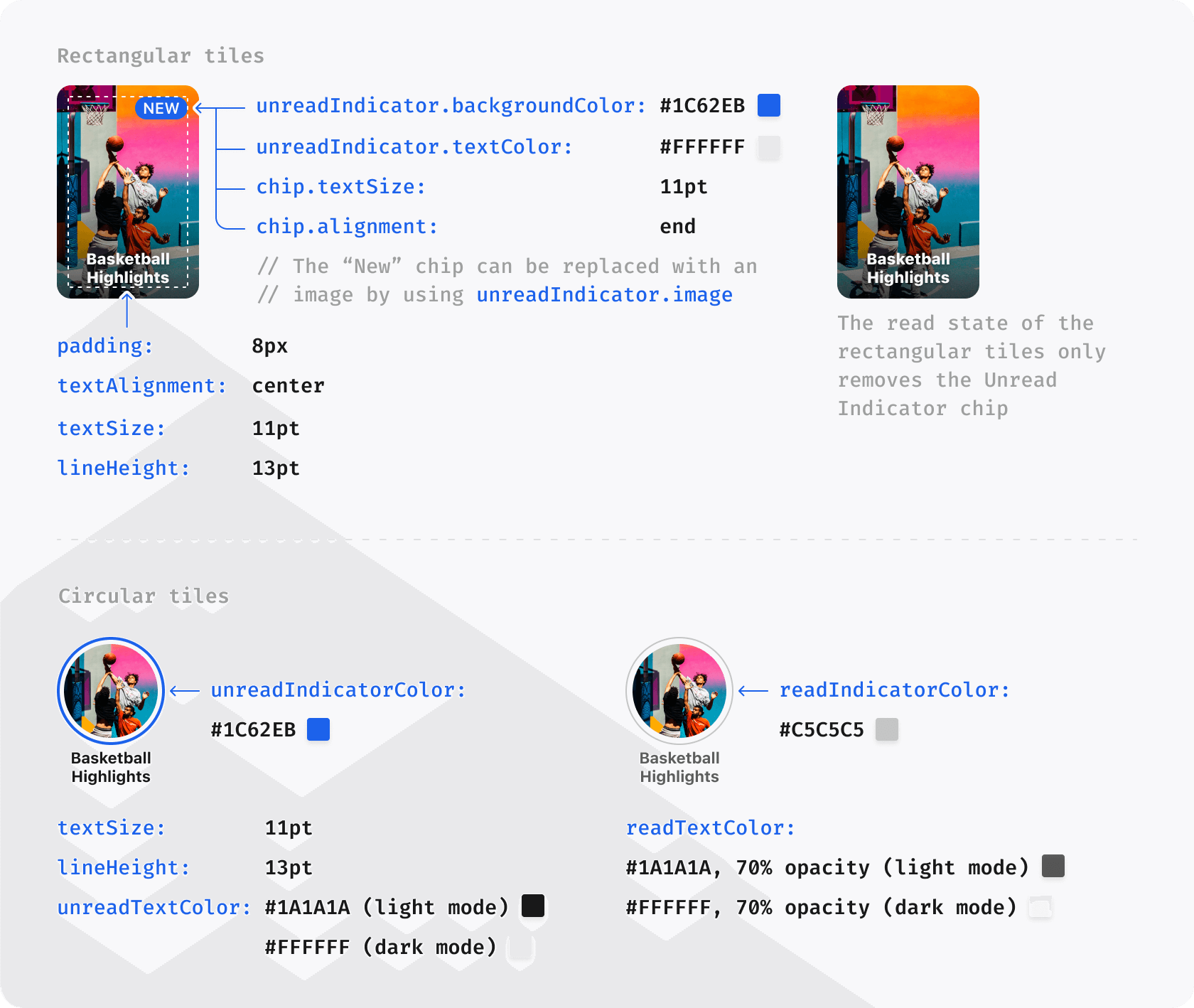
The Theme object contains every property you can customize.
Some properties take their default value from others. For example, setting
colors.primary to #FF0000 also colors the unread indicator on rectangular
tiles red. The tables mark these properties with "inherits".
Future SDK versions may use a property for more elements.
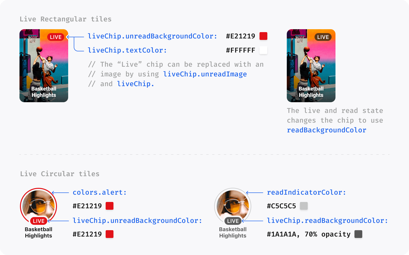
The Stories API can supply customLiveChipText for a Live Story or
pinnedChipText for a pinned Story. The SDK uses that text in the Story tile
chip. These fields come from Story content; they are separate from UiTheme.
Use the chip theme properties below to style their background and border on
round or rectangular tiles.
Both circularTile.liveChip and rectangularTile.liveChip accept these extra
properties:
unreadBackgroundGradient: A CSS gradient string. Its default is null. A
set value replaces unreadBackgroundColor on unread Live or pinned chips.
readBorderColor: A CSS color for the one-pixel inner border on a read Live
or pinned chip. Its default is null.
unreadBorderColor: A CSS color for the one-pixel inner border on an unread
Live or pinned chip. Its default is null.
The player property sets options for the Story player.
Property
Default Value
Data Type
Description
disableUrls
false
boolean
Disable the hash URLs when opening a Story. Note that this will also disable sharing.
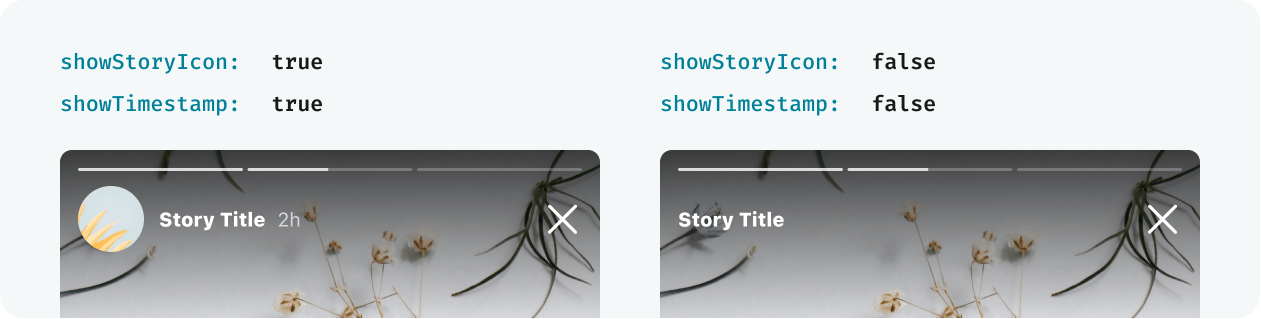
showStoryIcon
true
boolean
Shows the Story icon in the Player
showShareButton
true
boolean
Shows the share button in the Player. Setting this to false entirely disables sharing in Storyteller
actionButton.icon
null
string - image URL
URL of a 20 × 20 px custom icon to display in the action buttons. HTML strings are not supported.
actionButton.showOnMobile
true
boolean
Shows the action button on top of the player on small screens. If set to false, the action button will only be shown if there is sufficient space to display it underneath the player.
Sets the alignment of the action button on small screens. Possible values are left, center and right. If there is enough space for the button to sit underneath the player, it will always be centered.
icons.back
null
string - image URL or data string
An image to be used in place of the default Clips player back/close icon
icons.share
null
string - image URL or data string
Not used by the Web SDK. An image to be used in place of the default share icon
playAllStories
false
boolean
Set this to true to stop the player from closing after all unread Stories have been viewed
The clipPlayer property sets options for the Clips player.
To change the back or close icon at the top left of the Clips player, use
player.icons.back.
Property
Default Value
Data Type
Description
disableUrls
false
boolean
Disable the hash URLs when opening a Clip. Note that this will also disable sharing.
showShareButton
true
boolean
Shows the share button in the Player. Setting this to false entirely disables sharing.
showLikeButton
true
boolean
Shows the like button in the Player.
showFeedTitle
true
boolean
Shows the feed title or feed title image in the Clips player header.
showClipTitle
true
boolean
Shows the active Clip title in the Clips player metadata.
showNavigationCategories
true
boolean
Shows Clip navigation categories and the active category title in the Clips player header.
The remote theme sets whether the Clips player shows like and share counts. A
feed's showLikeCount or showShareCount value overrides the tenant value
for that feed. If the feed doesn't set a field, the tenant value applies, and
then the default, true. UiTheme doesn't include these fields. Before
version 11.0, the SDK ignored them, so tenants whose remote theme already sets
them see the change after the update.
showClipTitle: false hides the Clip title. A long description supplied with
the Clip remains available in the expandable details.
The remote theme field behavior.player.clipsActionButtonCompactSize sets the
size of Clip action buttons. When it is true, the Clips player shows smaller
action buttons in the Clip details area. When it is false, the buttons span
the width below the Clip. If the remote theme doesn't set it, the value is
false.
To change it, ask Storyteller to set it for the feed. Before version 11.0, the
SDK ignored this field, so feeds that already set it show compact buttons
after the update. UiTheme still sets the button styles through
player.actionButton and buttons.
Captions stay off until Storyteller turns them on for Stories, Clips, or both.
The CC button then appears on Clips and on supported Story Pages, even when
the content has no caption track. It stays available while a track loads and
after an empty or failed response. A missing or unavailable track does not
interrupt playback. Ads and Poll or Quiz Pages hide the CC button.
Caption text appears when a Clip or Story Page has a WebVTT track with an
active cue. Clip captions appear after the Clip starts playing and stay
visible while it is paused. Clips that are preloaded or not in view keep their
captions hidden. Live Clips show the CC button but no caption text.
The user's caption choice applies to both Clips and Stories. When functional
cookies are allowed (enableFunctionalCookies, see
Control privacy and tracking), the SDK stores the
choice in the browser. Otherwise, the choice lasts until the page reloads.
Story captions appear near the top of each supported Page. Poll and Quiz Pages
hide both the caption text and the CC button. The CC button sits 16 px from
the lower-right corner of the Story. On a Page with an action button, it moves
up to 72 px from the bottom. Caption text changes as soon as the next cue
starts.
Caption styling comes from the remote theme, not from UiTheme. Each valid
caption field in the feed's remote theme overrides the same field in the
tenant's remote theme. A missing or invalid feed field uses the tenant value,
then the default in the table below. The horizontal and vertical padding
follow this rule separately.
Version 11.0 changed this behavior. Earlier versions used the feed's caption
settings as one object whenever the feed had them, and their defaults were
18 px text, a 22 px line height, and a #000000 background. If your captions
relied on those defaults, check them after you update.
Captions align to the start edge of the surrounding text direction: left for
LTR and right for RTL. Each rendered line has its own background, including
lines created by wrapping. The background height includes the text line height
and vertical padding. A 2 px gap separates consecutive backgrounds.
lineHeight controls the text area. The SDK adds padding and the gap when it
places the next line. Padding and corner radius accept zero.
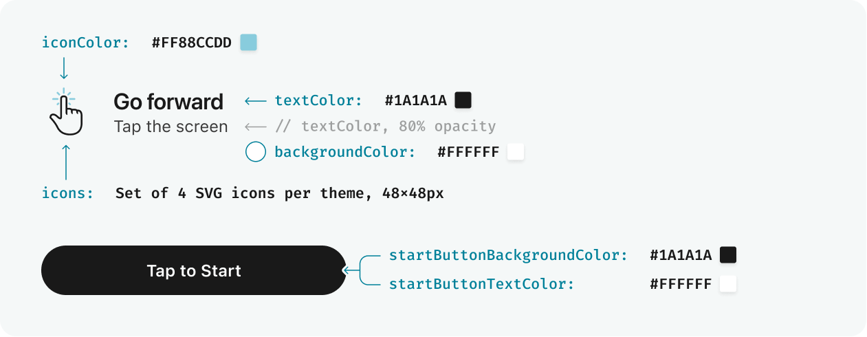
The instructions property sets the appearance of the instructions screen.
Property
Default Value
Data Type
Description
show
true
boolean
Determines whether the Instructions Screen is shown the first time a user opens the Story player. Set to false to completely disable the instructions screen.
headingColor
inherits colors.black.primary for light, colors.white.primary for dark
string - CSS color property
The color of the heading text on the Instructions Screen
iconColor
inherits headingColor
string - CSS color property
The foreground color of the built-in instruction icons
iconHighlightColor
inherits colors.primary
string - CSS color property
The highlight color of the built-in instruction icons
subHeadingColor
inherits colors.black.secondary for light, colors.white.secondary for dark
string - CSS color property
The color of the subheading text on the Instructions Screen
backgroundColor
inherits colors.white.primary for light, colors.black.primary for dark
string - CSS color property
The color of the background of the Instructions Screen
icons
{}
object with optional forward, back, swipe, pause image URLs
A set of custom icons to be used for each instruction on the Instructions Screen
button.backgroundColor
inherits colors.black.primary for light, colors.white.primary for dark
string - CSS color property
The background color of the button used on the Instructions Screen
button.textColor
inherits colors.white.primary for light, colors.black.primary for dark
string - CSS color property
The text color of the button used on the Instructions Screen
iconColor and iconHighlightColor recolor every built-in instruction icon.
This includes the pointer icons on non-touch devices and the touch and swipe
icons on touch devices. By default, the icon color follows headingColor and
the highlight follows colors.primary. These properties don't change the
heading or subheading text colors.
Use icons to replace the image for any instruction. A custom image replaces
the built-in icon and its theme colors for that instruction. Built-in icons
without a custom image still follow the theme colors. Use 48 × 48 px PNG
images:
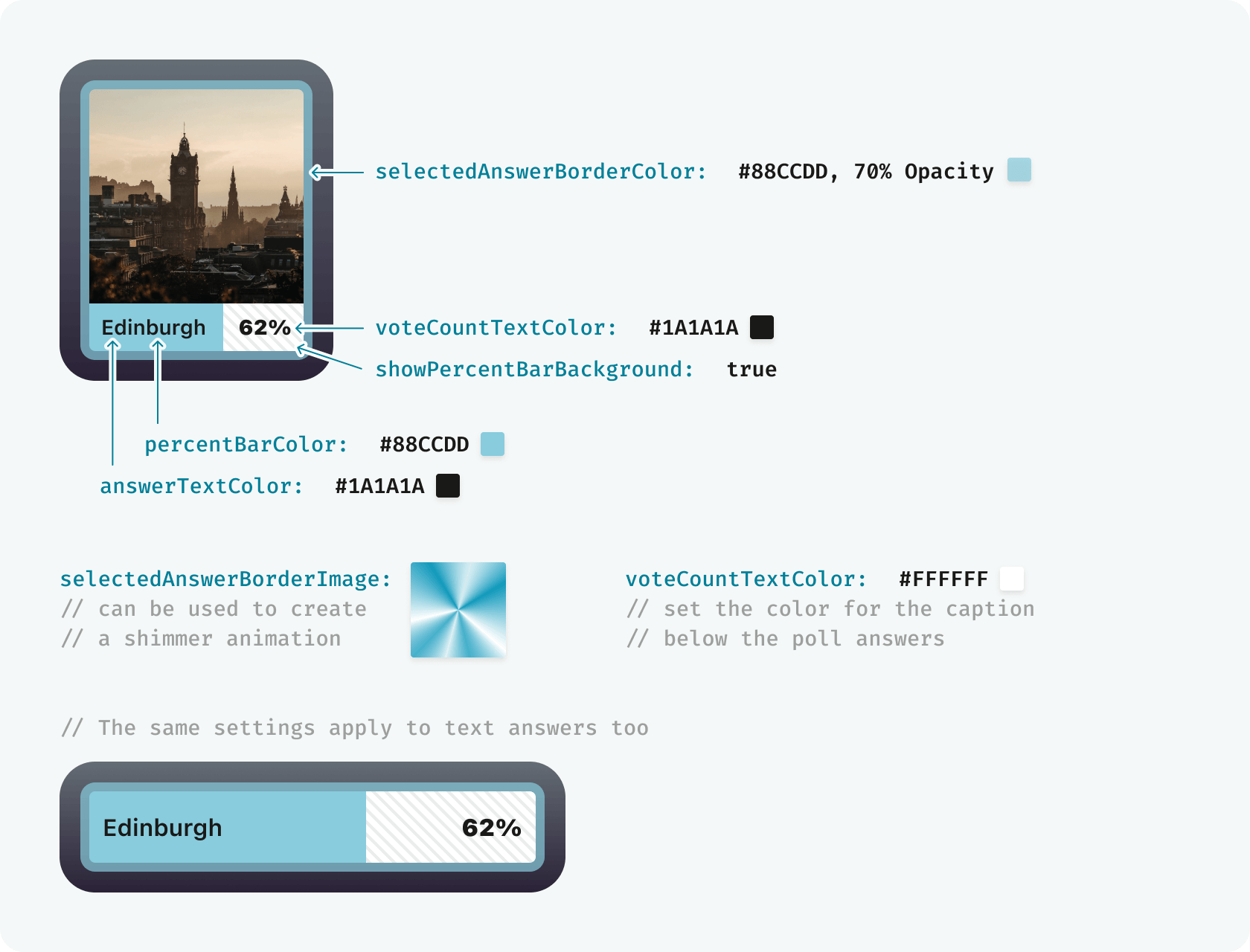
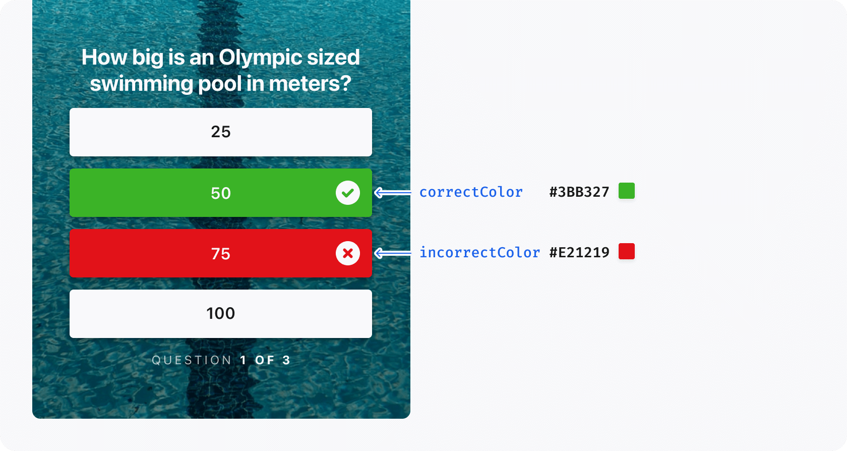
The engagementUnits property sets the style of Polls and Quizzes.
Property
Default Value
Data Type
Description
poll.answerTextColor
inherits colors.black.primary
string - CSS color property
The text color used for Poll Answers
poll.percentBarColor
#CDD0DC
string - CSS color property
The background color of the percentage bar in Poll Answers
poll.selectedAnswerBorderColor
inherits colors.white.tertiary
string - CSS color property
The border color applied to the selected Poll Answer
poll.answeredMessageTextColor
inherits colors.white.tertiary
string - CSS color property
The color of the vote count shown to users after they select a Poll Answer
poll.selectedAnswerBorderImage
null
string or null
Not used by the Web SDK. A border image for the selected Poll Answer. The Web SDK uses selectedAnswerBorderColor
poll.showVoteCount
true
boolean
Shows the approximate number of Poll Answers after a user selects an answer. If this is set to false, the message "Thanks for voting!" is displayed instead
poll.showPercentBarBackground
false
boolean
Not used by the Web SDK. Adds a striped background under the percentage bar in Poll Answers
triviaQuiz.correctColor
inherits colors.success
string - CSS color property
The color used to show correct answers in Quizzes
triviaQuiz.incorrectColor
inherits colors.alert
string - CSS color property
The color used to show incorrect answers in Quizzes
consttheme=newStoryteller.UiTheme({light:{colors:{primary:'blue',success:'green',},},});// Setting theme by direct property accesstheme.light.colors.primary='red';// Applying light/dark mode specific valuestheme.light.instructions.headingColor='black';theme.dark.instructions.headingColor='white';Storyteller.sharedInstance.theme=theme;
{"slug": "themes", "page_title": "Customize Themes", "page_url": "Themes/", "canonical_url": "/web/Themes/", "markdown": "# Customize themes\n\n<!-- markdownlint-disable MD033 -->\n<span id=\"custom-themes\"><\/span>\n\nA theme sets the colors, font, spacing, and controls of Storyteller views and\nplayers. You can set a theme in two places:\n\n- The **global theme**, `Storyteller.sharedInstance.theme`, applies to every\n view and player on the page.\n- A **view's theme**, the `theme` in that view's `configuration`, changes one\n view and the player it opens.\n\nBoth take a `UiTheme` object. Storyteller also applies a **remote theme**:\ntheme settings that Storyteller configures for your tenant or for a feed. The\nremote theme controls [captions](#closed-captions),\n[compact Clip action buttons](#compact-clip-action-buttons), and Clip like and\nshare counts. You can't change these settings with `UiTheme`.\n\n## Set the global theme\n\nSet the global theme after `initialize` resolves:\n\n```javascript\nStoryteller.sharedInstance.initialize('demo-api-key').then(() => {\n const myTheme = new Storyteller.UiTheme();\n myTheme.light.colors.primary = '#FF2D00';\n myTheme.dark.colors.primary = '#FF2D00';\n\n Storyteller.sharedInstance.theme = myTheme;\n});\n```\n\nThe SDK applies the theme when you assign it, and views that already exist\nupdate. If you change a property later, assign the theme again.\n\n## Set a view's theme\n\nTo style one view differently, set `theme` in its `configuration`:\n\n```javascript\nconst storiesRow = new Storyteller.StorytellerStoriesRowView(\n 'storyteller-stories-row',\n ['category-id']\n);\n\nconst rowTheme = new Storyteller.UiTheme();\nrowTheme.light.lists.row.tileSpacing = 4;\nrowTheme.dark.lists.row.tileSpacing = 4;\n\nstoriesRow.configuration = { theme: rowTheme };\n```\n\n!!! info \"Learn more\"\n\n For all view configuration options, see [Configure views](StorytellerListView.md#theme).\n\nThe Storyteller Web Showcase builds a static theme in\n[`buildBasicTheme`](https://github.com/getstoryteller/storyteller-showcase-web/blob/11.0.0/nextjs/src/helpers/buildBasicTheme.ts#L77).\n\n## Theme precedence\n\nFor each `UiTheme` property, the SDK uses the first value it finds:\n\n1. The value in the view's `configuration.theme`\n2. The value in the global theme, `Storyteller.sharedInstance.theme`\n3. The default value in the tables on this page\n\nThe view's theme is merged over the global theme. A view theme value that\nequals the default doesn't override the global value.\n\n`initialize` resets the global theme. Each `initialize` call, including a call\nafter the user changes, sets `Storyteller.sharedInstance.theme` back to the\ndefaults. Set the global theme after `initialize` resolves, and set it again\nafter any later `initialize` call. A theme in a view's `configuration` is kept.\n\nThe remote theme is separate from `UiTheme`, and `UiTheme` values don't\noverride it:\n\n- [Captions](#closed-captions): each valid caption field in the feed's remote\n theme overrides the same field in the tenant's remote theme. Missing fields\n use the tenant value, then the default.\n- [Compact Clip action buttons](#compact-clip-action-buttons): the feed's\n remote theme turns them on. The default is `false`.\n- [Like and share counts](#clip-player): a feed value overrides the tenant\n value. The default is `true`.\n\n## Configure a UiTheme {#configuring-a-uitheme}\n\nA `UiTheme` has two properties:\n\n- `light`: the `Theme` used in light mode\n- `dark`: the `Theme` used in dark mode\n\nThe view's [`uiStyle`](StorytellerListView.md#uistyle) selects which one\napplies: `light`, `dark`, or `auto`. With `auto`, the view follows the\nbrowser's `prefers-color-scheme` setting. Set a property in both `light` and\n`dark` when it should not change with the color scheme.\n\n## Theme properties {#creating-themes}\n\nThe `Theme` object contains every property you can customize.\n\nSome properties take their default value from others. For example, setting\n`colors.primary` to `#FF0000` also colors the unread indicator on rectangular\ntiles red. The tables mark these properties with \"inherits\".\n\nFuture SDK versions may use a property for more elements.\n\n### Colors\n\nThe `colors` property sets the base colors that the SDK uses.\n\n| Property | Default Value | Data Type | Description |\n| ----------------- | ------------------------------ | ----------------------------- | ---------------------------------------------------------------------------------------------------- |\n| `primary` | `#1C62EB` | `string` - CSS color property | The default accent color used throughout the UI. In general, this should be the primary brand color. |\n| `success` | `#3BB327` | `string` - CSS color property | Used to indicate correct answers in Quizzes. |\n| `alert` | `#E21219` | `string` - CSS color property | Used to indicate incorrect answers in Quizzes. |\n| `white.primary` | `#FFFFFF` | `string` - CSS color property | Used for white text |\n| `white.secondary` | `white.primary` at 85% opacity | `string` - CSS color property | Used for light text |\n| `white.tertiary` | `white.primary` at 70% opacity | `string` - CSS color property | Used for gray text |\n| `black.primary` | `#1A1A1A` | `string` - CSS color property | Used for black text |\n| `black.secondary` | `black.primary` at 85% opacity | `string` - CSS color property | Used for light black text |\n| `black.tertiary` | `black.primary` at 70% opacity | `string` - CSS color property | Used for gray text |\n| `focusIndicator` | `colors.primary` | `string` - CSS color property | Used for the focus outlines of interactive elements |\n\n### Font\n\nSet `font` to a CSS `font-family` value to use a custom font throughout the\nSDK. The default value is `inherit`.\n\n### Primitives\n\nThe `primitives` object contains base values that the SDK uses throughout.\n\n| Property | Default Value | Data Type | Description |\n| -------------- | ------------- | --------- | -------------------------------------------------------------------------------------- |\n| `cornerRadius` | `4` | `number` | The corner radius in pixels used for rectangular tiles, buttons, and Poll/Quiz answers |\n\n### Lists\n\nThe `lists` property sets the layout of rows and grids.\n\n| Property | Default Value | Data Type | Description |\n| ------------------------------------------ | ------------------------------------------------------------------------------ | ----------------------------- | --------------------------------------------------------------------------------------------------------- |\n| `lists.backgroundColor` | inherits `colors.white.primary` for `light`, `colors.black.primary` for `dark` | `string` - CSS color property | Used for the outline on the Live chip and the fade at the sides of a row. |\n| `lists.row.tileSpacing` | `8` | `number` | The (external) space between each Story Tile in a row |\n| `lists.row.startInset` | `12` | `number` | The (external) space before the first Story Tile in a row |\n| `lists.row.endInset` | `12` | `number` | The (external) space after the last Story Tile in a row |\n| `lists.row.startPadding` | `0` | `number` | The (internal) space before the first Story Tile in a row |\n| `lists.row.endPadding` | `0` | `number` | The (internal) space after the last Story Tile in a row |\n| `lists.row.showScrollIndicator` | `true` | `boolean` | Whether the scroll indicator should be visible on non-touch screens (it's always hidden on touch screens) |\n| `lists.row.scrollIndicatorBackgroundColor` | `white` | `string` - CSS color property | The background color of the scroll indicator |\n| `lists.row.scrollIndicatorColor` | `rgba(26, 26, 26, 0.7)` | `string` - CSS color property | The color of the scroll indicator icon. Ignored if `scrollIndicatorIcon` is set |\n| `lists.row.scrollIndicatorIcon` | `undefined` | `string` - image URL | URL of a custom scroll indicator icon. HTML strings are not supported. |\n| `lists.row.scrollIndicatorFade` | `true` | `boolean` | Used to show/hide the fade overlay on the edges of the Story row |\n| `lists.row.scrollIndicatorInlineAlignment` | `inside` | `inside`, `outside` | Whether the scroll arrows should appear on top of the row (`inside`) or next to it (`outside`). |\n| `lists.grid.tileSpacing` | `8` | `number` | The space between each Story Tile in a grid, both vertically and horizontally |\n| `lists.grid.columns` | `2` | `number` | The number of columns in a grid |\n| `lists.grid.topInset` | `12` | `number` | The space before the first row in a grid |\n| `lists.grid.bottomInset` | `12` | `number` | The space after the last row in a grid |\n| `lists.grid.startInset` | `16` | `number` | The space on the left side of a grid |\n| `lists.grid.endInset` | `16` | `number` | The space on the right side of a grid |\n\n### Story tiles\n\nThe `storyTiles` property sets the appearance of Story tiles.\n\n| Property | Default Value | Data Type | Description |\n| --------------------------------------------------- | -------------------------------------------------------------------------------- | -------------------------------------------------------------- | ------------------------------------------------------------------------------------------------------------------------------------------------------------------------------------- |\n| `chip.textSize` | `11` | `number` | Text size for the New Indicator and Live Indicator |\n| `chip.show` | `true` | `boolean` | Used to show/hide the new/live chip |\n| `title.textSize` | `11` | `number` | Size of the Story Title on a Tile |\n| `title.lineHeight` | `13` | `number` | The line height of the Story Title on a Tile |\n| `title.alignment` | `center` | `Alignment` (`Storyteller.Alignment.start`, `.center`, `.end`) | The alignment of the Story Title on a Tile. Possible values are `start`, `center` and `end` |\n| `title.fontWeight` | `700` | `number` | The font weight (CSS `font-weight`) of the Story Title on a Tile |\n| `circularTile.liveChip.readImage` | `null` | `string` - `<img>` `src` property | Image to be used in place of default read Live Indicator for circular tiles |\n| `circularTile.liveChip.unreadImage` | `null` | `string` - `<img>` `src` property | Image to be used in place of default unread Live Indicator for circular tiles |\n| `circularTile.liveChip.readBackgroundColor` | inherits `colors.black.tertiary` | `string` - CSS color property | Background color of the circular tiles Live Indicator when all Pages have been read |\n| `circularTile.liveChip.unreadBackgroundColor` | inherits `colors.alert` | `string` - CSS color property | Background color of the circular tiles Live Indicator when the Story contains unread Pages |\n| `circularTile.liveChip.unreadBackgroundGradient` | `null` | `string` - CSS gradient | Background of unread Live and pinned chips on circular tiles. When set, it replaces `unreadBackgroundColor`. See [Live chip gradient and borders](#live-chip-gradient-and-borders) |\n| `circularTile.liveChip.readTextColor` | inherits `colors.white.primary` | `string` - CSS color property | Text color of the circular tiles Live Indicator when all Pages have been read |\n| `circularTile.liveChip.unreadTextColor` | inherits `colors.white.primary` | `string` - CSS color property | Text color of the circular tiles Live Indicator when the Story contains unread Pages |\n| `circularTile.liveChip.readBorderColor` | `null` | `string` - CSS color property | Color of the one-pixel inner border on read Live and pinned chips on circular tiles |\n| `circularTile.liveChip.unreadBorderColor` | `null` | `string` - CSS color property | Color of the one-pixel inner border on unread Live and pinned chips on circular tiles |\n| `circularTile.title.unreadTextColor` | inherits `colors.black.primary` for `light`, `colors.white.primary` for `dark` | `string` - CSS color property | The text color of the Story Title for a circular tile when the Story is unread |\n| `circularTile.title.readTextColor` | inherits `colors.black.tertiary` for `light`, `colors.white.tertiary` for `dark` | `string` - CSS color property | The text color of the Story Title for a circular tile when the Story is read |\n| `circularTile.unreadIndicatorColor` | inherits `colors.primary` | `string` - CSS color property or linear-gradient | The color of the ring around a circular tile when the Story is unread |\n| `circularTile.readIndicatorColor` | `#C5C5C5` | `string` - CSS color property or linear-gradient | The color of the ring around a circular tile when the Story is read |\n| `circularTile.unreadStrokeWidth` | `2` | `number` (in px) | The thickness of the ring around a circular tile when the Story is unread |\n| `circularTile.readStrokeWidth` | `1` | `number` (in px) | The thickness of the ring around a circular tile when the Story is read |\n| `circularTile.scrollIndicatorBlockAlignment` | `cell` | `cell`, `thumbnail` | Whether the scroll arrows should be centered with the whole cell (including the titles), or with the thumbnail. |\n| `rectangularTile.liveChip.readImage` | `null` | `string` - `<img>` `src` property | Image to be used in place of default read Live Indicator for rectangular tiles |\n| `rectangularTile.liveChip.unreadImage` | `null` | `string` - `<img>` `src` property | Image to be used in place of default unread Live Indicator for rectangular tiles |\n| `rectangularTile.liveChip.readBackgroundColor` | inherits `colors.black.tertiary` | `string` - CSS color property | Background color of the rectangular tiles Live Indicator when all Story Pages have been read or the Clip has been viewed |\n| `rectangularTile.liveChip.unreadBackgroundColor` | inherits `colors.alert` | `string` - CSS color property | Background color of the rectangular tiles Live Indicator when the Story contains unread Pages or the Clip has not been viewed |\n| `rectangularTile.liveChip.unreadBackgroundGradient` | `null` | `string` - CSS gradient | Background of unread Live and pinned chips on rectangular tiles. When set, it replaces `unreadBackgroundColor`. See [Live chip gradient and borders](#live-chip-gradient-and-borders) |\n| `rectangularTile.liveChip.readTextColor` | inherits `colors.white.primary` | `string` - CSS color property | Text color of the rectangular tiles Live Indicator when all Story Pages have been read or the Clip has been viewed |\n| `rectangularTile.liveChip.unreadTextColor` | inherits `colors.white.primary` | `string` - CSS color property | Text color of the rectangular tiles Live Indicator when the Story contains unread Pages or the Clip has not been viewed |\n| `rectangularTile.liveChip.readBorderColor` | `null` | `string` - CSS color property | Color of the one-pixel inner border on read Live and pinned chips on rectangular tiles |\n| `rectangularTile.liveChip.unreadBorderColor` | `null` | `string` - CSS color property | Color of the one-pixel inner border on unread Live and pinned chips on rectangular tiles |\n| `rectangularTile.title.textColor` | inherits `colors.white.primary` | `string` - CSS color property | The text color of the Story Title for a rectangular tile |\n| `rectangularTile.padding` | `8` | `number` | The internal padding for a rectangular Story tile |\n| `rectangularTile.chip.alignment` | `end` | `Alignment` (`Storyteller.Alignment.start`, `.center`, `.end`) | Alignment of the New Indicator and Live Indicator in Rectangular Tiles, can be `start`, `center` or `end`. |\n| `rectangularTile.unreadIndicator.image` | `null` | `string` - `<img>` `src` property | An image which can be used in place of the default unread indicator for a rectangular tile |\n| `rectangularTile.unreadIndicator.backgroundColor` | inherits `colors.primary` | `string` - CSS color property | The background color of the unread indicator for a rectangular tile |\n| `rectangularTile.unreadIndicator.textColor` | inherits `colors.white.primary` | `string` - CSS color property | The text color of the unread indicator for a rectangular tile |\n| `rectangularTile.showWebStoriesIcon` | `false` | `boolean` | Set this to true to show a Story icon on rectangular thumbnails |\n| `rectangularTile.showGradient` | `true` | `boolean` | Set this to `false` to hide the gradient behind the Story title on rectangular cells |\n\n#### Live chip gradient and borders\n\nThe Stories API can supply `customLiveChipText` for a Live Story or\n`pinnedChipText` for a pinned Story. The SDK uses that text in the Story tile\nchip. These fields come from Story content; they are separate from `UiTheme`.\nUse the chip theme properties below to style their background and border on\nround or rectangular tiles.\n\nBoth `circularTile.liveChip` and `rectangularTile.liveChip` accept these extra\nproperties:\n\n- `unreadBackgroundGradient`: A CSS gradient string. Its default is `null`. A\n set value replaces `unreadBackgroundColor` on unread Live or pinned chips.\n- `readBorderColor`: A CSS color for the one-pixel inner border on a read Live\n or pinned chip. Its default is `null`.\n- `unreadBorderColor`: A CSS color for the one-pixel inner border on an unread\n Live or pinned chip. Its default is `null`.\n\n\n\n\n\n### Player\n\nThe `player` property sets options for the Story player.\n\n| Property | Default Value | Data Type | Description |\n| --------------------------- | ------------- | --------------------------------------------------------------------------- | ------------------------------------------------------------------------------------------------------------------------------------------------------------------------------------------------------------- |\n| `disableUrls` | `false` | `boolean` | Disable the hash URLs when opening a Story. Note that this will also disable sharing. |\n| `showStoryIcon` | `true` | `boolean` | Shows the Story icon in the Player |\n| `showShareButton` | `true` | `boolean` | Shows the share button in the Player. Setting this to `false` entirely disables sharing in Storyteller |\n| `actionButton.icon` | `null` | `string` - image URL | URL of a 20 \u00d7 20 px custom icon to display in the action buttons. HTML strings are not supported. |\n| `actionButton.showOnMobile` | `true` | `boolean` | Shows the action button on top of the player on small screens. If set to `false`, the action button will only be shown if there is sufficient space to display it underneath the player. |\n| `actionButton.alignment` | `center` | `ButtonAlignment` (`Storyteller.ButtonAlignment.left`, `.center`, `.right`) | Sets the alignment of the action button on small screens. Possible values are `left`, `center` and `right`. If there is enough space for the button to sit underneath the player, it will always be centered. |\n| `icons.back` | `null` | `string` - image URL or data string | An image to be used in place of the default Clips player back/close icon |\n| `icons.share` | `null` | `string` - image URL or data string | Not used by the Web SDK. An image to be used in place of the default share icon |\n| `playAllStories` | `false` | `boolean` | Set this to true to stop the player from closing after all unread Stories have been viewed |\n\n\n\n### Clips player {#clip-player}\n\nThe `clipPlayer` property sets options for the Clips player.\n\nTo change the back or close icon at the top left of the Clips player, use\n[`player.icons.back`](#player).\n\n| Property | Default Value | Data Type | Description |\n| -------------------------- | ------------- | --------- | ------------------------------------------------------------------------------------------ |\n| `disableUrls` | `false` | `boolean` | Disable the hash URLs when opening a Clip. Note that this will also disable sharing. |\n| `showShareButton` | `true` | `boolean` | Shows the share button in the Player. Setting this to `false` entirely disables sharing. |\n| `showLikeButton` | `true` | `boolean` | Shows the like button in the Player. |\n| `showFeedTitle` | `true` | `boolean` | Shows the feed title or feed title image in the Clips player header. |\n| `showClipTitle` | `true` | `boolean` | Shows the active Clip title in the Clips player metadata. |\n| `showNavigationCategories` | `true` | `boolean` | Shows Clip navigation categories and the active category title in the Clips player header. |\n\nThe remote theme sets whether the Clips player shows like and share counts. A\nfeed's `showLikeCount` or `showShareCount` value overrides the tenant value\nfor that feed. If the feed doesn't set a field, the tenant value applies, and\nthen the default, `true`. `UiTheme` doesn't include these fields. Before\nversion 11.0, the SDK ignored them, so tenants whose remote theme already sets\nthem see the change after the update.\n\n`showClipTitle: false` hides the Clip title. A long description supplied with\nthe Clip remains available in the [expandable details](StorytellerListView.md#clip-details).\n\n#### Compact Clip action buttons\n\nThe remote theme field `behavior.player.clipsActionButtonCompactSize` sets the\nsize of Clip action buttons. When it is `true`, the Clips player shows smaller\naction buttons in the Clip details area. When it is `false`, the buttons span\nthe width below the Clip. If the remote theme doesn't set it, the value is\n`false`.\n\nTo change it, ask Storyteller to set it for the feed. Before version 11.0, the\nSDK ignored this field, so feeds that already set it show compact buttons\nafter the update. `UiTheme` still sets the button styles through\n[`player.actionButton`](#player) and [`buttons`](#buttons).\n\n### Captions {#closed-captions}\n\nCaptions stay off until Storyteller turns them on for Stories, Clips, or both.\nThe CC button then appears on Clips and on supported Story Pages, even when\nthe content has no caption track. It stays available while a track loads and\nafter an empty or failed response. A missing or unavailable track does not\ninterrupt playback. Ads and Poll or Quiz Pages hide the CC button.\n\nCaption text appears when a Clip or Story Page has a WebVTT track with an\nactive cue. Clip captions appear after the Clip starts playing and stay\nvisible while it is paused. Clips that are preloaded or not in view keep their\ncaptions hidden. Live Clips show the CC button but no caption text.\n\nThe user's caption choice applies to both Clips and Stories. When functional\ncookies are allowed (`enableFunctionalCookies`, see\n[Control privacy and tracking](PrivacyAndTracking.md)), the SDK stores the\nchoice in the browser. Otherwise, the choice lasts until the page reloads.\n\nStory captions appear near the top of each supported Page. Poll and Quiz Pages\nhide both the caption text and the CC button. The CC button sits 16 px from\nthe lower-right corner of the Story. On a Page with an action button, it moves\nup to 72 px from the bottom. Caption text changes as soon as the next cue\nstarts.\n\nCaption styling comes from the remote theme, not from `UiTheme`. Each valid\ncaption field in the feed's remote theme overrides the same field in the\ntenant's remote theme. A missing or invalid feed field uses the tenant value,\nthen the default in the table below. The horizontal and vertical padding\nfollow this rule separately.\n\nVersion 11.0 changed this behavior. Earlier versions used the feed's caption\nsettings as one object whenever the feed had them, and their defaults were\n18 px text, a 22 px line height, and a `#000000` background. If your captions\nrelied on those defaults, check them after you update.\n\nCaptions align to the start edge of the surrounding text direction: left for\nLTR and right for RTL. Each rendered line has its own background, including\nlines created by wrapping. The background height includes the text line height\nand vertical padding. A 2 px gap separates consecutive backgrounds.\n\n`lineHeight` controls the text area. The SDK adds padding and the gap when it\nplaces the next line. Padding and corner radius accept zero.\n\n| Remote theme field | Default value | Description |\n| -------------------- | ------------------- | ---------------------------------------------- |\n| `font` | System font stack | Caption font family, with system-font fallback |\n| `textSize` | `16` | Font size in pixels |\n| `lineHeight` | Natural font height | Line height in pixels |\n| `textColor` | `#FFFFFF` | Caption text color |\n| `backgroundColor` | `#171A25` | Caption background color |\n| `backgroundOpacity` | `0.65` | Background opacity from `0` to `1` |\n| `padding.horizontal` | `10` | Left and right padding in pixels |\n| `padding.vertical` | `4` | Top and bottom padding in pixels |\n| `cornerRadius` | `8` | Background corner radius in pixels |\n\n### Buttons\n\nThe `buttons` property sets the style of buttons throughout the SDK.\n\n| Property | Default Value | Data Type | Description |\n| ----------------- | ---------------------------------- | --------------------------------------------------------------- | ----------------------------------------------------------------------------------------------------- |\n| `backgroundColor` | inherits `colors.white.primary` | `string` - CSS color property | The background color of buttons throughout the SDK |\n| `textColor` | inherits `colors.black.primary` | `string` - CSS color property | The text color of buttons throughout the SDK |\n| `textCase` | `default` | `TextCase` (`Storyteller.TextCase.upper`, `.lower`, `.default`) | Sets the text case for buttons throughout the SDK. Possible values are `upper`, `lower` and `default` |\n| `cornerRadius` | inherits `primitives.cornerRadius` | `number` | The corner radius for all buttons throughout the SDK |\n\n### Instructions\n\nThe `instructions` property sets the appearance of the instructions screen.\n\n| Property | Default Value | Data Type | Description |\n| ------------------------ | ---------------------------------------------------------------------------------- | ------------------------------------------------------------------- | --------------------------------------------------------------------------------------------------------------------------------------------------------------- |\n| `show` | `true` | `boolean` | Determines whether the Instructions Screen is shown the first time a user opens the Story player. Set to `false` to completely disable the instructions screen. |\n| `headingColor` | inherits `colors.black.primary` for `light`, `colors.white.primary` for `dark` | `string` - CSS color property | The color of the heading text on the Instructions Screen |\n| `iconColor` | inherits `headingColor` | `string` - CSS color property | The foreground color of the built-in instruction icons |\n| `iconHighlightColor` | inherits `colors.primary` | `string` - CSS color property | The highlight color of the built-in instruction icons |\n| `subHeadingColor` | inherits `colors.black.secondary` for `light`, `colors.white.secondary` for `dark` | `string` - CSS color property | The color of the subheading text on the Instructions Screen |\n| `backgroundColor` | inherits `colors.white.primary` for `light`, `colors.black.primary` for `dark` | `string` - CSS color property | The color of the background of the Instructions Screen |\n| `icons` | `{}` | object with optional `forward`, `back`, `swipe`, `pause` image URLs | A set of custom icons to be used for each instruction on the Instructions Screen |\n| `button.backgroundColor` | inherits `colors.black.primary` for `light`, `colors.white.primary` for `dark` | `string` - CSS color property | The background color of the button used on the Instructions Screen |\n| `button.textColor` | inherits `colors.white.primary` for `light`, `colors.black.primary` for `dark` | `string` - CSS color property | The text color of the button used on the Instructions Screen |\n\n`iconColor` and `iconHighlightColor` recolor every built-in instruction icon.\nThis includes the pointer icons on non-touch devices and the touch and swipe\nicons on touch devices. By default, the icon color follows `headingColor` and\nthe highlight follows `colors.primary`. These properties don't change the\nheading or subheading text colors.\n\n```javascript\nconst theme = new Storyteller.UiTheme();\n\ntheme.light.colors.primary = '#ff2d00'; // Built-in icon highlights inherit this\ntheme.light.instructions.iconColor = '#2b2929';\ntheme.dark.instructions.iconColor = '#f5f2f2';\n\nStoryteller.sharedInstance.theme = theme;\n```\n\nUse `icons` to replace the image for any instruction. A custom image replaces\nthe built-in icon and its theme colors for that instruction. Built-in icons\nwithout a custom image still follow the theme colors. Use 48 \u00d7 48 px PNG\nimages:\n\n```javascript\nconst theme = new Storyteller.UiTheme();\nconst customIcons = {\n forward: './icon-forward-custom.png',\n pause: './icon-pause-custom.png',\n back: './icon-back-custom.png',\n swipe: './icon-swipe-custom.png',\n};\n\ntheme.light.instructions.icons = customIcons;\ntheme.dark.instructions.icons = customIcons;\n\nStoryteller.sharedInstance.theme = theme;\n```\n\n\n\n### Polls and Quizzes (`engagementUnits`) {#engagement-units}\n\nThe `engagementUnits` property sets the style of Polls and Quizzes.\n\n| Property | Default Value | Data Type | Description |\n| -------------------------------- | -------------------------------- | ----------------------------- | ------------------------------------------------------------------------------------------------------------------------------------------------------------- |\n| `poll.answerTextColor` | inherits `colors.black.primary` | `string` - CSS color property | The text color used for Poll Answers |\n| `poll.percentBarColor` | `#CDD0DC` | `string` - CSS color property | The background color of the percentage bar in Poll Answers |\n| `poll.selectedAnswerBorderColor` | inherits `colors.white.tertiary` | `string` - CSS color property | The border color applied to the selected Poll Answer |\n| `poll.answeredMessageTextColor` | inherits `colors.white.tertiary` | `string` - CSS color property | The color of the vote count shown to users after they select a Poll Answer |\n| `poll.selectedAnswerBorderImage` | `null` | `string` or `null` | Not used by the Web SDK. A border image for the selected Poll Answer. The Web SDK uses `selectedAnswerBorderColor` |\n| `poll.showVoteCount` | `true` | `boolean` | Shows the approximate number of Poll Answers after a user selects an answer. If this is set to `false`, the message \"Thanks for voting!\" is displayed instead |\n| `poll.showPercentBarBackground` | `false` | `boolean` | Not used by the Web SDK. Adds a striped background under the percentage bar in Poll Answers |\n| `triviaQuiz.correctColor` | inherits `colors.success` | `string` - CSS color property | The color used to show correct answers in Quizzes |\n| `triviaQuiz.incorrectColor` | inherits `colors.alert` | `string` - CSS color property | The color used to show incorrect answers in Quizzes |\n\n\n\n\n\n## Example\n\n```javascript\nconst theme = new Storyteller.UiTheme({\n light: {\n colors: {\n primary: 'blue',\n success: 'green',\n },\n },\n});\n\n// Setting theme by direct property access\ntheme.light.colors.primary = 'red';\n\n// Applying light/dark mode specific values\ntheme.light.instructions.headingColor = 'black';\ntheme.dark.instructions.headingColor = 'white';\n\nStoryteller.sharedInstance.theme = theme;\n```\n", "copy_markdown_include_header": false, "base_path": "", "ai_dir": "ai", "missing_payload_behavior": "empty"}