Use StorytellerTheme to apply your brand's colors, typography, spacing, and
controls to Storyteller UI. Start with the practical setup below, then use the
property reference when you need a specific setting.
A StorytellerTheme contains separate light and darkTheme values. The
component's uiStyle selects which one is rendered:
uiStyle
Theme used
.light
StorytellerTheme.light
.dark
StorytellerTheme.dark
.auto
The current system appearance
Omitted
Keeps the view's current setting. A newly created view starts at .auto.
Choose the scope before you customize the theme:
Scope
How to set it
Use it when
Global
Storyteller.shared.theme
Most or all Storyteller UI should use the same brand theme.
Component
The theme value in a list or player configuration
One component needs a deliberate variation from the global theme.
Set the global theme before configuring Storyteller views, normally alongside
your app's Storyteller initialization. StorytellerTheme is a value type, so
if you change your local copy later, assign it to Storyteller.shared.theme
again and reconfigure any existing component that should use the new values.
Start with a small group of visible brand choices. Configure both appearances
explicitly rather than assuming that a light value is also suitable in dark
mode.
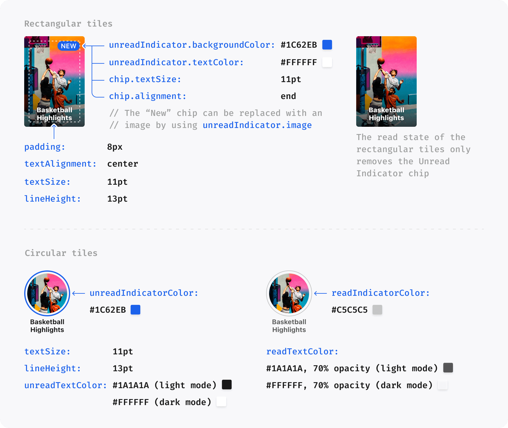
The primary color is inherited by supported accent surfaces such as unread
circular-tile indicators. The list background changes with the selected
appearance. Once this works, add only the properties your design requires.
During development, temporarily force each appearance with uiStyle. This
separates theme configuration problems from the simulator or device's current
appearance.
Verify the same integration with .light, then explicitly return a reused view
to .auto when the app should follow the system appearance. Omitting uiStyle
does not reset an existing view; it leaves that view's current setting unchanged.
A configuration-level theme replaces the global host theme for that component;
it is not merged over Storyteller.shared.theme. Start from a copy of the
global theme when you want a small variation.
This row uses compactRowTheme. When the SDK opens the Player from this list,
the Player uses the same override. Other independently configured components
continue to use the global theme. See
StorytellerListView for the full list configuration
contract.
Custom fonts require setup in the host app as well as a
StorytellerFontProvider:
Add each .ttf or .otf file to the app target and confirm its target
membership.
Add each filename to Fonts provided by application (UIAppFonts) in the
app's Info settings. For a manually maintained Info.plist, the equivalent
entry is:
The assertion is a useful development check: if it fails, confirm the asset's
target membership, UIAppFonts filename, and PostScript name. The SDK's default
StorytellerFontProvider supplies system fonts. A custom provider can return
nil, but individual UI surfaces may then retain or choose their own fallback;
return a font for every weight if consistent typography is required.
StorytellerFontWeight includes .light. An exhaustive switch written against
an older SDK must add .light or an @unknown default branch when it is
recompiled with SDK 11.5.1 or later.
Storyteller Settings can select the font family and weight used by titles on
rectangular Story and Clip tiles independently from the global host theme:
These are remote Settings values, not public Theme properties. They apply to
rectangular title-bearing tiles in rows, grids, category screens, and Search.
They do not change circular tiles, eyebrows, list headings, or Player text.
The host app must include and register every requested font face before the SDK
renders a tile. Follow the target-membership and UIAppFonts steps in
Configure custom fonts. Set fontFamily to the
registered UIKit family name, such as Acme Sans; this differs from the
PostScript face name such as AcmeSans-Semibold used with
UIFont(name:size:). During development, use UIFont.familyNames to verify the
registered family spelling.
fontWeight is a numeric string. The iOS SDK supports these mappings:
Remote value
StorytellerFontWeight
"300"
.light
"400"
.regular
"500"
.medium
"600"
.semibold
"700"
.bold
"800"
.heavy
"900"
.black
Family and weight inherit independently. A feed- or Search-specific leaf takes
precedence over its tenant-level value. A missing, null, blank, malformed, or
unknown leaf keeps the corresponding tenant value when present. After remote
inheritance, an absent weight keeps the existing .heavy rectangular-title
weight. An absent or unregistered family asks the selected host
customFont provider for the resolved weight; the SDK's default provider
returns the matching system font. If a custom provider cannot create the
resolved weight, the SDK retries the existing .heavy rectangular-title
weight before allowing the surface's normal font fallback.
Rectangular Story and Clip tiles can use an ordered, multi-stop gradient behind
their titles in rows, grids, category screens, and Search. Circular tiles and
Player gradients are unaffected.
For a host-supplied theme, assign a stop-based Theme.Gradient to
tiles.rectangularTile.titleGradient in each appearance that needs it:
A valid stop gradient contains at least two stops. Locations must be finite,
within 0...1, and in non-decreasing order. Repeated colors and locations are
valid, and the first and last locations do not need to be 0 and 1. Invalid
host gradients keep the existing iOS tile-title gradient.
Storyteller Settings can provide the same capability under
theme.light.tiles.rectangularTile.titleGradient and
theme.dark.tiles.rectangularTile.titleGradient:
Stop colors accept #RRGGBB or alpha-last #RRGGBBAA. The stop list is
validated atomically: a malformed color or location rejects that remote
gradient without discarding valid sibling theme fields. Missing, incomplete,
equal, or unsupported remote positions use topCenter to bottomCenter.
The value resolves in this order: feed-specific remote appearance,
tenant-level remote appearance, selected host light/dark theme, then the
existing iOS default. The default remains clear at 0, black at 50% opacity at
0.45, and black at 80% opacity at 1, from top center to bottom center.
Existing two-color configurations remain supported when stops is absent or
null. Their remote colors retain the legacy #RRGGBB or alpha-first
#AARRGGBB format:
Use sheets.cornerRadius to set the top-corner radius, in points, for
Storyteller content Sheets and the Search Filters sheet. Configure light and
dark appearances independently:
A feed- or collection-specific remote value takes precedence over the
tenant-level remote value, which takes precedence over the selected host
theme. Sheet actions opened from a Story or Clip use that presentation's active
theme context. Card, direct, and deeplink Sheet opens use the global theme
context.
0 requests square top corners. Any finite value greater than or equal to zero
is accepted; negative, non-finite, and malformed values are ignored so the next
valid layer can apply. When no layer supplies a valid value, Search Filters
retain their existing 6-point radius and content Sheets retain UIKit's system
radius. The content-Sheet override is available on iOS 15 and newer; iOS 13 and
14 always keep the system presentation radius.
A theme supplied in the component configuration is used for that component;
otherwise the SDK uses Storyteller.shared.theme.
The SDK fills unset optional properties from related theme values or its own
defaults. For example, an unset circular-tile unread indicator inherits
colors.primary.
Where a property supports remote theming, a feed- or collection-specific
remote value takes precedence over a tenant-level remote value, which in
turn takes precedence over the selected host theme value.
Remote configuration does not cover every public Theme property. If a host
value is unexpectedly replaced, check whether that property is configured for
the current feed or tenant before changing the app theme.
Use the narrowest property that expresses the design change:
Change the main accent: set colors.primary. Dependent defaults such as
unread indicators inherit it unless you override them directly.
Tighten a horizontal row: set lists.row.tileSpacing,
lists.row.startInset, and lists.row.endInset in both appearances.
Style general buttons: set buttons.backgroundColor,
buttons.textColor, and buttons.cornerRadius.
Style Storyteller Sheets: set sheets.cornerRadius in both appearances;
see Configure Sheet corner radius for
defaults and platform availability.
Style the instruction start button: use
instructions.button.backgroundColor and
instructions.button.textColor; these detailed instruction values apply to
the iOS instruction overlay.
Improve Clips Player readability: configure player.clips.topGradient
and player.clips.bottomGradient; see Gradient and
Player for supported values and defaults.
The Showcase app keeps a larger real-world theme in one place. See
StorytellerThemeManager.globalTheme
for colors, fonts, list styling, and item-specific variations.
Check one visible value at a time before applying a complete design system:
Symptom
Check
No component changes
Assign the theme before configuring the view. If you mutated a local copy after assignment, assign it again and reconfigure the component.
One component looks different
Inspect the theme passed in that component's configuration; it replaces the global host theme for that component.
Only one appearance is correct
Force .light and .dark in turn and confirm that both branches contain the intended values.
The system font still appears
Confirm target membership, UIAppFonts, PostScript names, and a non-nil result for every requested weight.
A remote rectangular title font does not appear
Confirm the remote fontFamily matches a value in UIFont.familyNames, every required face is registered, and the active light/dark branch contains the expected numeric-string weight.
Only some surfaces change
Confirm that the property applies to that surface and whether a more specific property or supported remote value takes precedence.
The remainder of this page documents the public host Theme properties.
Optional properties often inherit from the palette, primitives, or another
theme property; each table identifies that fallback where applicable. Values
managed through Storyteller Settings are identified separately and are not host
Theme properties.
The lists customizes properties of the various list types available from the SDK.
Property
Default Value
Data Type
Description
backgroundColor
colors.white.primary in light mode; colors.black.primary in dark mode
UIColor?
Background color for Storyteller lists.
enablePlayerOpen
true
Bool
Controls whether the SDK opens the player when a tile is tapped. When set to false, the SDK will not open the player and the app must handle tile taps via StorytellerListViewDelegate.onTileTapped(data:) in UIKit or the .onTileTapped(data:) list action in SwiftUI. See onTileTapped. This setting is not applied for lists on SDK‑owned screens (Storyteller Home, Followable Categories, and Search) where the SDK always opens the player.
animateTilesOnReorder
true
Bool
When the reloadData() method is called to update lists, a reorder animation is added to visualise the updating process.
row.tileSpacing
8
CGFloat
The space between each Tile in a row
row.startInset
12
CGFloat
The space before the first Tile in a row
row.endInset
12
CGFloat
The space after the last Tile in a row
grid.tileSpacing
8
CGFloat
The space between each Tile in a grid, both vertically and horizontally
grid.columns
2
Int
The number of columns in a grid. Not applicable to Search and Category screens.
grid.topInset
0
CGFloat
The space before the first row in a grid
grid.bottomInset
0
CGFloat
The space after the last row in a grid
title.font
customFont
StorytellerFontProvider?
Defines the font of the Title in Section
title.textSize
22
CGFloat
Size of the Title in Section
title.lineHeight
28
CGFloat
The line height of the Title in Section
title.textCase
default
StorytellerTextCasing
Sets the text case for the Title in Section. Possible values are upper, lower and default
The Gradient struct supports the existing two-color initializer and an
ordered stop-based initializer. Stop gradients are used by rectangular tile
titles; existing two-color integrations remain source- and decode-compatible.
Property
Default Value
Data Type
Description
startColor
Required
UIColor
The color where the gradient begins.
endColor
Required
UIColor
The color where the gradient ends.
startPosition
Required
Theme.Gradient.GradientPosition
The position indicating where the gradient starts.
endPosition
Required
Theme.Gradient.GradientPosition
The position indicating where the gradient ends.
stops
nil for the two-color initializer
[Theme.Gradient.Stop]?
Ordered colors and locations supplied by the stop-based initializer.
Each Theme.Gradient.Stop contains a UIColor and a CGFloat location.
The player property is used to customize properties relating to the Story and Clips Player.
Property
Default Value
Data Type
Description
showStoryIcon
false
Bool
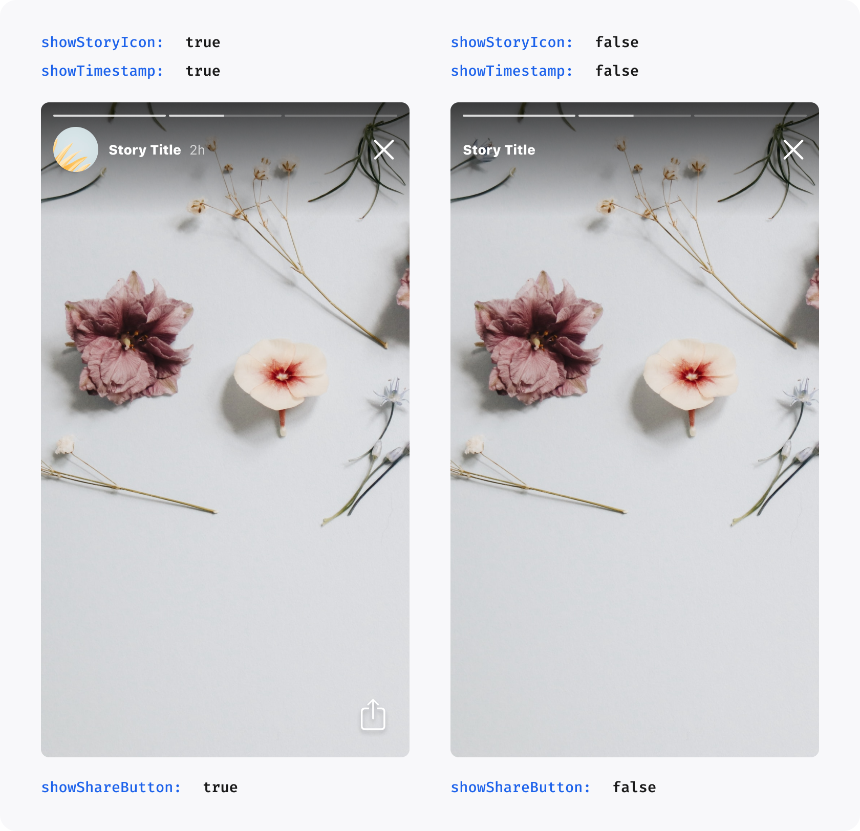
Shows the round story icon before the Story Title in the Player
showTimestamp
true
Bool
Shows the timestamp after the Story Title in the Player, indicating how long ago a story was published
showShareButton
true
Bool
Shows the share button in the Player. Setting this to false entirely disables sharing in Storyteller
showLikeButton
true
Bool
Shows the like button in the Clips Player. Setting this to false entirely disables liking in Storyteller
enableFollowableCategorySwipeFromRightEdge
true
Bool
Enables opening the Followable Category screen with a right-edge swipe in the Clips Player. Set to false to disable this gesture
clips.showButtonBackgrounds
true
Bool
Controls whether the Clips Player renders the default button backgrounds for like, share, mute, and captions buttons
clips.actionIconSize
32
CGFloat
Size in points for Clips Player action icons. Values outside the supported 24...38 range are clamped during theme resolution
clips.feedSwitcher.selected.fontWeight
selection-style default
StorytellerFontWeight?
Optional selected For You / Following tab weight. When set, it overrides the weight implied by theme.behavior.following.feedSwitcher.selectionStyle
clips.feedSwitcher.selected.textSize
16
CGFloat?
Optional selected For You / Following tab text size
clips.feedSwitcher.selected.lineHeight
nil
CGFloat?
Optional selected For You / Following tab line height
clips.feedSwitcher.unselected.fontWeight
selection-style default
StorytellerFontWeight?
Optional unselected For You / Following tab weight. When set, it overrides the weight implied by theme.behavior.following.feedSwitcher.selectionStyle
clips.feedSwitcher.unselected.textSize
16
CGFloat?
Optional unselected For You / Following tab text size
clips.feedSwitcher.unselected.lineHeight
nil
CGFloat?
Optional unselected For You / Following tab line height
clips.eyebrow.font
inherits theme.customFont
StorytellerFontProvider?
Font family used for the Clips Player eyebrow row. The SDK requests the .regular weight at render time
clips.eyebrow.textSize
15
CGFloat
Text size used for the Clips Player eyebrow row
clips.eyebrow.lineHeight
nil
CGFloat?
Optional line height for the Clips Player eyebrow row. nil preserves the current UIKit spacing for the resolved font
clips.eyebrow.textColor
inherits theme.colors.white.secondary
UIColor?
Text color used for the Clips Player eyebrow row
clips.title.font
inherits theme.customFont
StorytellerFontProvider?
Font family used for the Clips Player main title. The SDK requests clips.title.fontWeight, defaulting to .bold
clips.title.fontWeight
.bold
StorytellerFontWeight?
Optional weight requested from the Clips Player title font provider
clips.title.textSize
16
CGFloat
Text size used for the Clips Player main title
clips.title.lineHeight
nil
CGFloat?
Optional line height for the Clips Player main title. nil preserves the system default line spacing for the resolved font
clips.title.textColor
inherits theme.colors.white.primary
UIColor?
Text color used for the Clips Player main title
clips.categoryNavigation.fontWeight
.bold
StorytellerFontWeight?
Optional category-navigation label weight requested from theme.customFont
clips.categoryNavigation.textSize
15
CGFloat?
Optional category-navigation label text size
clips.categoryNavigation.lineHeight
nil
CGFloat?
Optional category-navigation label line height
clips.topGradient
black at 60% opacity from .topCenter to clear at .bottomCenter
Theme.Gradient?
Customizes the existing 96-point top readability scrim without changing its bounds or visibility
clips.bottomGradient
clear at .topCenter to black at 60% opacity at .bottomCenter
Theme.Gradient?
Customizes the existing metadata-backed bottom readability scrim without changing its bounds or visibility rule
clips.modal
nil
Theme.Player.Clips.Modal?
Optional host-configured layout for modal Clips, including status-bar video, internal spacing, gradient height, progress dimensions and navigation imagery. See Modal Clips layout
clips.embeddedVideoSizing
nil (inherits remote Settings, then .legacy)
StorytellerEmbeddedClipsVideoSizing?
Opts Embedded Clips content and supported video Ads into full-width, aspect-preserving, vertically centred media sizing. It does not affect modal/fullscreen Clips, Stories, or tvOS
clips.progressBar.playedColor
inherits colors.white.primary
UIColor?
Color of the completed portion of the Clips progress track
clips.progressBar.remainingColor
white at 40% opacity
UIColor?
Color of the remaining portion of the Clips progress track
clips.progressBar.position
.bottom
Theme.Player.Clips.ProgressBar.Position
Sets the Clips progress bar to .bottom or .aboveAction. .aboveAction applies only to Embedded Clips with a visible primary action
clips.progressBar.active.playedColor
inherits clips.progressBar.playedColor
UIColor?
Completed-track color while the user is scrubbing
clips.progressBar.active.remainingColor
inherits clips.progressBar.remainingColor
UIColor?
Remaining-track color while the user is scrubbing
clips.progressBar.active.currentTimeColor
inherits colors.white.primary
UIColor?
Current-time label color while the user is scrubbing
clips.progressBar.active.totalTimeColor
inherits colors.white.tertiary
UIColor?
Total-time label color while the user is scrubbing
clips.spacing.backButtonStartInset
0
CGFloat
Left inset in points for the Clips Player back/close button
clips.spacing.contentInsetHorizontal
16
CGFloat
Horizontal (start/end) padding in points for the description and action content areas
clips.spacing.contentInsetBottom
16
CGFloat
Bottom padding in points for the description and action content areas
clips.spacing.actionSpacing
12
CGFloat
Vertical spacing in points between action icons (follow, like, share, mute, caption)
clips.spacing.eyebrowToTitleSpacing
4
CGFloat
Spacing in points between the eyebrow text and the clip title
clips.spacing.titleToActionSpacing
16
CGFloat
Horizontal gap in points between the title/description text and the action icons column
clips.spacing.titleToCategoriesSpacing
nil
CGFloat?
Vertical gap in points between the rendered title/description block and categories in Embedded Clips
clips.spacing.categoriesToMoreSpacing
nil
CGFloat?
Vertical gap in points between categories and the shared expansion/collapse affordance in Embedded Clips
clips.spacing.metadataToProgressBarSpacing
nil
CGFloat?
Minimum vertical gap in points between the metadata block and the visible progress track in Embedded Clips
clips.spacing.progressBarToActionSpacing
nil
CGFloat?
Minimum vertical gap in points between the visible progress track and primary action in Embedded Clips, independent of progress-bar ordering
liveChip.image
null
UIImage?
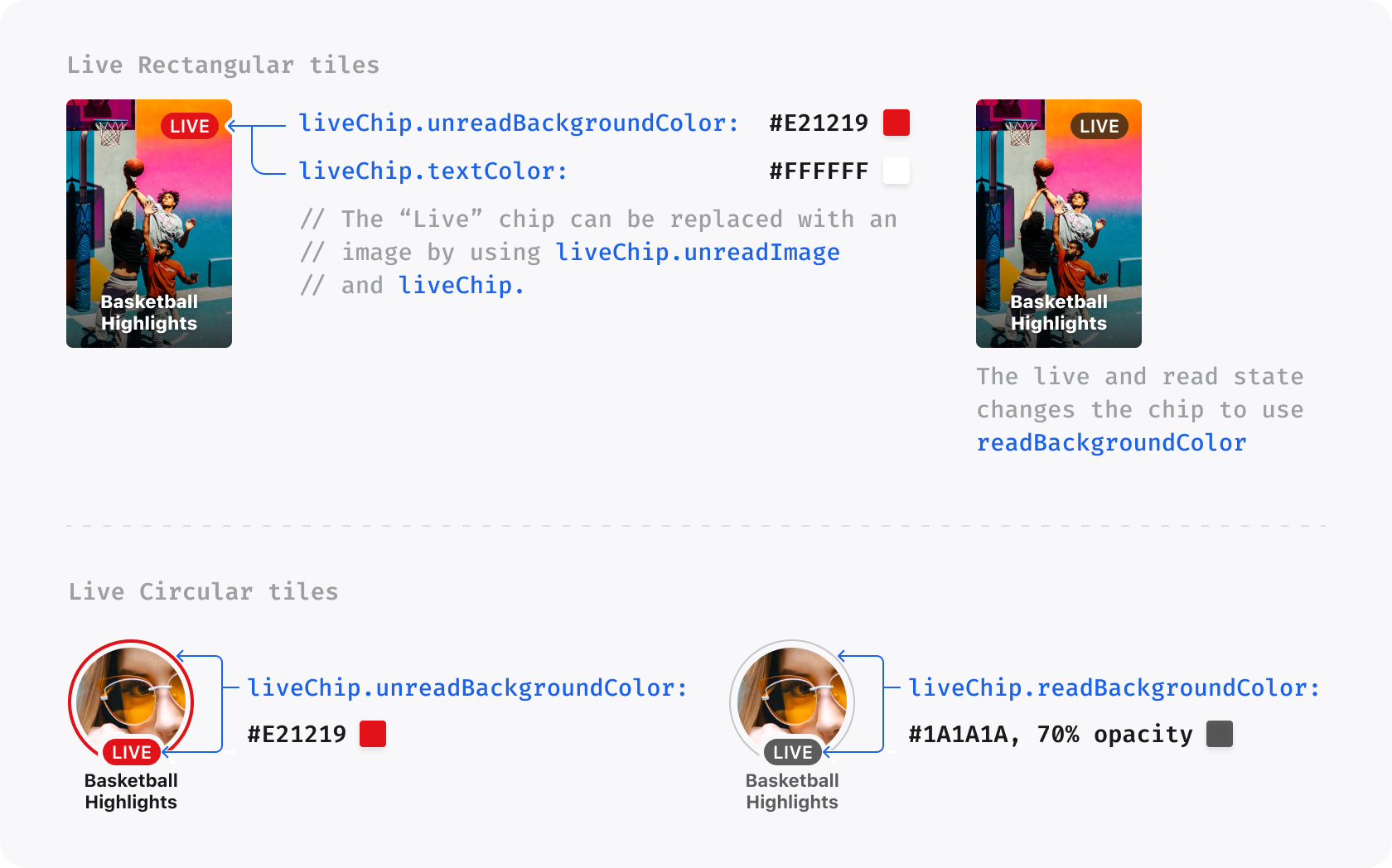
Image used in place of Live Chip before Live Story or Clip Titles. If set, it overrides liveChip.backgroundGradient
liveChip.textColor
null
UIColor?
Text color used for badge label for Live Story or Clip
liveChip.backgroundGradient
null
Gradient?
Background gradient of the badge for Live Story or Clip. If set, it overrides liveChip.backgroundColor
liveChip.backgroundColor
theme.colors.alert
UIColor?
Background color of the badge for Live Story or Clip
liveChip.borderColor
null
UIColor
Border color of the badge for Live Story or Clip
icons.share
null
UIImage?
An image to be used in place of the default share icon
icons.refresh
null
UIImage?
Refresh button image to be used in place of refresh share icon, used in the error state
icons.back
null
UIImage?
Back button image to be used in place of the default Clips back icon
icons.like.initial
null
UIImage?
An image to be used in place of the default like icon when the clip is not liked
icons.like.liked
null
UIImage?
An image to be used in place of the default like icon when the clip is liked
Bundled Lottie animation played when the Clips like button changes from liked to unliked
icons.mute.muted
null
UIImage?
Image used for the mute button when audio is muted in Stories and Clips
icons.mute.unmuted
null
UIImage?
Image used for the mute button when audio is unmuted in Stories and Clips
icons.captions.enabled
null
UIImage?
Image used for the captions button when captions are enabled in Stories and Clips
icons.captions.disabled
null
UIImage?
Image used for the captions button when captions are disabled in Stories and Clips
Like and share count visibility is managed through Storyteller Settings and is
not exposed through the public host Theme API.
When a Clip includes a long description, the Player renders it below the title
using customFont at semibold 15pt and colors.white.secondary. Title, long
description, and categories each show up to two lines while collapsed. If any
section overflows, one more/less control expands or collapses all three
sections together. This behavior is automatic and does not add a theme property.
If only one mute or captions state is provided, the missing state continues to use the bundled Storyteller icon.
The canonical key path for this API is theme.player.clips.eyebrow.
clips.eyebrow.lineHeight intentionally defaults to nil to preserve the current UIKit eyebrow spacing.
clips.title.lineHeight intentionally defaults to nil, unlike other title theme APIs that ship a non-nil line height. Leaving it unset preserves the current Clips title spacing.
The feed switcher and category-navigation labels inherit theme.customFont; they do not have separate font-family properties. The clip title continues to use clips.title.font, falling back to theme.customFont. Each configured weight is requested from that provider.
When feed-switcher weights are absent, underline selection mode keeps .semibold for both tabs, while text-weight selection mode keeps .heavy selected and .medium unselected. Explicit selected or unselected weights replace only those fallback weights; theme.behavior.following.feedSwitcher.selectionStyle still controls underline visibility, animation, and the remaining selection behavior.
Configured sizes and line heights scale with Dynamic Type. Category names and the delimiter from theme.behavior.player.clips.categoryNavigation.delimiter share one attributed typography style, while the existing less control keeps its current style.
Host values and remote light/dark values resolve independently for every typography field. A feed- or collection-specific remote value overrides the tenant/global remote value, which overrides the host-supplied light or dark theme. Remote font-weight strings are case-insensitive, so values such as REGULAR, LIGHT, and BLACK resolve to the corresponding lowercase-backed public enum cases. Missing, unknown, non-finite, or non-positive remote values continue to the next fallback without changing compatibility output.
theme.player.clips.topGradient and theme.player.clips.bottomGradient use the existing two-colour Theme.Gradient type. All nine GradientPosition values are supported for either endpoint, and the start and end positions must be different.
When topGradient is absent at every layer, the Clips Player keeps its existing black-at-60%-opacity to clear gradient from .topCenter to .bottomCenter over the fixed 96-point top scrim. When bottomGradient is absent at every layer, it keeps the existing clear-at-top to black-at-60%-opacity-at-bottom appearance over the title-stack-derived bottom scrim. The bottom scrim remains hidden when the Clip title is missing or empty.
Each gradient resolves independently in this order: feed- or collection-specific remote light/dark theme, tenant/global remote light/dark theme, host-supplied light/dark theme, then its iOS default. Missing, null, incomplete, malformed, or unknown remote values continue to the next layer for that gradient only; a malformed top value does not discard a valid bottom value, and vice versa.
A clear-to-clear gradient is an explicit transparent scrim and does not fall back to the default. This can be used to remove either scrim visually while preserving its existing container and visibility behavior. Custom colours are rendered as supplied, so the integrating app is responsible for maintaining sufficient contrast between video content and Player controls or text.
Remote colours accept #RRGGBB or alpha-first #AARRGGBB values. For example:
Set theme.light.player.clips.modal and theme.dark.player.clips.modal to customize non-embedded iOS Clips Players. These options are configured by the integrating app; they do not add remote Settings keys. Leaving the object or an individual property unset preserves the existing behavior for that property. Embedded Clips keep their separate spacing and progress-position settings.
All dimensions are fixed points. Spacing, insets and gradient heights accept zero; negative or non-finite values are ignored. Progress thickness, icon size and navigation height must be positive and finite. Navigation height has a minimum of 48 points, and navigation glyphs are capped at 48 points while the Back and Search buttons retain at least 48 × 48-point targets.
Property under clips.modal
Type
Behavior when configured
drawBehindStatusBar
Bool?
Extends the content video behind the status bar while navigation remains below the safe-area top. Ad media retains its safe-area layout
feedSwitcherItemSpacing
CGFloat?
Gap between For You and Following
titleToCategoriesSpacing
CGFloat?
Gap between the title/description block and categories
categoriesToMoreSpacing
CGFloat?
Gap between categories and the shared more/less control
metadataToProgressBarSpacing
CGFloat?
Minimum gap between metadata and the resting visible progress track
progressBarToActionSpacing
CGFloat?
Gap between the resting progress track and primary action, in either ordering, including layouts with a bottom banner
progressBarPosition
Theme.Player.Clips.ProgressBar.Position?
.aboveAction places the track above a visible primary action; .bottom retains the existing bottom placement. A hidden CTA or disabled progress bar does not reserve an extra gap
topGradientHeight
CGFloat?
Height of the top readability gradient; unset retains 96 points
bottomGradientHeight
CGFloat?
Height of the bottom readability gradient, still attached to the media. Its existing visibility rule is preserved
progressBarHeight
CGFloat?
Resting track thickness; unset retains 2 points
progressBarActiveHeight
CGFloat?
Scrubbing track thickness; unset retains 8 points. The active track never becomes thinner than the resting track
progressBarInsetHorizontal
CGFloat?
Left and right track inset; unset retains 16 points
navigationIconSize
CGFloat?
Maximum dimension of Back and Search glyphs, preserving their aspect ratios
navigationInsetHorizontal
CGFloat?
Leading Back inset (overrides clips.spacing.backButtonStartInset) and trailing Search inset
navigationInsetTop
CGFloat?
Additional navigation inset below the safe-area top
navigationHeight
CGFloat?
Navigation row height; unset retains 48 points
searchIcon
UIImage?
Modal Search replacement image; unset retains the system magnifier
Spacing applies only when both rendered endpoints exist. When a bottom-positioned track sits below the CTA, metadata keeps enough clearance for the intervening button. Metadata does not move as the track expands during scrubbing. Content-specific lower spacing and progress dimensions do not alter full-screen Ad creatives.
Keep using player.icons.back for the Back image, clips.topGradient and clips.bottomGradient for gradient colors, clips.progressBar for track colors, and existing typography and action-button options. The remote theme.behavior.player.clips.modalContentBottomAnchor continues to select video- or screen-anchored lower controls independently.
The four optional internal spacing properties apply only to Embedded Clips. Each property resolves independently through the active feed-specific server appearance, tenant/global server appearance, and host-supplied light or dark theme. Missing, non-finite, or negative values are treated as unset and preserve the existing iOS layout for that relationship.
Configured spacing is added only when both rendered elements are present. The fixed point values do not scale with Dynamic Type, while the surrounding metadata continues to reflow. The Sky configuration uses 8, 4, 16, and 16 points for title-to-categories, categories-to-expansion, metadata-to-progress, and progress-to-action respectively.
You can omit likeInitial and likeLiked when you want to keep the SDK's default static heart icons and only override the transition animations.
Tenant settings can also provide static Clips Player like icons through the remote theme payload. Use complete URL pairs under the light and/or dark style theme:
Both initial and liked must be provided for the SDK to replace the default static like icons. Remote settings do not configure icons.like.animation; use the local StorytellerTheme API for bundled Lottie animations.
theme.player.clips.embeddedVideoSizing supports these local values:
Value
Behavior
.legacy
Preserves the existing height-constrained Embedded Clips media layout
.widthConstrained
Uses the complete Embedded Clips viewport width, preserves the source aspect ratio, and centres the media vertically
With .widthConstrained, landscape or other short media shows black space above and below it. Media whose width-derived height exceeds the viewport is cropped equally at the top and bottom. The video is never cropped at the left or right, and the outer viewport, controls, captions, action rail, AdChoices, and banner placement keep their existing layout.
Set the value independently on the light and dark themes:
Leaving a local value as nil inherits theme.behavior.player.clips.embeddedVideoSizing from remote Settings. Remote Settings accepts the exact strings legacy and widthConstrained. An explicit local light or dark value always wins over the remote value. Missing, null, malformed, and unknown remote values preserve .legacy behavior without discarding other valid theme fields.
The option applies only to Embedded Clips, including supported first-party, VAST, GAM, and AdMob video Ads. Modal or fullscreen Clips, direct Player presentation, Stories, image Ads, bottom banners, and tvOS are unchanged. See Width-constrained Embedded Clips video Ads when supplying a custom view-based video Ad.
theme.player.clips.progressBar.position controls the progress bar hierarchy for Clips. It supports the following appearance-scoped values:
Value
Behavior
.bottom / bottom
Preserves the existing progress bar position. This is the default
.aboveAction / aboveAction
Places the progress bar above the visible primary action in Embedded Clips
When .aboveAction is selected, modal and full-screen Clips remain unchanged. Embedded Clips without a visible primary action also keep the stable bottom position without reserving an empty action gap. The scrub gesture area follows the rendered progress bar in both positions.
The active light or dark value resolves in this order: feed-specific remote theme, tenant/global remote theme, host-supplied theme, then .bottom. Unknown or malformed remote values are ignored so normal inheritance can continue.
theme.behavior.player.clips.modalContentBottomAnchor is a remote Settings property for non-embedded modal Clips Players. It accepts the following values:
Value
Behavior
video
Keeps the title, metadata, side actions, primary action, and progress controls anchored to the bottom of the 9:16 media frame. This is the default and preserves the existing layout
screen
Keeps the media top-aligned at 9:16 while anchoring the lower Player UI to the viewport safe-area bottom, using the space below the media on taller screens
Missing, null, malformed, or unknown values resolve to video. The setting does not stretch or crop video, does not affect Embedded Clips, and keeps standard Ads on the existing video-anchored layout.
The default Followable Category profile screen is configured from remote Settings via the CMS. There is no SDK public Theme API for these profile fields.
Set theme.behavior.player.clips.enableProfileScreen to true to use the profile screen. When this value is false or missing, the SDK uses the legacy Followable Category screen. A custom category screen returned by StorytellerDelegate.viewController(for:) always takes priority over either SDK screen.
Profile appearance is configured independently under theme.light.profileScreen and theme.dark.profileScreen:
Property
Default Value
Data Type
Description
contentAvailability.clips
true
Bool
Shows the Latest/Popular Clips feed
contentAvailability.stories
false
Bool
Shows the Stories row sourced from the category display title
displayTitle.textSize
22
Int
Category title text size
displayTitle.lineHeight
28
Int
Category title line height
displayTitle.textCase
default
String
default, upper, or lower
displayTitle.textColor
#FFFFFF
String
Category title color
description.textSize
16
Int
Category description text size
description.lineHeight
20
Int
Category description line height
description.textCase
default
String
default, upper, or lower
description.textColor
#D9FFFFFF
String
Category description color
followButton.cornerRadius
8
Int
Follow/Unfollow button corner radius
followButton.title.textSize
14
Int
Button title text size
followButton.title.lineHeight
20
Int
Button title line height
followButton.title.textCase
default
String
default, upper, or lower
followButton.followed.textColor
#FFFFFF
String
Unfollow-state title color
followButton.followed.backgroundColor
#33FFFFFF
String
Unfollow-state background color
followButton.unfollowed.textColor
#FFFFFF
String
Follow-state title color
followButton.unfollowed.backgroundColor
#1C62EB
String
Follow-state background color
tabs.title.textSize
20
Int
Latest/Popular title text size
tabs.title.lineHeight
24
Int
Latest/Popular title line height
tabs.title.textCase
default
String
default, upper, or lower
tabs.selectedTextColor
Light: #FF1A1A1A; Dark: #FFFFFFFF
String
Selected tab title color
tabs.unselectedTextColor
Light: #991A1A1A; Dark: #D9FFFFFF
String
Unselected tab title color
Colors accept six-digit RGB (#RRGGBB) or eight-digit alpha-first ARGB (#AARRGGBB). Missing, null, malformed, or out-of-range fields fall back independently, so one invalid field does not discard valid sibling values. If both content availability values resolve to false, the SDK falls back to Clips enabled and Stories disabled.
Missing Profile tab colours follow the active appearance. Automatic UI style uses the system Light or Dark appearance, while forced Light or Dark styles use their corresponding fallback values. Explicitly configured selected or unselected colours take precedence independently.
Text uses the resolved SDK theme font. The profile image comes from the CMS and its border is not themeable. theme.light.categoryScreen.followIcons and theme.dark.categoryScreen.followIcons continue to configure the legacy screen and are separate from profileScreen.
The cards property applies customizations to Storyteller Cards. Cards audio behavior is controlled by tenant settings, while local theme values can replace the icons used by the Cards audio control.
Property
Default Value
Data Type
Description
audio.mutedIcon
nil
UIImage?
Complete 48x48 visual used for the Cards audio control when the active video Card is muted
audio.unmutedIcon
nil
UIImage?
Complete 48x48 visual used for the Cards audio control when the active video Card is unmuted
If a Cards audio icon is not provided, the SDK uses a default 48x48 tap target with a bundled 32x32 circular state icon centered inside it. Custom theme.cards.audio images replace that whole visual directly, without an SDK-drawn circle/background; include any desired backer in the image asset. theme.player.icons.mute customizes Stories and Clips Player mute icons; use theme.cards.audio for Cards.
Use the instructions property to customize the appearance of the instructions screen.
Property
Default Value
Data Type
Description
show
true
Bool
Determines whether the Instructions Screen is shown the first time the Story Player or Clips Player is opened on a device. Set to false to completely disable the instructions screen.
headingColor
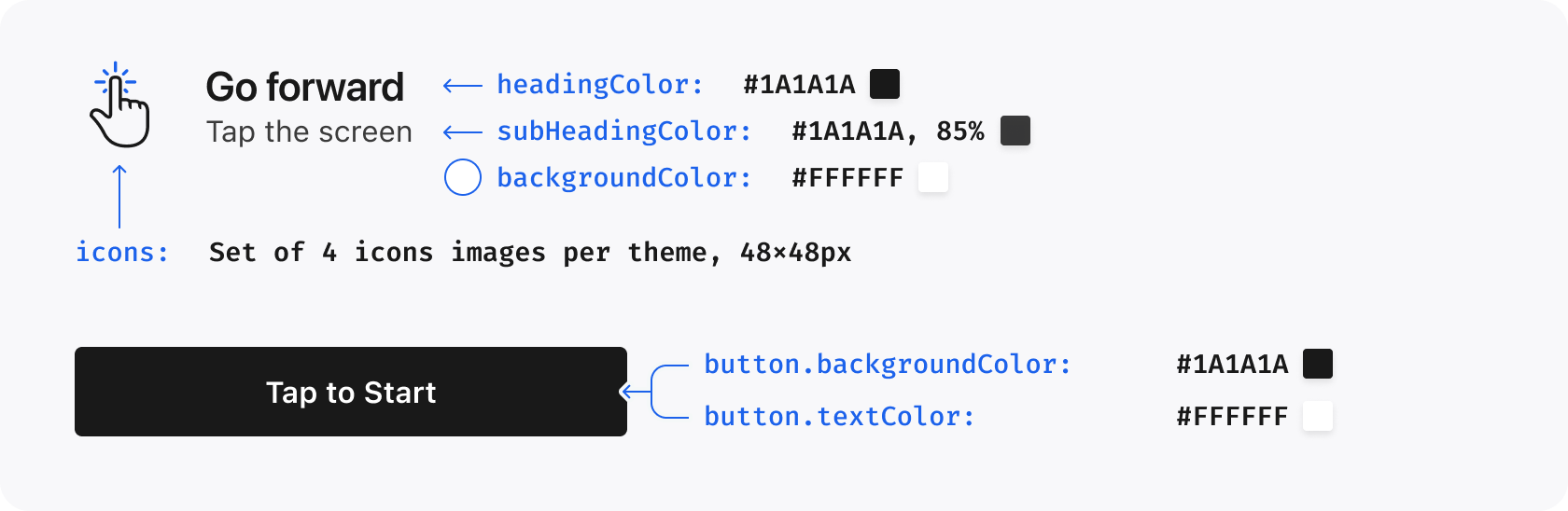
inherits colors.black.primary for light, colors.white.primary for dark
UIColor
The color of the heading text on the Instructions Screen
headingTextCase
default
StorytellerTextCasing
Determines the text case of the heading on the Instructions Screen. Possible values are upper, lower and default
headingFont
null
StorytellerFontProvider
Defines the font of the heading text on the Instructions Screen
subHeadingColor
inherits colors.black.secondary for light, colors.white.secondary for dark
UIColor
The color of the subheading text on the Instructions Screen
backgroundColor
inherits colors.white.primary for light, colors.black.primary for dark
UIColor
The color of the background of the Instructions Screen
icons
null
StorytellerInstructionIcons
A set of custom icons to be used for each instruction on the Instructions Screen
button.backgroundColor
inherits colors.black.primary for light, colors.white.primary for dark
UIColor
The background color of the button used on the Instructions Screen
button.textColor
inherits colors.white.primary for light, colors.black.primary for dark
UIColor
The text color of the button used on the Instructions Screen
The icons property can be used to provide a completely custom set of icons. The icons should be 48x48 PNGs. An example of using this property is shown below:
The sheets property controls the top corners of Storyteller content Sheets
and the Search Filters sheet. See
Configure Sheet corner radius for remote
configuration, precedence, validation, defaults, and iOS availability.
Property
Default Value
Data Type
Description
sheets.cornerRadius
nil
CGFloat?
Optional top-corner radius in points. nil preserves each Sheet surface's compatibility default.
Clip lists in Search retain their loaded results when their Player closes, regardless of the remote theme.behavior.reloading.reloadOnExit setting. This applies whether or not the viewer opened a category and preserves the Search journey. Other lists keep their configured reloading behavior. See Clip Category Navigation.
The search property applies customizations to suggestions, no-results, results and filters in the Search component. Every new Search appearance property is optional. Omitted values keep the existing iOS appearance, and theme.light and theme.dark resolve independently.
Search text uses customFont with the semantic weight for each element. search.heading.font remains the font override for the Filters title, while Search result section headings continue to use lists.title. Configure the Apply Filters button through search.filters.applyButton; each remote or host-app field resolves independently before the compatibility default. Shared buttons values do not affect this Search action.
Property
Default Value
Data Type
Description
search.backgroundColor
colors.white.primary in light mode; colors.black.primary in dark mode
Start with Creating Themes, then use the
property reference above to add only the overrides your integration needs. For a
complete custom-font setup, including app registration and font-name checks, see
Configure custom fonts.
The home property can be used to customize properties related to the Storyteller Home component.
Property
Default Value
Data Type
Description
home.headerTitle.font
nil
StorytellerFontProvider
The only font that can vary from theme.font, defines the font for the heading
home.headerTitle.textSize
22
CGFloat
Size of the title in section
home.headerTitle.lineHeight
28
CGFloat
The line height of the title on in section
home.headerTitle.textCase
default
StorytellerTextCasing
Sets the text case for buttons throughout the UI. Possible values are upper, lower and default
home.headerTitle.textColor
nil
UIColor
Color of heading text in Storyteller Home
home.circularTitle.textSize
11
CGFloat
Size of the circular title in section
home.circularTitle.lineHeight
13
CGFloat
The line height of the circular title on in section
home.singletonTitle.textSize
22
CGFloat
Size of the singleton title in section
home.singletonTitle.lineHeight
28
CGFloat
The line height of the singleton title in section
home.gridTitle.textSize
16
CGFloat
Size of the grid title in section
home.gridTitle.lineHeight
22
CGFloat
The line height of the grid title on in section
{"slug": "themes", "page_title": "Customize Themes", "page_url": "Themes/", "canonical_url": "/ios/Themes/", "markdown": "# Themes\n\nUse `StorytellerTheme` to apply your brand's colors, typography, spacing, and\ncontrols to Storyteller UI. Start with the practical setup below, then use the\n[property reference](#property-reference) when you need a specific setting.\n\n- [Choose global or component scope](#configuring-a-storytellertheme)\n- [Create and verify light and dark themes](#creating-themes)\n- [Configure custom fonts](#configure-custom-fonts)\n- [Configure remote rectangular tile title fonts](#configure-remote-rectangular-tile-title-fonts)\n- [Configure rectangular tile title gradients](#configure-rectangular-tile-title-gradients)\n- [Configure Sheet corner radius](#configure-sheet-corner-radius)\n- [Understand precedence and fallback](#understand-precedence-and-fallback)\n- [Diagnose a theme that does not appear](#verify-and-troubleshoot)\n\n## Configuring a StorytellerTheme\n\nA `StorytellerTheme` contains separate `light` and `dark` `Theme` values. The\ncomponent's `uiStyle` selects which one is rendered:\n\n| `uiStyle` | Theme used |\n| --- | --- |\n| `.light` | `StorytellerTheme.light` |\n| `.dark` | `StorytellerTheme.dark` |\n| `.auto` | The current system appearance |\n| Omitted | Keeps the view's current setting. A newly created view starts at `.auto`. |\n\nChoose the scope before you customize the theme:\n\n| Scope | How to set it | Use it when |\n| --- | --- | --- |\n| Global | `Storyteller.shared.theme` | Most or all Storyteller UI should use the same brand theme. |\n| Component | The `theme` value in a list or player configuration | One component needs a deliberate variation from the global theme. |\n\nSet the global theme before configuring Storyteller views, normally alongside\nyour app's Storyteller initialization. `StorytellerTheme` is a value type, so\nif you change your local copy later, assign it to `Storyteller.shared.theme`\nagain and reconfigure any existing component that should use the new values.\n\n## Creating Themes\n\nStart with a small group of visible brand choices. Configure both appearances\nexplicitly rather than assuming that a light value is also suitable in dark\nmode.\n\n<!-- storyteller-swift-example: id=themes-01 target=sdk-ios context=statements -->\n\n```swift\nimport StorytellerSDK\nimport UIKit\n\nvar brandTheme = StorytellerTheme()\n\nbrandTheme.light.colors.primary = UIColor(red: 0.04, green: 0.31, blue: 0.76, alpha: 1)\nbrandTheme.light.lists.backgroundColor = UIColor.white\n\nbrandTheme.dark.colors.primary = UIColor(red: 0.36, green: 0.66, blue: 1, alpha: 1)\nbrandTheme.dark.lists.backgroundColor = UIColor(red: 0.06, green: 0.07, blue: 0.09, alpha: 1)\n\nStoryteller.shared.theme = brandTheme\n```\n\nThe primary color is inherited by supported accent surfaces such as unread\ncircular-tile indicators. The list background changes with the selected\nappearance. Once this works, add only the properties your design requires.\n\n### Verify light and dark appearances\n\nDuring development, temporarily force each appearance with `uiStyle`. This\nseparates theme configuration problems from the simulator or device's current\nappearance.\n\n<!-- storyteller-swift-example: id=themes-appearance target=sdk-ios context=statements -->\n\n```swift\nimport StorytellerSDK\n\nlet darkPreviewRow = StorytellerStoriesRowView()\ndarkPreviewRow.configure(with: StorytellerStoriesListConfiguration(\n categories: [\"category-id\"],\n uiStyle: .dark\n))\n```\n\nVerify the same integration with `.light`, then explicitly return a reused view\nto `.auto` when the app should follow the system appearance. Omitting `uiStyle`\ndoes not reset an existing view; it leaves that view's current setting unchanged.\n\n### Apply a theme to one component\n\nA configuration-level theme replaces the global host theme for that component;\nit is not merged over `Storyteller.shared.theme`. Start from a copy of the\nglobal theme when you want a small variation.\n\n<!-- storyteller-swift-example: id=themes-02 target=sdk-ios context=statements -->\n\n```swift\nimport StorytellerSDK\nimport UIKit\n\nvar compactRowTheme = Storyteller.shared.theme\ncompactRowTheme.light.colors.primary = UIColor.systemOrange\ncompactRowTheme.light.lists.row.tileSpacing = 4\ncompactRowTheme.dark.colors.primary = UIColor.systemOrange\ncompactRowTheme.dark.lists.row.tileSpacing = 4\n\nlet storytellerStoriesRow = StorytellerStoriesRowView()\nstorytellerStoriesRow.configure(with: StorytellerStoriesListConfiguration(\n categories: [\"category-id\"],\n theme: compactRowTheme,\n uiStyle: .auto\n))\n```\n\nThis row uses `compactRowTheme`. When the SDK opens the Player from this list,\nthe Player uses the same override. Other independently configured components\ncontinue to use the global theme. See\n[StorytellerListView](StorytellerListViews.md) for the full list configuration\ncontract.\n\n## Configure custom fonts\n\nCustom fonts require setup in the host app as well as a\n`StorytellerFontProvider`:\n\n1. Add each `.ttf` or `.otf` file to the app target and confirm its target\n membership.\n1. Add each filename to **Fonts provided by application** (`UIAppFonts`) in the\n app's Info settings. For a manually maintained `Info.plist`, the equivalent\n entry is:\n\n ```xml\n <key>UIAppFonts<\/key>\n <array>\n <string>AcmeSans-Light.otf<\/string>\n <string>AcmeSans-Regular.otf<\/string>\n <string>AcmeSans-Medium.otf<\/string>\n <string>AcmeSans-Semibold.otf<\/string>\n <string>AcmeSans-Bold.otf<\/string>\n <\/array>\n ```\n\n1. Use the font's internal PostScript name in `UIFont(name:size:)`. This is not\n always the same as the filename or the name displayed in Finder.\n1. Map every `StorytellerFontWeight` requested by the SDK and assign the\n provider to both appearances.\n\n<!-- storyteller-swift-example: id=themes-03 target=sdk-ios context=statements -->\n\n```swift\nimport StorytellerSDK\nimport UIKit\n\nfinal class BrandFontProvider: StorytellerFontProvider, @unchecked Sendable {\n override func font(weight: StorytellerFontWeight, size: CGFloat) -> UIFont? {\n let postScriptName: String\n\n switch weight {\n case .light:\n postScriptName = \"AcmeSans-Light\"\n case .regular:\n postScriptName = \"AcmeSans-Regular\"\n case .medium:\n postScriptName = \"AcmeSans-Medium\"\n case .semibold:\n postScriptName = \"AcmeSans-Semibold\"\n case .bold, .heavy, .black:\n postScriptName = \"AcmeSans-Bold\"\n @unknown default:\n postScriptName = \"AcmeSans-Regular\"\n }\n\n return UIFont(name: postScriptName, size: size)\n }\n}\n\nlet brandFont = BrandFontProvider()\nfor weight in StorytellerFontWeight.allCases {\n assert(brandFont.font(weight: weight, size: 16) != nil)\n}\n\nvar fontTheme = StorytellerTheme()\nfontTheme.light.customFont = brandFont\nfontTheme.dark.customFont = brandFont\nStoryteller.shared.theme = fontTheme\n```\n\nThe assertion is a useful development check: if it fails, confirm the asset's\ntarget membership, `UIAppFonts` filename, and PostScript name. The SDK's default\n`StorytellerFontProvider` supplies system fonts. A custom provider can return\n`nil`, but individual UI surfaces may then retain or choose their own fallback;\nreturn a font for every weight if consistent typography is required.\n\n`StorytellerFontWeight` includes `.light`. An exhaustive switch written against\nan older SDK must add `.light` or an `@unknown default` branch when it is\nrecompiled with SDK 11.5.1 or later.\n\n## Configure remote rectangular tile title fonts\n\nStoryteller Settings can select the font family and weight used by titles on\nrectangular Story and Clip tiles independently from the global host theme:\n\n```text\ntheme.light.tiles.rectangularTile.title.fontFamily\ntheme.light.tiles.rectangularTile.title.fontWeight\ntheme.dark.tiles.rectangularTile.title.fontFamily\ntheme.dark.tiles.rectangularTile.title.fontWeight\n```\n\nThese are remote Settings values, not public `Theme` properties. They apply to\nrectangular title-bearing tiles in rows, grids, category screens, and Search.\nThey do not change circular tiles, eyebrows, list headings, or Player text.\n\nThe host app must include and register every requested font face before the SDK\nrenders a tile. Follow the target-membership and `UIAppFonts` steps in\n[Configure custom fonts](#configure-custom-fonts). Set `fontFamily` to the\nregistered UIKit family name, such as `Acme Sans`; this differs from the\nPostScript face name such as `AcmeSans-Semibold` used with\n`UIFont(name:size:)`. During development, use `UIFont.familyNames` to verify the\nregistered family spelling.\n\n`fontWeight` is a numeric string. The iOS SDK supports these mappings:\n\n| Remote value | `StorytellerFontWeight` |\n| --- | --- |\n| `\"300\"` | `.light` |\n| `\"400\"` | `.regular` |\n| `\"500\"` | `.medium` |\n| `\"600\"` | `.semibold` |\n| `\"700\"` | `.bold` |\n| `\"800\"` | `.heavy` |\n| `\"900\"` | `.black` |\n\nFamily and weight inherit independently. A feed- or Search-specific leaf takes\nprecedence over its tenant-level value. A missing, null, blank, malformed, or\nunknown leaf keeps the corresponding tenant value when present. After remote\ninheritance, an absent weight keeps the existing `.heavy` rectangular-title\nweight. An absent or unregistered family asks the selected host\n`customFont` provider for the resolved weight; the SDK's default provider\nreturns the matching system font. If a custom provider cannot create the\nresolved weight, the SDK retries the existing `.heavy` rectangular-title\nweight before allowing the surface's normal font fallback.\n\n## Configure rectangular tile title gradients\n\nRectangular Story and Clip tiles can use an ordered, multi-stop gradient behind\ntheir titles in rows, grids, category screens, and Search. Circular tiles and\nPlayer gradients are unaffected.\n\nFor a host-supplied theme, assign a stop-based `Theme.Gradient` to\n`tiles.rectangularTile.titleGradient` in each appearance that needs it:\n\n<!-- storyteller-swift-example: id=themes-rectangular-title-gradient target=sdk-ios context=statements -->\n\n```swift\nimport StorytellerSDK\nimport UIKit\n\nvar tileTheme = StorytellerTheme()\n\ntileTheme.light.tiles.rectangularTile.titleGradient = Theme.Gradient(\n stops: [\n Theme.Gradient.Stop(color: UIColor.clear, location: 0),\n Theme.Gradient.Stop(color: UIColor.black.withAlphaComponent(0.25), location: 0.55),\n Theme.Gradient.Stop(color: UIColor.black.withAlphaComponent(0.72), location: 1),\n ],\n startPosition: .topCenter,\n endPosition: .bottomCenter\n)\n\ntileTheme.dark.tiles.rectangularTile.titleGradient =\n tileTheme.light.tiles.rectangularTile.titleGradient\n```\n\nA valid stop gradient contains at least two stops. Locations must be finite,\nwithin `0...1`, and in non-decreasing order. Repeated colors and locations are\nvalid, and the first and last locations do not need to be `0` and `1`. Invalid\nhost gradients keep the existing iOS tile-title gradient.\n\nStoryteller Settings can provide the same capability under\n`theme.light.tiles.rectangularTile.titleGradient` and\n`theme.dark.tiles.rectangularTile.titleGradient`:\n\n```json\n{\n \"theme\": {\n \"light\": {\n \"tiles\": {\n \"rectangularTile\": {\n \"titleGradient\": {\n \"stops\": [\n { \"color\": \"#00000000\", \"location\": 0 },\n { \"color\": \"#00000000\", \"location\": 0.55 },\n { \"color\": \"#000000B8\", \"location\": 1 }\n ],\n \"startPosition\": \"topCenter\",\n \"endPosition\": \"bottomCenter\"\n }\n }\n }\n }\n }\n}\n```\n\nStop colors accept `#RRGGBB` or alpha-last `#RRGGBBAA`. The stop list is\nvalidated atomically: a malformed color or location rejects that remote\ngradient without discarding valid sibling theme fields. Missing, incomplete,\nequal, or unsupported remote positions use `topCenter` to `bottomCenter`.\n\nThe value resolves in this order: feed-specific remote appearance,\ntenant-level remote appearance, selected host light/dark theme, then the\nexisting iOS default. The default remains clear at `0`, black at 50% opacity at\n`0.45`, and black at 80% opacity at `1`, from top center to bottom center.\n\nExisting two-color configurations remain supported when `stops` is absent or\n`null`. Their remote colors retain the legacy `#RRGGBB` or alpha-first\n`#AARRGGBB` format:\n\n```json\n{\n \"titleGradient\": {\n \"startColor\": \"#00000000\",\n \"endColor\": \"#CC000000\",\n \"startPosition\": \"topCenter\",\n \"endPosition\": \"bottomCenter\"\n }\n}\n```\n\n## Configure Sheet corner radius\n\nUse `sheets.cornerRadius` to set the top-corner radius, in points, for\nStoryteller content Sheets and the Search Filters sheet. Configure light and\ndark appearances independently:\n\n<!-- storyteller-swift-example: id=themes-sheets target=sdk-ios context=statements -->\n\n```swift\nvar theme = StorytellerTheme()\n\ntheme.light.sheets.cornerRadius = 12\ntheme.dark.sheets.cornerRadius = 12\n\nStoryteller.shared.theme = theme\n```\n\nThe equivalent remote Settings fragment is:\n\n```json\n{\n \"theme\": {\n \"light\": {\n \"sheets\": {\n \"cornerRadius\": 12\n }\n },\n \"dark\": {\n \"sheets\": {\n \"cornerRadius\": 12\n }\n }\n }\n}\n```\n\nA feed- or collection-specific remote value takes precedence over the\ntenant-level remote value, which takes precedence over the selected host\ntheme. Sheet actions opened from a Story or Clip use that presentation's active\ntheme context. Card, direct, and deeplink Sheet opens use the global theme\ncontext.\n\n`0` requests square top corners. Any finite value greater than or equal to zero\nis accepted; negative, non-finite, and malformed values are ignored so the next\nvalid layer can apply. When no layer supplies a valid value, Search Filters\nretain their existing `6`-point radius and content Sheets retain UIKit's system\nradius. The content-Sheet override is available on iOS 15 and newer; iOS 13 and\n14 always keep the system presentation radius.\n\n## Understand precedence and fallback\n\nTheme resolution follows this order:\n\n1. `uiStyle` chooses the light or dark appearance.\n1. A theme supplied in the component configuration is used for that component;\n otherwise the SDK uses `Storyteller.shared.theme`.\n1. The SDK fills unset optional properties from related theme values or its own\n defaults. For example, an unset circular-tile unread indicator inherits\n `colors.primary`.\n1. Where a property supports remote theming, a feed- or collection-specific\n remote value takes precedence over a tenant-level remote value, which in\n turn takes precedence over the selected host theme value.\n\nRemote configuration does not cover every public `Theme` property. If a host\nvalue is unexpectedly replaced, check whether that property is configured for\nthe current feed or tenant before changing the app theme.\n\n## Common recipes\n\nUse the narrowest property that expresses the design change:\n\n- **Change the main accent:** set `colors.primary`. Dependent defaults such as\n unread indicators inherit it unless you override them directly.\n- **Tighten a horizontal row:** set `lists.row.tileSpacing`,\n `lists.row.startInset`, and `lists.row.endInset` in both appearances.\n- **Style general buttons:** set `buttons.backgroundColor`,\n `buttons.textColor`, and `buttons.cornerRadius`.\n- **Style Storyteller Sheets:** set `sheets.cornerRadius` in both appearances;\n see [Configure Sheet corner radius](#configure-sheet-corner-radius) for\n defaults and platform availability.\n- **Style the instruction start button:** use\n `instructions.button.backgroundColor` and\n `instructions.button.textColor`; these detailed instruction values apply to\n the iOS instruction overlay.\n- **Improve Clips Player readability:** configure `player.clips.topGradient`\n and `player.clips.bottomGradient`; see [Gradient](#gradient) and\n [Player](#player) for supported values and defaults.\n\nThe Showcase app keeps a larger real-world theme in one place. See\n[`StorytellerThemeManager.globalTheme`](https://github.com/getstoryteller/storyteller-showcase-ios/blob/11.8.0/main/ShowcaseApp/Storyteller/StorytellerThemeManager.swift#L41)\nfor colors, fonts, list styling, and item-specific variations.\n\n## Verify and troubleshoot\n\nCheck one visible value at a time before applying a complete design system:\n\n| Symptom | Check |\n| --- | --- |\n| No component changes | Assign the theme before configuring the view. If you mutated a local copy after assignment, assign it again and reconfigure the component. |\n| One component looks different | Inspect the `theme` passed in that component's configuration; it replaces the global host theme for that component. |\n| Only one appearance is correct | Force `.light` and `.dark` in turn and confirm that both branches contain the intended values. |\n| The system font still appears | Confirm target membership, `UIAppFonts`, PostScript names, and a non-`nil` result for every requested weight. |\n| A remote rectangular title font does not appear | Confirm the remote `fontFamily` matches a value in `UIFont.familyNames`, every required face is registered, and the active light/dark branch contains the expected numeric-string weight. |\n| Only some surfaces change | Confirm that the property applies to that surface and whether a more specific property or supported remote value takes precedence. |\n\nFor a wider diagnosis flow, see\n[Appearance or Configuration Does Not Change](Troubleshooting.md#appearance-or-configuration-does-not-change).\n\n## Property reference\n\nThe remainder of this page documents the public host `Theme` properties.\nOptional properties often inherit from the palette, primitives, or another\ntheme property; each table identifies that fallback where applicable. Values\nmanaged through Storyteller Settings are identified separately and are not host\n`Theme` properties.\n\n### Colors\n\nThe `colors` property on theme is used to establish a set of base colors for the SDK to use.\n\n| Property | Default Value | Data Type | Description |\n|----------|---------------|-----------|-------------|\n| `primary` | `#1C62EB` | `UIColor` | The default accent color used throughout the UI. In general, this should be the primary brand color. |\n| `success` | `#3BB327` | `UIColor`| Used to indicate correct answers in Quizzes. |\n| `alert` | `#E21219` | `UIColor`| Used to indicate incorrect answers in Quizzes. |\n| `white.primary` | `#FFFFFF`| `UIColor` | Used for white text |\n| `white.secondary` | `white.primary` at 85% opacity | `UIColor` | Used for light text |\n| `white.tertiary` | `white.primary` at 70% opacity | `UIColor` | Used for gray text |\n| `black.primary` | `#1A1A1A`| `UIColor` | Used for dark text and backgrounds |\n| `black.secondary` | `black.primary` at 85% opacity | `UIColor` | Used for light black text |\n| `black.tertiary` | `black.primary` at 70% opacity | `UIColor` | Used for gray text |\n\n---\n\n### Font\n\n| Property | Default Value | Data Type | Description |\n| --- | --- | --- | --- |\n| `customFont` | System font matching the requested weight and size | `StorytellerFontProvider` | Supplies fonts throughout Storyteller UI. Assign it separately to the light and dark themes. |\n\nSee [Configure custom fonts](#configure-custom-fonts) for asset registration,\nPostScript-name verification, and a complete provider example.\n\n---\n\n### Primitives\n\nThe `primitives` object contains base values which are used throughout the UI.\n\n| Property | Default Value | Data Type | Description |\n|----------|---------------|-----------|-------------|\n| `cornerRadius` | `8` | `CGFloat` | The corner radius used for rectangular tiles, buttons and poll/quiz answers |\n\n---\n\n### Lists\n\nThe `lists` customizes properties of the various list types available from the SDK.\n\n| Property | Default Value | Data Type | Description |\n| ------------------ | ---------------------- | --------- | -------------------------------------------------------------------------------- |\n| `backgroundColor` | `colors.white.primary` in light mode; `colors.black.primary` in dark mode | `UIColor?` | Background color for Storyteller lists. |\n| `enablePlayerOpen` | `true` | `Bool` | Controls whether the SDK opens the player when a tile is tapped. When set to `false`, the SDK will not open the player and the app must handle tile taps via `StorytellerListViewDelegate.onTileTapped(data:)` in UIKit or the `.onTileTapped(data:)` list action in SwiftUI. See [onTileTapped](StorytellerDelegate.md#ontiletapped). This setting is not applied for lists on SDK\u2011owned screens (Storyteller Home, Followable Categories, and Search) where the SDK always opens the player. |\n| `animateTilesOnReorder` | `true` | `Bool` | When the `reloadData()` method is called to update lists, a reorder animation is added to visualise the updating process. |\n| `row.tileSpacing` | `8` | `CGFloat` | The space between each Tile in a row |\n| `row.startInset` | `12` | `CGFloat` | The space before the first Tile in a row |\n| `row.endInset` | `12` | `CGFloat` | The space after the last Tile in a row |\n| `grid.tileSpacing` | `8` | `CGFloat` | The space between each Tile in a grid, both vertically and horizontally |\n| `grid.columns` | `2` | `Int` | The number of columns in a grid. Not applicable to Search and Category screens. |\n| `grid.topInset` | `0` | `CGFloat` | The space before the first row in a grid |\n| `grid.bottomInset` | `0` | `CGFloat` | The space after the last row in a grid |\n| `title.font` | `customFont` | `StorytellerFontProvider?` | Defines the font of the Title in Section |\n| `title.textSize` | `22` | `CGFloat` | Size of the Title in Section |\n| `title.lineHeight` | `28` | `CGFloat` | The line height of the Title in Section |\n| `title.textCase` | `default` | `StorytellerTextCasing` | Sets the text case for the Title in Section. Possible values are `upper`, `lower` and `default` |\n| `title.textColor` | `nil` | `UIColor` | Color of Title in Section |\n\n---\n\n### Gradient\n\nThe `Gradient` struct supports the existing two-color initializer and an\nordered stop-based initializer. Stop gradients are used by rectangular tile\ntitles; existing two-color integrations remain source- and decode-compatible.\n\n| Property | Default Value | Data Type | Description |\n|----------------|---------------|---------------------------------------|------------------------------------------------------|\n| `startColor` | Required | `UIColor` | The color where the gradient begins. |\n| `endColor` | Required | `UIColor` | The color where the gradient ends. |\n| `startPosition`| Required | `Theme.Gradient.GradientPosition` | The position indicating where the gradient starts. |\n| `endPosition` | Required | `Theme.Gradient.GradientPosition` | The position indicating where the gradient ends. |\n| `stops` | `nil` for the two-color initializer | `[Theme.Gradient.Stop]?` | Ordered colors and locations supplied by the stop-based initializer. |\n\nEach `Theme.Gradient.Stop` contains a `UIColor` and a `CGFloat` location.\n\n#### Enum: GradientPosition\n\nDefines positions for starting and ending points of the gradient.\n\n| Value | Description |\n|----------------|--------------------------------------------------|\n| `bottomLeft` | Bottom left corner of the gradient area. |\n| `bottomCenter` | Bottom center edge of the gradient area. |\n| `bottomRight` | Bottom right corner of the gradient area. |\n| `centerLeft` | Center left edge of the gradient area. |\n| `centerCenter` | Center of the gradient area. |\n| `centerRight` | Center right edge of the gradient area. |\n| `topLeft` | Top left corner of the gradient area. |\n| `topCenter` | Top center edge of the gradient area. |\n| `topRight` | Top right corner of the gradient area. |\n\n`GradientPosition` is a nested enum, not an `Int`-backed value. Construct a gradient by supplying all four required values:\n\n<!-- storyteller-swift-example: id=themes-gradient target=sdk-ios context=statements -->\n\n```swift\nimport StorytellerSDK\nimport UIKit\n\nlet brandGradient = Theme.Gradient(\n startColor: UIColor.systemBlue,\n endColor: UIColor.systemPurple,\n startPosition: .topCenter,\n endPosition: .bottomCenter\n)\n```\n\n### Tiles\n\nThe `tiles` property can be used to customize the appearance of the Tiles.\n\n| Property | Default Value | Data Type | Description |\n| ------------------------------------------------- | -------------------------------------------------------------------------------- | ----------- | -------------------------------------------------------------------------------------------------------------------------- |\n| `chip.textSize` | `11` | `CGFloat` | Text size for the New Indicator and Live Indicator. |\n| `chip.show` | `true` | `Bool` | Used to show/hide the new/live chip |\n| `title.textSize` | `11` | `CGFloat` | Size of the Title on a Tile |\n| `title.lineHeight` | `13` | `CGFloat` | The line height of the Title on a Tile |\n| `title.alignment` | `center` | `StorytellerAlignment` | The alignment of the Title on a Tile. Possible values are `left`, `center` and `right` |\n| `circularTile.title.unreadTextColor` | inherits `colors.black.primary` for `light`, `colors.white.primary` for `dark` | `UIColor` | The text color of the Title for a circular tile when the story or the clip is unread |\n| `circularTile.title.readTextColor` | inherits `colors.black.tertiary` for `light`, `colors.white.tertiary` for `dark` | `UIColor` | The text color of the Tile for a circular tile when the story or the clip is read |\n| `circularTile.unreadIndicatorColor` | inherits `colors.primary` | `UIColor` | The color of the ring around a circular tile when the story or the clip is unread |\n| `circularTile.readIndicatorColor` | `#C5C5C5` | `UIColor` | The color of the ring around a circular tile when the story or the clip is read |\n| `circularTile.unreadIndicatorGradient` | `nil` | `Gradient?` | The gradient of the ring around a circular tile when the story or the clip is unread. If set, overrides `circularTile.unreadIndicatorColor` |\n| `circularTile.unreadIndicatorBorderColor` | `nil` | `UIColor?` | The border color of the ring around a circular tile when the story or the clip is unread |\n| `circularTile.readIndicatorBorderColor` | `nil` | `UIColor?` | The border color of the ring around a circular tile when the story or the clip is read |\n| `circularTile.unreadBorderWidth` | `2` | `CGFloat` | The width of Circular Tile ring border in unread state |\n| `circularTile.readBorderWidth` | `1` | `CGFloat` | The width of Circular Tile ring border in read state |\n| `circularTile.liveChip.readImage` | `null` | `UIImage?` | Image to be used in place of default read Live Indicator. |\n| `circularTile.liveChip.unreadImage` | `null` | `UIImage?` | Image to be used in place of default unread Live Indicator |\n| `circularTile.liveChip.unreadBackgroundColor` | `colors.alert` | `UIColor` | Background color of the Live Indicator when the story contains unread pages or the clip has not been viewed. |\n| `circularTile.liveChip.readBackgroundColor` | `colors.black.tertiary` | `UIColor` | Background color of the Live Indicator when all story pages have been read or the clip has been viewed. |\n| `circularTile.liveChip.unreadBackgroundGradient` | `nil` | `Gradient?` | The gradient of the ring around a live tile and background of the Live Indicator. If set, overrides `circularTile.liveChip.unreadBackgroundColor` |\n| `circularTile.liveChip.unreadTextColor` | `colors.white.primary` | `UIColor` | Text color of the Live Indicator when the story contains unread pages or the clip has not been viewed. |\n| `circularTile.liveChip.readTextColor` | `colors.white.primary` | `UIColor` | Text color of the Live Indicator when all story pages have been read or the clip has been viewed. |\n| `circularTile.liveChip.unreadBorderColor` | `null` | `UIColor?` | Border color of the Live Indicator when the story contains unread pages or the clip has not been viewed. |\n| `circularTile.liveChip.readBorderColor` | `null` | `UIColor?` | Boder color of the Live Indicator when all story pages have been read or the clip has been viewed. |\n| `rectangularTile.padding` | `8` | `CGFloat` | The internal padding for a rectangular story or the clip tile |\n| `rectangularTile.title.textColor` | inherits `colors.white.primary` | `UIColor` | The text color of the Title for a rectangular tile |\n| `rectangularTile.titleGradient` | clear at `0`, 50%-alpha black at `0.45`, 80%-alpha black at `1` | `Gradient?` | The ordered gradient rendered behind rectangular Story and Clip tile titles. Feed and tenant remote values can override the selected host appearance. |\n| `rectangularTile.chip.alignment` | `end` | `StorytellerAlignment` | The alignment of the New Indicator and Live Indicator in Rectangular Tiles. Possible values are `start`, `center` or `end` |\n| `rectangularTile.unreadIndicator.image` | `null` | `UIImage?` | An image which can be used in place of the default unread indicator for a rectangular tile. If set, overrides `rectangularTile.unreadIndicator.gradient` |\n| `rectangularTile.unreadIndicator.gradient` | `nil` | `Gradient?` | The background gradient of the unread indicator for a rectangular tile. If set, overrides `rectangularTile.unreadIndicator.backgroundColor` |\n| `rectangularTile.unreadIndicator.backgroundColor` | inherits `colors.primary` | `UIColor` | The background color of the unread indicator for a rectangular tile |\n| `rectangularTile.unreadIndicator.textColor` | inherits `colors.white.primary` | `UIColor` | The text color of the unread indicator for a rectangular tile |\n| `rectangularTile.unreadIndicator.borderColor` | `null` | `UIColor?` | Border color of the unread indicator for a rectangular tile |\n| `rectangularTile.liveChip.readImage` | `null` | `UIImage?` | Image to be used in place of default read Live Indicator. |\n| `rectangularTile.liveChip.unreadImage` | `null` | `UIImage?` | Image to be used in place of default unread Live Indicator. If set, overrides `rectangularTile.liveChip.unreadBackgroundGradient` |\n| `rectangularTile.liveChip.unreadBackgroundGradient` | `nil` | `Gradient?` | Gradient background to be used for the Live Indicator. If set, overrides `rectangularTile.liveChip.unreadBackgroundColor` |\n| `rectangularTile.liveChip.unreadBackgroundColor` | `colors.alert` | `UIColor` | Background color of the Live Indicator when the story contains unread pages or the clip has not been viewed. |\n| `rectangularTile.liveChip.readBackgroundColor` | `colors.black.tertiary` | `UIColor` | Background color of the Live Indicator when all pages have been read or the clip has been viewed |\n| `rectangularTile.liveChip.unreadTextColor` | `colors.white.primary` | `UIColor` | Text color of the Live Indicator when the story contains unread pages or the clip has not been viewed. |\n| `rectangularTile.liveChip.readTextColor` | `colors.white.primary` | `UIColor` | Text color of the Live Indicator when all story pages have been read or the clip has been viewed. |\n| `rectangularTile.liveChip.unreadBorderColor` | `null` | `UIColor?` | Border color of the Live Indicator when the story contains unread pages or the clip has not been viewed. |\n| `rectangularTile.liveChip.readBorderColor` | `null` | `UIColor?` | Border color of the Live Indicator when all story pages have been read or the clip has been viewed. |\n\n\n\n\n\n---\n\n### Player\n\nThe `player` property is used to customize properties relating to the Story and Clips Player.\n\n| Property | Default Value | Data Type | Description |\n|----------|---------------|-----------|-------------|\n| `showStoryIcon` | `false` | `Bool` | Shows the round story icon before the Story Title in the Player |\n| `showTimestamp` | `true` | `Bool` | Shows the timestamp after the Story Title in the Player, indicating how long ago a story was published |\n| `showShareButton` | `true` | `Bool` | Shows the share button in the Player. Setting this to `false` entirely disables sharing in Storyteller |\n| `showLikeButton` | `true` | `Bool` | Shows the like button in the Clips Player. Setting this to `false` entirely disables liking in Storyteller |\n| `enableFollowableCategorySwipeFromRightEdge` | `true` | `Bool` | Enables opening the Followable Category screen with a right-edge swipe in the Clips Player. Set to `false` to disable this gesture |\n| `clips.showButtonBackgrounds` | `true` | `Bool` | Controls whether the Clips Player renders the default button backgrounds for like, share, mute, and captions buttons |\n| `clips.actionIconSize` | `32` | `CGFloat` | Size in points for Clips Player action icons. Values outside the supported `24...38` range are clamped during theme resolution |\n| `clips.feedSwitcher.selected.fontWeight` | selection-style default | `StorytellerFontWeight?` | Optional selected For You / Following tab weight. When set, it overrides the weight implied by `theme.behavior.following.feedSwitcher.selectionStyle` |\n| `clips.feedSwitcher.selected.textSize` | `16` | `CGFloat?` | Optional selected For You / Following tab text size |\n| `clips.feedSwitcher.selected.lineHeight` | `nil` | `CGFloat?` | Optional selected For You / Following tab line height |\n| `clips.feedSwitcher.unselected.fontWeight` | selection-style default | `StorytellerFontWeight?` | Optional unselected For You / Following tab weight. When set, it overrides the weight implied by `theme.behavior.following.feedSwitcher.selectionStyle` |\n| `clips.feedSwitcher.unselected.textSize` | `16` | `CGFloat?` | Optional unselected For You / Following tab text size |\n| `clips.feedSwitcher.unselected.lineHeight` | `nil` | `CGFloat?` | Optional unselected For You / Following tab line height |\n| `clips.eyebrow.font` | inherits `theme.customFont` | `StorytellerFontProvider?` | Font family used for the Clips Player eyebrow row. The SDK requests the `.regular` weight at render time |\n| `clips.eyebrow.textSize` | `15` | `CGFloat` | Text size used for the Clips Player eyebrow row |\n| `clips.eyebrow.lineHeight` | `nil` | `CGFloat?` | Optional line height for the Clips Player eyebrow row. `nil` preserves the current UIKit spacing for the resolved font |\n| `clips.eyebrow.textColor` | inherits `theme.colors.white.secondary` | `UIColor?` | Text color used for the Clips Player eyebrow row |\n| `clips.title.font` | inherits `theme.customFont` | `StorytellerFontProvider?` | Font family used for the Clips Player main title. The SDK requests `clips.title.fontWeight`, defaulting to `.bold` |\n| `clips.title.fontWeight` | `.bold` | `StorytellerFontWeight?` | Optional weight requested from the Clips Player title font provider |\n| `clips.title.textSize` | `16` | `CGFloat` | Text size used for the Clips Player main title |\n| `clips.title.lineHeight` | `nil` | `CGFloat?` | Optional line height for the Clips Player main title. `nil` preserves the system default line spacing for the resolved font |\n| `clips.title.textColor` | inherits `theme.colors.white.primary` | `UIColor?` | Text color used for the Clips Player main title |\n| `clips.categoryNavigation.fontWeight` | `.bold` | `StorytellerFontWeight?` | Optional category-navigation label weight requested from `theme.customFont` |\n| `clips.categoryNavigation.textSize` | `15` | `CGFloat?` | Optional category-navigation label text size |\n| `clips.categoryNavigation.lineHeight` | `nil` | `CGFloat?` | Optional category-navigation label line height |\n| `clips.topGradient` | black at 60% opacity from `.topCenter` to clear at `.bottomCenter` | `Theme.Gradient?` | Customizes the existing 96-point top readability scrim without changing its bounds or visibility |\n| `clips.bottomGradient` | clear at `.topCenter` to black at 60% opacity at `.bottomCenter` | `Theme.Gradient?` | Customizes the existing metadata-backed bottom readability scrim without changing its bounds or visibility rule |\n| `clips.modal` | `nil` | `Theme.Player.Clips.Modal?` | Optional host-configured layout for modal Clips, including status-bar video, internal spacing, gradient height, progress dimensions and navigation imagery. See [Modal Clips layout](#modal-clips-layout) |\n| `clips.embeddedVideoSizing` | `nil` (inherits remote Settings, then `.legacy`) | `StorytellerEmbeddedClipsVideoSizing?` | Opts Embedded Clips content and supported video Ads into full-width, aspect-preserving, vertically centred media sizing. It does not affect modal/fullscreen Clips, Stories, or tvOS |\n| `clips.progressBar.playedColor` | inherits `colors.white.primary` | `UIColor?` | Color of the completed portion of the Clips progress track |\n| `clips.progressBar.remainingColor` | white at 40% opacity | `UIColor?` | Color of the remaining portion of the Clips progress track |\n| `clips.progressBar.position` | `.bottom` | `Theme.Player.Clips.ProgressBar.Position` | Sets the Clips progress bar to `.bottom` or `.aboveAction`. `.aboveAction` applies only to Embedded Clips with a visible primary action |\n| `clips.progressBar.active.playedColor` | inherits `clips.progressBar.playedColor` | `UIColor?` | Completed-track color while the user is scrubbing |\n| `clips.progressBar.active.remainingColor` | inherits `clips.progressBar.remainingColor` | `UIColor?` | Remaining-track color while the user is scrubbing |\n| `clips.progressBar.active.currentTimeColor` | inherits `colors.white.primary` | `UIColor?` | Current-time label color while the user is scrubbing |\n| `clips.progressBar.active.totalTimeColor` | inherits `colors.white.tertiary` | `UIColor?` | Total-time label color while the user is scrubbing |\n| `clips.spacing.backButtonStartInset` | `0` | `CGFloat` | Left inset in points for the Clips Player back/close button |\n| `clips.spacing.contentInsetHorizontal` | `16` | `CGFloat` | Horizontal (start/end) padding in points for the description and action content areas |\n| `clips.spacing.contentInsetBottom` | `16` | `CGFloat` | Bottom padding in points for the description and action content areas |\n| `clips.spacing.actionSpacing` | `12` | `CGFloat` | Vertical spacing in points between action icons (follow, like, share, mute, caption) |\n| `clips.spacing.eyebrowToTitleSpacing` | `4` | `CGFloat` | Spacing in points between the eyebrow text and the clip title |\n| `clips.spacing.titleToActionSpacing` | `16` | `CGFloat` | Horizontal gap in points between the title/description text and the action icons column |\n| `clips.spacing.titleToCategoriesSpacing` | `nil` | `CGFloat?` | Vertical gap in points between the rendered title/description block and categories in Embedded Clips |\n| `clips.spacing.categoriesToMoreSpacing` | `nil` | `CGFloat?` | Vertical gap in points between categories and the shared expansion/collapse affordance in Embedded Clips |\n| `clips.spacing.metadataToProgressBarSpacing` | `nil` | `CGFloat?` | Minimum vertical gap in points between the metadata block and the visible progress track in Embedded Clips |\n| `clips.spacing.progressBarToActionSpacing` | `nil` | `CGFloat?` | Minimum vertical gap in points between the visible progress track and primary action in Embedded Clips, independent of progress-bar ordering |\n| `liveChip.image` | `null` | `UIImage?` | Image used in place of Live Chip before Live Story or Clip Titles. If set, it overrides `liveChip.backgroundGradient` |\n| `liveChip.textColor` | `null` | `UIColor?` | Text color used for badge label for Live Story or Clip |\n| `liveChip.backgroundGradient` | `null` | `Gradient?` | Background gradient of the badge for Live Story or Clip. If set, it overrides `liveChip.backgroundColor` |\n| `liveChip.backgroundColor` | `theme.colors.alert` | `UIColor?` | Background color of the badge for Live Story or Clip |\n| `liveChip.borderColor` | `null` | `UIColor` | Border color of the badge for Live Story or Clip |\n| `icons.share` | `null` | `UIImage?` | An image to be used in place of the default share icon |\n| `icons.refresh` | `null` | `UIImage?` | Refresh button image to be used in place of refresh share icon, used in the error state |\n| `icons.back` | `null` | `UIImage?` | Back button image to be used in place of the default Clips back icon |\n| `icons.like.initial` | `null` | `UIImage?` | An image to be used in place of the default like icon when the clip is not liked |\n| `icons.like.liked` | `null` | `UIImage?` | An image to be used in place of the default like icon when the clip is liked |\n| `icons.like.animation.liked` | `null` | `StorytellerPlayerIcons.LikeIcons.Animation.Resource?` | Bundled Lottie animation played when the Clips like button changes from unliked to liked |\n| `icons.like.animation.unliked` | `null` | `StorytellerPlayerIcons.LikeIcons.Animation.Resource?` | Bundled Lottie animation played when the Clips like button changes from liked to unliked |\n| `icons.mute.muted` | `null` | `UIImage?` | Image used for the mute button when audio is muted in Stories and Clips |\n| `icons.mute.unmuted` | `null` | `UIImage?` | Image used for the mute button when audio is unmuted in Stories and Clips |\n| `icons.captions.enabled` | `null` | `UIImage?` | Image used for the captions button when captions are enabled in Stories and Clips |\n| `icons.captions.disabled` | `null` | `UIImage?` | Image used for the captions button when captions are disabled in Stories and Clips |\n\nLike and share count visibility is managed through Storyteller Settings and is\nnot exposed through the public host `Theme` API.\n\nWhen a Clip includes a long description, the Player renders it below the title\nusing `customFont` at semibold 15pt and `colors.white.secondary`. Title, long\ndescription, and categories each show up to two lines while collapsed. If any\nsection overflows, one `more`/`less` control expands or collapses all three\nsections together. This behavior is automatic and does not add a theme property.\n\nIf only one mute or captions state is provided, the missing state continues to use the bundled Storyteller icon.\n\nExample:\n\n<!-- storyteller-swift-example: id=themes-04 target=sdk-ios context=statements -->\n\n```swift\nvar theme = StorytellerTheme()\n\ntheme.light.player.clips.showButtonBackgrounds = false\ntheme.light.player.clips.actionIconSize = 24\ntheme.light.player.clips.eyebrow = .init(\n font: StorytellerFontProvider(),\n textSize: 20,\n lineHeight: 24,\n textColor: UIColor.white\n)\ntheme.light.player.clips.title = .init(\n font: StorytellerFontProvider(),\n textSize: 20,\n lineHeight: 24,\n textColor: UIColor.white,\n fontWeight: .regular\n)\ntheme.light.player.clips.feedSwitcher = .init(\n selected: .init(fontWeight: .regular, textSize: 15, lineHeight: 20),\n unselected: .init(fontWeight: .light, textSize: 15, lineHeight: 20)\n)\ntheme.light.player.clips.categoryNavigation = .init(\n fontWeight: .regular,\n textSize: 13,\n lineHeight: 16\n)\ntheme.light.player.clips.topGradient = .init(\n startColor: UIColor.systemBlue.withAlphaComponent(0.8),\n endColor: .clear,\n startPosition: .topLeft,\n endPosition: .bottomRight\n)\ntheme.light.player.clips.bottomGradient = .init(\n startColor: UIColor.systemPink.withAlphaComponent(0.8),\n endColor: .clear,\n startPosition: .bottomRight,\n endPosition: .topLeft\n)\ntheme.light.player.clips.progressBar.position = .aboveAction\ntheme.light.player.clips.spacing = .init(\n backButtonStartInset: 12,\n contentInsetHorizontal: 16,\n contentInsetBottom: 20,\n actionSpacing: 20,\n eyebrowToTitleSpacing: 6,\n titleToActionSpacing: 16,\n titleToCategoriesSpacing: 8,\n categoriesToMoreSpacing: 4,\n metadataToProgressBarSpacing: 16,\n progressBarToActionSpacing: 16\n)\ntheme.light.player.icons = StorytellerPlayerIcons(\n back: UIImage(named: \"icon-back-custom\"),\n muteMuted: UIImage(named: \"icon-mute-muted-custom\"),\n muteUnmuted: UIImage(named: \"icon-mute-unmuted-custom\"),\n captionsEnabled: UIImage(named: \"icon-captions-enabled-custom\"),\n captionsDisabled: UIImage(named: \"icon-captions-disabled-custom\")\n)\n```\n\nThe canonical key path for this API is `theme.player.clips.eyebrow`.\n\n`clips.eyebrow.lineHeight` intentionally defaults to `nil` to preserve the current UIKit eyebrow spacing.\n\n`clips.title.lineHeight` intentionally defaults to `nil`, unlike other title theme APIs that ship a non-`nil` line height. Leaving it unset preserves the current Clips title spacing.\n\n### Clips player typography\n\nThe feed switcher and category-navigation labels inherit `theme.customFont`; they do not have separate font-family properties. The clip title continues to use `clips.title.font`, falling back to `theme.customFont`. Each configured weight is requested from that provider.\n\nWhen feed-switcher weights are absent, underline selection mode keeps `.semibold` for both tabs, while text-weight selection mode keeps `.heavy` selected and `.medium` unselected. Explicit selected or unselected weights replace only those fallback weights; `theme.behavior.following.feedSwitcher.selectionStyle` still controls underline visibility, animation, and the remaining selection behavior.\n\nConfigured sizes and line heights scale with Dynamic Type. Category names and the delimiter from `theme.behavior.player.clips.categoryNavigation.delimiter` share one attributed typography style, while the existing `less` control keeps its current style.\n\nHost values and remote light/dark values resolve independently for every typography field. A feed- or collection-specific remote value overrides the tenant/global remote value, which overrides the host-supplied light or dark theme. Remote font-weight strings are case-insensitive, so values such as `REGULAR`, `LIGHT`, and `BLACK` resolve to the corresponding lowercase-backed public enum cases. Missing, unknown, non-finite, or non-positive remote values continue to the next fallback without changing compatibility output.\n\nSky configuration:\n\n<!-- storyteller-swift-example: id=themes-05 target=sdk-ios context=statements -->\n\n```swift\nvar theme = StorytellerTheme()\n\ntheme.light.player.clips.feedSwitcher.selected = .init(\n fontWeight: .regular,\n textSize: 15,\n lineHeight: 20\n)\ntheme.light.player.clips.feedSwitcher.unselected = .init(\n fontWeight: .light,\n textSize: 15,\n lineHeight: 20\n)\ntheme.light.player.clips.title.fontWeight = .regular\ntheme.light.player.clips.title.textSize = 15\ntheme.light.player.clips.title.lineHeight = 20\ntheme.light.player.clips.categoryNavigation = .init(\n fontWeight: .regular,\n textSize: 13,\n lineHeight: 16\n)\n```\n\nEquivalent remote Settings fragment:\n\n```json\n{\n \"theme\": {\n \"light\": {\n \"player\": {\n \"clips\": {\n \"feedSwitcher\": {\n \"selected\": { \"fontWeight\": \"REGULAR\", \"textSize\": 15, \"lineHeight\": 20 },\n \"unselected\": { \"fontWeight\": \"LIGHT\", \"textSize\": 15, \"lineHeight\": 20 }\n },\n \"title\": { \"fontWeight\": \"REGULAR\", \"textSize\": 15, \"lineHeight\": 20 },\n \"categoryNavigation\": { \"fontWeight\": \"REGULAR\", \"textSize\": 13, \"lineHeight\": 16 }\n }\n }\n },\n \"dark\": {\n \"player\": {\n \"clips\": {\n \"feedSwitcher\": {\n \"selected\": { \"fontWeight\": \"REGULAR\", \"textSize\": 15, \"lineHeight\": 20 },\n \"unselected\": { \"fontWeight\": \"LIGHT\", \"textSize\": 15, \"lineHeight\": 20 }\n },\n \"title\": { \"fontWeight\": \"REGULAR\", \"textSize\": 15, \"lineHeight\": 20 },\n \"categoryNavigation\": { \"fontWeight\": \"REGULAR\", \"textSize\": 13, \"lineHeight\": 16 }\n }\n }\n }\n }\n}\n```\n\n### Clips player gradients\n\n`theme.player.clips.topGradient` and `theme.player.clips.bottomGradient` use the existing two-colour `Theme.Gradient` type. All nine `GradientPosition` values are supported for either endpoint, and the start and end positions must be different.\n\nWhen `topGradient` is absent at every layer, the Clips Player keeps its existing black-at-60%-opacity to clear gradient from `.topCenter` to `.bottomCenter` over the fixed 96-point top scrim. When `bottomGradient` is absent at every layer, it keeps the existing clear-at-top to black-at-60%-opacity-at-bottom appearance over the title-stack-derived bottom scrim. The bottom scrim remains hidden when the Clip title is missing or empty.\n\nEach gradient resolves independently in this order: feed- or collection-specific remote light/dark theme, tenant/global remote light/dark theme, host-supplied light/dark theme, then its iOS default. Missing, `null`, incomplete, malformed, or unknown remote values continue to the next layer for that gradient only; a malformed top value does not discard a valid bottom value, and vice versa.\n\nA clear-to-clear gradient is an explicit transparent scrim and does not fall back to the default. This can be used to remove either scrim visually while preserving its existing container and visibility behavior. Custom colours are rendered as supplied, so the integrating app is responsible for maintaining sufficient contrast between video content and Player controls or text.\n\nRemote colours accept `#RRGGBB` or alpha-first `#AARRGGBB` values. For example:\n\n```json\n{\n \"theme\": {\n \"light\": {\n \"player\": {\n \"clips\": {\n \"topGradient\": {\n \"startColor\": \"#CC0057B8\",\n \"endColor\": \"#00000000\",\n \"startPosition\": \"topLeft\",\n \"endPosition\": \"bottomRight\"\n },\n \"bottomGradient\": {\n \"startColor\": \"#CCEF3340\",\n \"endColor\": \"#00000000\",\n \"startPosition\": \"bottomRight\",\n \"endPosition\": \"topLeft\"\n }\n }\n }\n }\n }\n}\n```\n\n### Modal Clips layout\n\nSet `theme.light.player.clips.modal` and `theme.dark.player.clips.modal` to customize non-embedded iOS Clips Players. These options are configured by the integrating app; they do not add remote Settings keys. Leaving the object or an individual property unset preserves the existing behavior for that property. Embedded Clips keep their separate spacing and progress-position settings.\n\nAll dimensions are fixed points. Spacing, insets and gradient heights accept zero; negative or non-finite values are ignored. Progress thickness, icon size and navigation height must be positive and finite. Navigation height has a minimum of 48 points, and navigation glyphs are capped at 48 points while the Back and Search buttons retain at least 48 \u00d7 48-point targets.\n\n| Property under `clips.modal` | Type | Behavior when configured |\n|---|---|---|\n| `drawBehindStatusBar` | `Bool?` | Extends the content video behind the status bar while navigation remains below the safe-area top. Ad media retains its safe-area layout |\n| `feedSwitcherItemSpacing` | `CGFloat?` | Gap between For You and Following |\n| `titleToCategoriesSpacing` | `CGFloat?` | Gap between the title/description block and categories |\n| `categoriesToMoreSpacing` | `CGFloat?` | Gap between categories and the shared more/less control |\n| `metadataToProgressBarSpacing` | `CGFloat?` | Minimum gap between metadata and the resting visible progress track |\n| `progressBarToActionSpacing` | `CGFloat?` | Gap between the resting progress track and primary action, in either ordering, including layouts with a bottom banner |\n| `progressBarPosition` | `Theme.Player.Clips.ProgressBar.Position?` | `.aboveAction` places the track above a visible primary action; `.bottom` retains the existing bottom placement. A hidden CTA or disabled progress bar does not reserve an extra gap |\n| `topGradientHeight` | `CGFloat?` | Height of the top readability gradient; unset retains 96 points |\n| `bottomGradientHeight` | `CGFloat?` | Height of the bottom readability gradient, still attached to the media. Its existing visibility rule is preserved |\n| `progressBarHeight` | `CGFloat?` | Resting track thickness; unset retains 2 points |\n| `progressBarActiveHeight` | `CGFloat?` | Scrubbing track thickness; unset retains 8 points. The active track never becomes thinner than the resting track |\n| `progressBarInsetHorizontal` | `CGFloat?` | Left and right track inset; unset retains 16 points |\n| `navigationIconSize` | `CGFloat?` | Maximum dimension of Back and Search glyphs, preserving their aspect ratios |\n| `navigationInsetHorizontal` | `CGFloat?` | Leading Back inset (overrides `clips.spacing.backButtonStartInset`) and trailing Search inset |\n| `navigationInsetTop` | `CGFloat?` | Additional navigation inset below the safe-area top |\n| `navigationHeight` | `CGFloat?` | Navigation row height; unset retains 48 points |\n| `searchIcon` | `UIImage?` | Modal Search replacement image; unset retains the system magnifier |\n\nSpacing applies only when both rendered endpoints exist. When a bottom-positioned track sits below the CTA, metadata keeps enough clearance for the intervening button. Metadata does not move as the track expands during scrubbing. Content-specific lower spacing and progress dimensions do not alter full-screen Ad creatives.\n\nKeep using `player.icons.back` for the Back image, `clips.topGradient` and `clips.bottomGradient` for gradient colors, `clips.progressBar` for track colors, and existing typography and action-button options. The remote `theme.behavior.player.clips.modalContentBottomAnchor` continues to select video- or screen-anchored lower controls independently.\n\n<!-- storyteller-swift-example: id=themes-modal-clips target=sdk-ios context=statements -->\n\n```swift\nvar theme = StorytellerTheme()\ntheme.light.player.clips.modal = .init(\n drawBehindStatusBar: true,\n feedSwitcherItemSpacing: 12,\n titleToCategoriesSpacing: 8,\n categoriesToMoreSpacing: 4,\n metadataToProgressBarSpacing: 16,\n progressBarToActionSpacing: 16,\n progressBarPosition: .aboveAction,\n topGradientHeight: 211,\n bottomGradientHeight: 180,\n progressBarHeight: 2,\n progressBarActiveHeight: 8,\n progressBarInsetHorizontal: 16,\n navigationIconSize: 24,\n navigationInsetHorizontal: 0,\n navigationInsetTop: 0,\n navigationHeight: 48,\n searchIcon: UIImage(named: \"clips-search\")\n)\ntheme.dark.player.clips.modal = theme.light.player.clips.modal\nStoryteller.shared.theme = theme\n```\n\n### Embedded Clips spacing\n\nThe four optional internal spacing properties apply only to Embedded Clips. Each property resolves independently through the active feed-specific server appearance, tenant/global server appearance, and host-supplied light or dark theme. Missing, non-finite, or negative values are treated as unset and preserve the existing iOS layout for that relationship.\n\nConfigured spacing is added only when both rendered elements are present. The fixed point values do not scale with Dynamic Type, while the surrounding metadata continues to reflow. The Sky configuration uses `8`, `4`, `16`, and `16` points for title-to-categories, categories-to-expansion, metadata-to-progress, and progress-to-action respectively.\n\nExample:\n\n<!-- storyteller-swift-example: id=themes-06 target=sdk-ios context=statements -->\n\n```swift\nvar theme = StorytellerTheme()\n\ntheme.light.player.icons = StorytellerPlayerIcons(\n back: UIImage(named: \"icon-back-custom\"),\n likeInitial: UIImage(named: \"custom_like_initial\"),\n likeLiked: UIImage(named: \"custom_like_liked\"),\n likeAnimation: .init(\n liked: .init(name: \"custom_like_liked_animation\"),\n unliked: .init(name: \"custom_like_unliked_animation\")\n )\n)\n```\n\nYou can omit `likeInitial` and `likeLiked` when you want to keep the SDK's default static heart icons and only override the transition animations.\n\nTenant settings can also provide static Clips Player like icons through the remote theme payload. Use complete URL pairs under the light and/or dark style theme:\n\n```json\n{\n \"light\": {\n \"player\": {\n \"icons\": {\n \"like\": {\n \"initial\": \"https://example.com/like.png\",\n \"liked\": \"https://example.com/liked.png\"\n }\n }\n }\n }\n}\n```\n\nBoth `initial` and `liked` must be provided for the SDK to replace the default static like icons. Remote settings do not configure `icons.like.animation`; use the local `StorytellerTheme` API for bundled Lottie animations.\n\n\n\n---\n\n### Embedded Clips video sizing\n\n`theme.player.clips.embeddedVideoSizing` supports these local values:\n\n| Value | Behavior |\n|-------|----------|\n| `.legacy` | Preserves the existing height-constrained Embedded Clips media layout |\n| `.widthConstrained` | Uses the complete Embedded Clips viewport width, preserves the source aspect ratio, and centres the media vertically |\n\nWith `.widthConstrained`, landscape or other short media shows black space above and below it. Media whose width-derived height exceeds the viewport is cropped equally at the top and bottom. The video is never cropped at the left or right, and the outer viewport, controls, captions, action rail, AdChoices, and banner placement keep their existing layout.\n\nSet the value independently on the light and dark themes:\n\n<!-- storyteller-swift-example: id=themes-embedded-video-sizing target=sdk-ios context=statements -->\n\n```swift\nvar theme = StorytellerTheme()\ntheme.light.player.clips.embeddedVideoSizing = .widthConstrained\ntheme.dark.player.clips.embeddedVideoSizing = .widthConstrained\n```\n\nLeaving a local value as `nil` inherits `theme.behavior.player.clips.embeddedVideoSizing` from remote Settings. Remote Settings accepts the exact strings `legacy` and `widthConstrained`. An explicit local light or dark value always wins over the remote value. Missing, `null`, malformed, and unknown remote values preserve `.legacy` behavior without discarding other valid theme fields.\n\nThe option applies only to Embedded Clips, including supported first-party, VAST, GAM, and AdMob video Ads. Modal or fullscreen Clips, direct Player presentation, Stories, image Ads, bottom banners, and tvOS are unchanged. See [Width-constrained Embedded Clips video Ads](Ads.md#width-constrained-embedded-clips-video-ads) when supplying a custom view-based video Ad.\n\n---\n\n### Clips progress bar position\n\n`theme.player.clips.progressBar.position` controls the progress bar hierarchy for Clips. It supports the following appearance-scoped values:\n\n| Value | Behavior |\n|-------|----------|\n| `.bottom` / `bottom` | Preserves the existing progress bar position. This is the default |\n| `.aboveAction` / `aboveAction` | Places the progress bar above the visible primary action in Embedded Clips |\n\nWhen `.aboveAction` is selected, modal and full-screen Clips remain unchanged. Embedded Clips without a visible primary action also keep the stable bottom position without reserving an empty action gap. The scrub gesture area follows the rendered progress bar in both positions.\n\nThe active light or dark value resolves in this order: feed-specific remote theme, tenant/global remote theme, host-supplied theme, then `.bottom`. Unknown or malformed remote values are ignored so normal inheritance can continue.\n\nExample remote Settings fragment:\n\n```json\n{\n \"theme\": {\n \"light\": {\n \"player\": {\n \"clips\": {\n \"progressBar\": {\n \"position\": \"aboveAction\"\n }\n }\n }\n }\n }\n}\n```\n\n---\n\n### Modal Clips content bottom anchor\n\n`theme.behavior.player.clips.modalContentBottomAnchor` is a remote Settings property for non-embedded modal Clips Players. It accepts the following values:\n\n| Value | Behavior |\n|-------|----------|\n| `video` | Keeps the title, metadata, side actions, primary action, and progress controls anchored to the bottom of the 9:16 media frame. This is the default and preserves the existing layout |\n| `screen` | Keeps the media top-aligned at 9:16 while anchoring the lower Player UI to the viewport safe-area bottom, using the space below the media on taller screens |\n\nMissing, `null`, malformed, or unknown values resolve to `video`. The setting does not stretch or crop video, does not affect Embedded Clips, and keeps standard Ads on the existing video-anchored layout.\n\nExample remote Settings fragment:\n\n```json\n{\n \"theme\": {\n \"behavior\": {\n \"player\": {\n \"clips\": {\n \"modalContentBottomAnchor\": \"screen\"\n }\n }\n }\n }\n}\n```\n\n---\n\n### Followable Category Profile\n\nThe default Followable Category profile screen is configured from remote Settings via the CMS. There is no SDK public `Theme` API for these profile fields.\n\nSet `theme.behavior.player.clips.enableProfileScreen` to `true` to use the profile screen. When this value is `false` or missing, the SDK uses the legacy Followable Category screen. A custom category screen returned by `StorytellerDelegate.viewController(for:)` always takes priority over either SDK screen.\n\nProfile appearance is configured independently under `theme.light.profileScreen` and `theme.dark.profileScreen`:\n\n| Property | Default Value | Data Type | Description |\n|----------|---------------|-----------|-------------|\n| `contentAvailability.clips` | `true` | `Bool` | Shows the Latest/Popular Clips feed |\n| `contentAvailability.stories` | `false` | `Bool` | Shows the Stories row sourced from the category display title |\n| `displayTitle.textSize` | `22` | `Int` | Category title text size |\n| `displayTitle.lineHeight` | `28` | `Int` | Category title line height |\n| `displayTitle.textCase` | `default` | `String` | `default`, `upper`, or `lower` |\n| `displayTitle.textColor` | `#FFFFFF` | `String` | Category title color |\n| `description.textSize` | `16` | `Int` | Category description text size |\n| `description.lineHeight` | `20` | `Int` | Category description line height |\n| `description.textCase` | `default` | `String` | `default`, `upper`, or `lower` |\n| `description.textColor` | `#D9FFFFFF` | `String` | Category description color |\n| `followButton.cornerRadius` | `8` | `Int` | Follow/Unfollow button corner radius |\n| `followButton.title.textSize` | `14` | `Int` | Button title text size |\n| `followButton.title.lineHeight` | `20` | `Int` | Button title line height |\n| `followButton.title.textCase` | `default` | `String` | `default`, `upper`, or `lower` |\n| `followButton.followed.textColor` | `#FFFFFF` | `String` | Unfollow-state title color |\n| `followButton.followed.backgroundColor` | `#33FFFFFF` | `String` | Unfollow-state background color |\n| `followButton.unfollowed.textColor` | `#FFFFFF` | `String` | Follow-state title color |\n| `followButton.unfollowed.backgroundColor` | `#1C62EB` | `String` | Follow-state background color |\n| `tabs.title.textSize` | `20` | `Int` | Latest/Popular title text size |\n| `tabs.title.lineHeight` | `24` | `Int` | Latest/Popular title line height |\n| `tabs.title.textCase` | `default` | `String` | `default`, `upper`, or `lower` |\n| `tabs.selectedTextColor` | Light: `#FF1A1A1A`; Dark: `#FFFFFFFF` | `String` | Selected tab title color |\n| `tabs.unselectedTextColor` | Light: `#991A1A1A`; Dark: `#D9FFFFFF` | `String` | Unselected tab title color |\n\nColors accept six-digit RGB (`#RRGGBB`) or eight-digit alpha-first ARGB (`#AARRGGBB`). Missing, `null`, malformed, or out-of-range fields fall back independently, so one invalid field does not discard valid sibling values. If both content availability values resolve to `false`, the SDK falls back to Clips enabled and Stories disabled.\n\nMissing Profile tab colours follow the active appearance. Automatic UI style uses the system Light or Dark appearance, while forced Light or Dark styles use their corresponding fallback values. Explicitly configured selected or unselected colours take precedence independently.\n\nExample remote Settings fragment:\n\n```json\n{\n \"theme\": {\n \"behavior\": {\n \"player\": {\n \"clips\": {\n \"enableProfileScreen\": true\n }\n }\n },\n \"light\": {\n \"profileScreen\": {\n \"contentAvailability\": {\n \"clips\": true,\n \"stories\": true\n },\n \"displayTitle\": {\n \"textColor\": \"#FF1A1A1A\"\n },\n \"tabs\": {\n \"selectedTextColor\": \"#FF1A1A1A\",\n \"unselectedTextColor\": \"#991A1A1A\"\n }\n }\n }\n }\n}\n```\n\nText uses the resolved SDK theme font. The profile image comes from the CMS and its border is not themeable. `theme.light.categoryScreen.followIcons` and `theme.dark.categoryScreen.followIcons` continue to configure the legacy screen and are separate from `profileScreen`.\n\n---\n\n### Cards\n\nThe `cards` property applies customizations to Storyteller Cards. Cards audio behavior is controlled by tenant settings, while local theme values can replace the icons used by the Cards audio control.\n\n| Property | Default Value | Data Type | Description |\n|----------|---------------|-----------|-------------|\n| `audio.mutedIcon` | `nil` | `UIImage?` | Complete 48x48 visual used for the Cards audio control when the active video Card is muted |\n| `audio.unmutedIcon` | `nil` | `UIImage?` | Complete 48x48 visual used for the Cards audio control when the active video Card is unmuted |\n\nIf a Cards audio icon is not provided, the SDK uses a default 48x48 tap target with a bundled 32x32 circular state icon centered inside it. Custom `theme.cards.audio` images replace that whole visual directly, without an SDK-drawn circle/background; include any desired backer in the image asset. `theme.player.icons.mute` customizes Stories and Clips Player mute icons; use `theme.cards.audio` for Cards.\n\nExample:\n\n<!-- storyteller-swift-example: id=themes-07 target=sdk-ios context=statements -->\n\n```swift\nvar theme = StorytellerTheme()\n\ntheme.light.cards.audio = .init(\n mutedIcon: UIImage(named: \"icon-card-audio-muted\"),\n unmutedIcon: UIImage(named: \"icon-card-audio-unmuted\")\n)\n```\n\n---\n\n### Buttons\n\nThe `buttons` property applies customizations to buttons which appear throughout the UI.\n\n| Property | Default Value | Data Type | Description |\n|----------|---------------|-----------|-------------|\n| `backgroundColor` | inherits `colors.white.primary` | `UIColor` | The background color of buttons throughout the UI |\n| `textColor` | inherits `colors.black.primary` | `UIColor` | The text color of buttons throughout the SDK |\n| `textCase` | `default` | `StorytellerTextCasing` | Sets the text case for buttons throughout the UI. Possible values are `upper`, `lower` and `default` |\n| `cornerRadius` | inherits `primitives.cornerRadius` | `CGFloat` | The corner radius for all buttons throughout the UI |\n\n---\n\n### Instructions\n\nUse the `instructions` property to customize the appearance of the instructions screen.\n\n| Property | Default Value | Data Type | Description |\n|----------|---------------|-----------|-------------|\n| `show` | `true` | `Bool` | Determines whether the Instructions Screen is shown the first time the Story Player or Clips Player is opened on a device. Set to `false` to completely disable the instructions screen. |\n| `headingColor` | inherits `colors.black.primary` for `light`, `colors.white.primary` for `dark` | `UIColor` | The color of the heading text on the Instructions Screen |\n| `headingTextCase` | `default` | `StorytellerTextCasing` | Determines the text case of the heading on the Instructions Screen. Possible values are `upper`, `lower` and `default` |\n| `headingFont` | `null` | `StorytellerFontProvider` | Defines the font of the heading text on the Instructions Screen |\n| `subHeadingColor` | inherits `colors.black.secondary` for `light`, `colors.white.secondary` for `dark` | `UIColor` | The color of the subheading text on the Instructions Screen |\n| `backgroundColor` | inherits `colors.white.primary` for `light`, `colors.black.primary` for `dark` | `UIColor` | The color of the background of the Instructions Screen |\n| `icons` | `null` | `StorytellerInstructionIcons` | A set of custom icons to be used for each instruction on the Instructions Screen |\n| `button.backgroundColor` | inherits `colors.black.primary` for `light`, `colors.white.primary` for `dark` | `UIColor` | The background color of the button used on the Instructions Screen |\n| `button.textColor` | inherits `colors.white.primary` for `light`, `colors.black.primary` for `dark` | `UIColor` | The text color of the button used on the Instructions Screen |\n\nThe `icons` property can be used to provide a completely custom set of icons. The icons should be 48x48 PNGs. An example of using this property is shown below:\n\n<!-- storyteller-swift-example: id=themes-08 target=sdk-ios context=statements -->\n\n```swift\nlet customIcons = StorytellerInstructionIcons(\n forward: UIImage(named: \"icon-forward-custom\"),\n pause: UIImage(named: \"icon-pause-custom\"),\n back: UIImage(named: \"icon-back-custom\"),\n move: UIImage(named: \"icon-move-custom\")\n)\n\nvar theme = StorytellerTheme()\ntheme.light.instructions.icons = customIcons\n```\n\n\n\n---\n\n### Engagement Units\n\nThe `engagementUnits` property can be used to customize properties relating to Polls and Quizzes.\n\n| Property | Default Value | Data Type | Description |\n|----------|---------------|-----------|-------------|\n| `poll.answerTextColor` | inherits `colors.black.primary` | `UIColor` | The text color used for Poll Answers |\n| `poll.percentBarColor` | `#CDD0DC` | `UIColor` | The background color of the percentage bar in Poll Answers |\n| `poll.selectedAnswerBorderColor` | inherits `colors.primary` | `UIColor` | The border color applied to the selected Poll Answer |\n| `poll.answeredMessageTextColor` | inherits `colors.white.tertiary` | `UIColor` | The color of the vote count shown to users after they select a Poll Answer |\n| `poll.selectedAnswerBorderImage` | `null` | `UIImage?` | A border image which can be used for the selected Poll Answer. If this is set, `selectedAnswerBorderColor` is used. |\n| `poll.showImageAnswerGradientOverlay` | `true` | `Bool` | Shows the gradient overlay behind the text in image Poll Answers |\n| `poll.showPercentBarBackground` | `false` | `Bool` | Adds a striped background under the percentage bar in Poll Answers |\n| `triviaQuiz.correctColor` | inherits `colors.success` | `UIColor` | The color used to show correct answers in Trivia Quizzes |\n| `triviaQuiz.incorrectColor` | inherits `colors.alert` | `UIColor` | The color used to show incorrect answers in Trivia Quizzes |\n\n\n\n\n\n---\n\n### Sheets\n\nThe `sheets` property controls the top corners of Storyteller content Sheets\nand the Search Filters sheet. See\n[Configure Sheet corner radius](#configure-sheet-corner-radius) for remote\nconfiguration, precedence, validation, defaults, and iOS availability.\n\n| Property | Default Value | Data Type | Description |\n|----------|---------------|-----------|-------------|\n| `sheets.cornerRadius` | `nil` | `CGFloat?` | Optional top-corner radius in points. `nil` preserves each Sheet surface's compatibility default. |\n\n---\n\n### Search\n\nClip lists in Search retain their loaded results when their Player closes, regardless of the remote `theme.behavior.reloading.reloadOnExit` setting. This applies whether or not the viewer opened a category and preserves the Search journey. Other lists keep their configured reloading behavior. See [Clip Category Navigation](Search.md#clip-category-navigation).\n\nThe `search` property applies customizations to suggestions, no-results, results and filters in the `Search` component. Every new Search appearance property is optional. Omitted values keep the existing iOS appearance, and `theme.light` and `theme.dark` resolve independently.\n\nSearch text uses `customFont` with the semantic weight for each element. `search.heading.font` remains the font override for the Filters title, while Search result section headings continue to use `lists.title`. Configure the Apply Filters button through `search.filters.applyButton`; each remote or host-app field resolves independently before the compatibility default. Shared `buttons` values do not affect this Search action.\n\n| Property | Default Value | Data Type | Description |\n|----------|---------------|-----------|-------------|\n| `search.backgroundColor` | `colors.white.primary` in light mode; `colors.black.primary` in dark mode | `UIColor?` | Background color across Search states |\n| `search.backIcon` | `chevron.backward` system image | `UIImage?` | Image to be used as a back icon in the Search UI |\n| `search.heading.font` | inherits `customFont` | `StorytellerFontProvider?` | Font override for the Filters title |\n| `search.heading.textSize` | `22` | `CGFloat` | Size of the Filters title |\n| `search.heading.lineHeight` | `28` | `CGFloat` | Line height of the Filters title |\n| `search.heading.textCase` | `default` | `StorytellerTextCasing` | Text case for the Filters title |\n| `search.heading.textColor` | inherits `lists.title.textColor` | `UIColor` | Color of Filter View title |\n| `search.input.backgroundColor` | existing Search field fill | `UIColor?` | Search field background color |\n| `search.input.textColor` | current light/dark primary text color | `UIColor?` | Entered search text color |\n| `search.input.placeholderTextColor` | system placeholder color | `UIColor?` | Search placeholder color |\n| `search.input.iconColor` | system gray | `UIColor?` | Search and clear icon color |\n| `search.input.cornerRadius` | existing Search field radius | `CGFloat?` | Search field corner radius |\n| `search.input.textSize` | `16` | `CGFloat?` | Search field text size |\n| `search.input.lineHeight` | font default | `CGFloat?` | Optional Search field line height |\n| `search.filterButton.backgroundColor` | clear | `UIColor?` | Filter button background color |\n| `search.filterButton.iconColor` | current light/dark primary text color | `UIColor?` | Filter icon color |\n| `search.filterButton.cornerRadius` | `0` | `CGFloat?` | Filter button corner radius |\n| `search.suggestions.textColor` | current light/dark primary text color | `UIColor?` | Suggestion text color |\n| `search.suggestions.iconColor` | current light/dark primary text color | `UIColor?` | Suggestion icons color |\n| `search.suggestions.iconBackgroundColor` | existing Search field fill | `UIColor?` | Magnifying-glass icon background color |\n| `search.suggestions.textSize` | `16` | `CGFloat?` | Suggestion text size |\n| `search.suggestions.lineHeight` | font default | `CGFloat?` | Optional suggestion line height |\n| `search.noResults.iconColor` | `#B0B0B4` | `UIColor?` | No-results icon color |\n| `search.noResults.title.textColor` | current light/dark primary text color | `UIColor?` | No-results title color |\n| `search.noResults.title.textSize` | inherits `lists.title.textSize` | `CGFloat?` | No-results title size |\n| `search.noResults.title.lineHeight` | inherits `lists.title.lineHeight` | `CGFloat?` | No-results title line height |\n| `search.noResults.title.textCase` | `default` | `StorytellerTextCasing?` | No-results title text case |\n| `search.noResults.message.textColor` | current light/dark tertiary text color | `UIColor?` | No-results message color |\n| `search.noResults.message.textSize` | `16` | `CGFloat?` | No-results message size |\n| `search.noResults.message.lineHeight` | font default | `CGFloat?` | Optional no-results message line height |\n| `search.noResults.message.textCase` | `default` | `StorytellerTextCasing?` | No-results message text case |\n| `search.filters.backgroundColor` | current light/dark background color | `UIColor?` | Filter sheet background color |\n| `search.filters.handleColor` | system secondary color | `UIColor?` | Filter sheet drag-handle color |\n| `search.filters.sectionHeading.textColor` | current light/dark primary text color | `UIColor?` | Filter section heading color |\n| `search.filters.sectionHeading.textSize` | `16` | `CGFloat?` | Filter section heading size |\n| `search.filters.sectionHeading.lineHeight` | font default | `CGFloat?` | Optional filter section heading line height |\n| `search.filters.sectionHeading.textCase` | `default` | `StorytellerTextCasing?` | Filter section heading text case |\n| `search.filters.option.backgroundColor` | existing Search field fill | `UIColor?` | Unselected filter option background color |\n| `search.filters.option.textColor` | current light/dark primary text color | `UIColor?` | Unselected filter option text color |\n| `search.filters.option.borderColor` | clear | `UIColor?` | Unselected filter option border color |\n| `search.filters.option.selectedBackgroundColor` | existing Search field fill | `UIColor?` | Selected filter option background color |\n| `search.filters.option.selectedTextColor` | current light/dark primary text color | `UIColor?` | Selected filter option text color |\n| `search.filters.option.selectedBorderColor` | current light/dark primary text color | `UIColor?` | Selected filter option border color |\n| `search.filters.option.cornerRadius` | inherits `primitives.cornerRadius` | `CGFloat?` | Filter option corner radius |\n| `search.filters.option.textSize` | `16` | `CGFloat?` | Filter option text size |\n| `search.filters.option.lineHeight` | font default | `CGFloat?` | Optional filter option line height |\n| `search.filters.applyButton.backgroundColor` | black in light mode; white in dark mode | `UIColor?` | Apply Filters button background color |\n| `search.filters.applyButton.textColor` | white in light mode; black in dark mode | `UIColor?` | Apply Filters button text color |\n| `search.filters.applyButton.textCase` | `default` | `StorytellerTextCasing` | Apply Filters button text case |\n| `search.filters.applyButton.cornerRadius` | inherits `primitives.cornerRadius` | `CGFloat?` | Apply Filters button corner radius |\n\n<!-- storyteller-swift-example: id=themes-09 target=sdk-ios context=statements -->\n\n```swift\nvar theme = StorytellerTheme()\n\ntheme.light.search.backgroundColor = UIColor.white\ntheme.light.search.input.backgroundColor = UIColor.systemGray6\ntheme.light.search.input.iconColor = UIColor.systemBlue\ntheme.light.search.filterButton.backgroundColor = UIColor.systemBlue\ntheme.light.search.filterButton.iconColor = UIColor.white\ntheme.light.search.noResults.title.textColor = UIColor.systemBlue\ntheme.light.search.filters.option.selectedBorderColor = UIColor.systemBlue\ntheme.light.search.filters.applyButton.backgroundColor = UIColor.systemBlue\ntheme.light.search.filters.applyButton.textColor = UIColor.white\n\ntheme.dark.search.backgroundColor = UIColor.black\ntheme.dark.search.input.backgroundColor = UIColor.secondarySystemBackground\ntheme.dark.search.filters.applyButton.backgroundColor = UIColor.white\ntheme.dark.search.filters.applyButton.textColor = UIColor.black\n\nStoryteller.shared.theme = theme\n```\n\n---\n\n### Example\n\nStart with [Creating Themes](#creating-themes), then use the\nproperty reference above to add only the overrides your integration needs. For a\ncomplete custom-font setup, including app registration and font-name checks, see\n[Configure custom fonts](#configure-custom-fonts).\n\n---\n\n### Home\n\nThe `home` property can be used to customize properties related to the Storyteller Home component.\n\n| Property | Default Value | Data Type | Description |\n|----------|---------------|-----------|-------------|\n| `home.headerTitle.font` | `nil` | `StorytellerFontProvider` | The only font that can vary from theme.font, defines the font for the heading |\n| `home.headerTitle.textSize` | `22` | `CGFloat` | Size of the title in section |\n| `home.headerTitle.lineHeight` | `28` | `CGFloat` | The line height of the title on in section |\n| `home.headerTitle.textCase` | `default` | `StorytellerTextCasing` | Sets the text case for buttons throughout the UI. Possible values are `upper`, `lower` and `default` |\n| `home.headerTitle.textColor` | `nil` | `UIColor` | Color of heading text in Storyteller Home |\n| `home.circularTitle.textSize` | `11` | `CGFloat` | Size of the circular title in section |\n| `home.circularTitle.lineHeight` | `13` | `CGFloat` | The line height of the circular title on in section |\n| `home.singletonTitle.textSize` | `22` | `CGFloat` | Size of the singleton title in section |\n| `home.singletonTitle.lineHeight` | `28` | `CGFloat` | The line height of the singleton title in section |\n| `home.gridTitle.textSize` | `16` | `CGFloat` | Size of the grid title in section |\n| `home.gridTitle.lineHeight` | `22` | `CGFloat` | The line height of the grid title on in section |\n", "copy_markdown_include_header": false, "base_path": "", "ai_dir": "ai", "missing_payload_behavior": "empty"}